
High-Converting Google Play Screenshots: A Guide to Boosting App Installs
Learn how to craft google play screenshots that convert, showcase your app's story, and boost installs with proven optimization and testing.
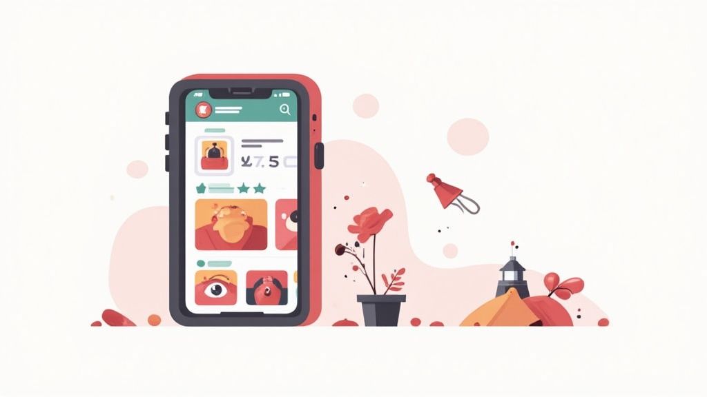
Google Play screenshots are the visual previews on your app's store listing, showing off its interface, features, and overall feel. But they are more than just pictures. They are a powerful sales tool that instantly communicates your app's value and heavily influences whether someone hits that install button.
Why Your Screenshots Are Your Strongest Sales Pitch
In a crowded marketplace, first impressions are everything. People make snap judgments, often deciding whether to download an app in just a few seconds. They are not reading your full description at first glance. They are scanning your visuals. This makes your Google Play screenshots the most critical lever you can pull to boost conversions and drive app store growth.
This behavior points to a fundamental truth in app marketing. Potential users are looking for quick, visual answers to their questions:
- What does this app actually do?
- How is it going to solve my problem?
- Does the interface look easy to use or is it a mess?
Your screenshots need to answer these questions immediately, telling a compelling story without the user having to read a single word of your description.
The Power of Visual Storytelling
Great screenshots do more than just list features. They weave a narrative that showcases your app's unique value. Instead of just showing a generic login screen, you have to demonstrate a tangible benefit. A fitness app, for example, should not just show a list of workouts. It should visualize progress, celebrate achievements, or highlight how simple it is to start a new routine.
This shift from features to benefits is what connects with users on an emotional level and really drives growth.
A well-crafted set of screenshots can boost app page conversion rates by 20–35%. This is not just a vanity metric. It is proof of the direct impact strong visuals have on grabbing user interest and driving downloads.
The modern app ecosystem is unbelievably competitive. As of 2025, the Google Play Store is home to roughly 1.56 million apps, with around 1,205 new ones added every single day. In this vast sea of options, standout visuals are not a nice-to-have. They are a necessity for survival. You can dig into more of these must-know Google Play Store stats on tekrevol.com.
Creating a Powerful Visual Hook
The first one or two screenshots in your gallery carry the most weight. This is your "visual hook", the thing that grabs attention and convinces someone to keep swiping. Your first image has to be your strongest, clearly communicating your app's main purpose with vibrant colors, a clean layout, and short, benefit-driven text.
Think about the user's journey. They have searched for a solution, and your app is just one of many results. Your icon and title got them to click, but that first screenshot is what makes or breaks their decision to explore further. If it’s cluttered, confusing, or just plain unappealing, they will bounce to the next option without a second thought.
To make your visual hook effective, you need to nail these three things:
- Clarity: The main benefit should be understood in under three seconds.
- Impact: Use bold, vibrant visuals and a strong headline to capture their interest.
- Relevance: It has to align perfectly with what the user was searching for.
By mastering the art of the visual hook and telling a compelling story, your Google Play screenshots will transform from simple images into a high-powered engine for conversions and app store growth.
Navigating Google Play Screenshot Requirements
There is nothing more frustrating than getting your app update rejected because of a screenshot issue. It stalls your launch, wastes time, and is completely avoidable. Treat Google's technical specs not as suggestions, but as hard-and-fast rules. Getting these right is the first step to a smooth submission and a professional-looking store listing.
These rules are not arbitrary. They exist to make sure your app's visuals look sharp and consistent across the ridiculously wide range of Android devices out there, from tiny phones to massive TVs. Sticking to the guidelines is about guaranteeing a good first impression for every single person who lands on your page.
Core Specifications for Phone Screenshots
Let’s start with the basics for phone screenshots, which are the foundation of your store listing. Google is very specific about file formats to keep the Play Store running smoothly.
You have two choices: JPEG or 24-bit PNG. The critical part here is that they cannot have an alpha channel, in other words, no transparency. Make sure your backgrounds are solid.
You need to upload a minimum of 2 screenshots but can go up to a maximum of 8. For phones, your screenshots must be in a 16:9 (landscape) or 9:16 (portrait) aspect ratio. The minimum dimension is 320px on the shortest side, and the maximum is 3840px on the longest side.
Expanding Beyond the Phone
While most of your users will be on phones, ignoring other devices is a huge missed opportunity. If your app supports tablets, Wear OS, or Android TV, you must provide custom screenshots for them. If you do not, your app might not even show up or be featured in those specific stores.
Tablets (and Chromebooks): Do not just reuse your phone screenshots here. You need to upload assets that show off your app's tablet UI. The same 16:9 or 9:16 aspect ratio rules apply, but the visuals must be tailored to the large-screen experience.
Wear OS: The rules for watches are completely different. Your screenshots must be a 1:1 aspect ratio (square) and show only the app's UI. You are not allowed to place the UI inside a fancy watch frame graphic. It has to be the raw screen capture.
Android TV: For TV listings, you will need a 16:9 landscape screenshot of your app's interface. On top of that, you must also provide a separate TV banner asset that measures 1280 x 720 pixels. This acts as the header image for your app's page on Android TV.
Actionable Insight: Customizing screenshots for each device type is non-negotiable. It’s tedious to do manually, which is why using a screenshot tool is a lifesaver. Inside an editor, you can often find pre-built templates for phones, tablets, and watches that take the guesswork out of resizing and ensure you meet every single requirement.
Google Play Screenshot Specifications At-a-Glance
Keeping track of all these specs can be a headache, especially when you are juggling multiple device types. Here is a quick reference table to make it easier to double-check your assets before hitting "publish" in the Play Console.
| Device Type | Minimum Screenshots | Maximum Screenshots | Aspect Ratio | Min/Max Dimensions (Pixels) | File Format |
|---|---|---|---|---|---|
| Phone | 2 | 8 | 16:9 or 9:16 | 320px min / 3840px max | JPEG or 24-bit PNG |
| 7-inch Tablet | 2 | 8 | 16:9 or 9:16 | 320px min / 3840px max | JPEG or 24-bit PNG |
| 10-inch Tablet | 2 | 8 | 16:9 or 9:16 | 320px min / 3840px max | JPEG or 24-bit PNG |
| Wear OS | 1 | 8 | 1:1 (Square) | 384px min / 3840px max | JPEG or 24-bit PNG |
| Android TV | 1 | 8 | 16:9 | 320px min / 3840px max | JPEG or 24-bit PNG |
Getting the technical side right ensures your app looks its best everywhere. But remember, these rules are just the starting point. The real work is creating visuals that grab attention and drive downloads. For a deeper look at how the other major platform handles this, check out our guide on App Store screenshot requirements.
Designing Screenshots That Drive Downloads
Alright, with the technical specs out of the way, we can get to the fun part: creating efficient and high-converting app store screenshots for Android and iOS that persuade people to hit "Install."
Effective screenshots are not just pretty pictures. They are a visual argument for why your app deserves a spot on someone's phone. This means every single design choice, from the vibrant colors you pick to where you place your text, has to serve that one purpose.
The whole game is about guiding the user's eye exactly where you want it to go, telling a story they can understand in just a few seconds. A strong visual hierarchy is your best friend here. It is how you make sure they see the most important message first.
Crafting a Strong Visual Hierarchy
Visual hierarchy is just a fancy way of saying you need to show what is most important. For a screenshot, that means your main headline or benefit should hit them first, followed by the app UI, and then any extra details.
Here is how to break it down:
- Primary Element: This is your bold, benefit-driven headline. Something like, "Plan Your Week in 60 Seconds." Make it big, high-contrast, and impossible to ignore.
- Secondary Element: The relevant slice of your app's UI. Using a device frame keeps it looking clean and professional. Do not be afraid to zoom in on the specific feature you are talking about.
- Tertiary Element: Any extra text or small callouts. These should be smaller and less in-your-face, adding context without creating clutter.
By controlling what users see first, second, and third, you control the narrative. You make your value prop unmissable.
Actionable Insight: The biggest mistake developers make is trying to show everything at once. A cluttered screenshot with competing text and visuals is a confusing one. Focus each image on a single, powerful benefit for maximum impact. A good site editor lets you easily adjust font sizes, colors, and positions to perfect this hierarchy.
Writing Captions That Convert
Your captions are the voice of your screenshots. They need to be short, punchy, and all about benefits, not features.
Nobody cares about your "advanced filtering algorithm" (a feature). They care that they can "Find the Perfect Restaurant in Seconds" (a benefit). It’s a subtle shift, but it makes all the difference.
Keep your language simple and direct. Start with strong verbs and speak to what the user actually needs. And let your brand’s voice shine through, whether it’s playful or professional. The right tone builds trust and makes your app feel more relatable. To really nail this, you have to understand the entire user experience, which is at the core of custom mobile app development.
Choosing Your Design Style
Not every app should have the same style of screenshots. The design needs to match your app's personality and purpose. Two main approaches work best on the Google Play Store, and you can even mix them for a more powerful story.
1. Feature-Focused Layouts
This is the classic approach where each screenshot highlights one specific feature. It is direct, clear, and works wonders for utility apps, productivity tools, or any app where function is the main selling point. The formula is simple: a clean UI mockup paired with a bold caption explaining the benefit.
2. Panoramic Storytelling
This is a more creative take where you connect multiple screenshots into one long, continuous image. It is fantastic for creating an immersive, high-impact experience and works especially well for games, lifestyle apps, or brands with a strong visual identity. That seamless flow encourages users to keep swiping, pulling them deeper into your app's world.
Many top-performing apps use a hybrid model. They might lead with a panoramic shot for the first 2-3 slots to create that "wow" factor, then switch to feature-focused layouts to break down specific functions. This gives you the best of both worlds. You grab their attention upfront, then deliver the proof they need to seal the deal.
For more inspiration on layouts, check out different ways to optimize Google Play graphics. It is a great way to see what is currently working for other successful apps.
Localizing Your Screenshots for a Global Audience
Your app has global potential, so why should not your Google Play screenshots? Launching in a new country is not just about translating your description. It is about making your entire store listing feel like it was made for that market. True localization goes way beyond just swapping out text.
Effective localization means adapting your visuals to resonate with local cultures and expectations. What connects with an audience in North America might fall completely flat in Japan or Germany. This means rethinking everything from the images and vibrant color schemes you use to the specific UI elements you decide to feature. It is all about building instant trust to boost global app store growth.
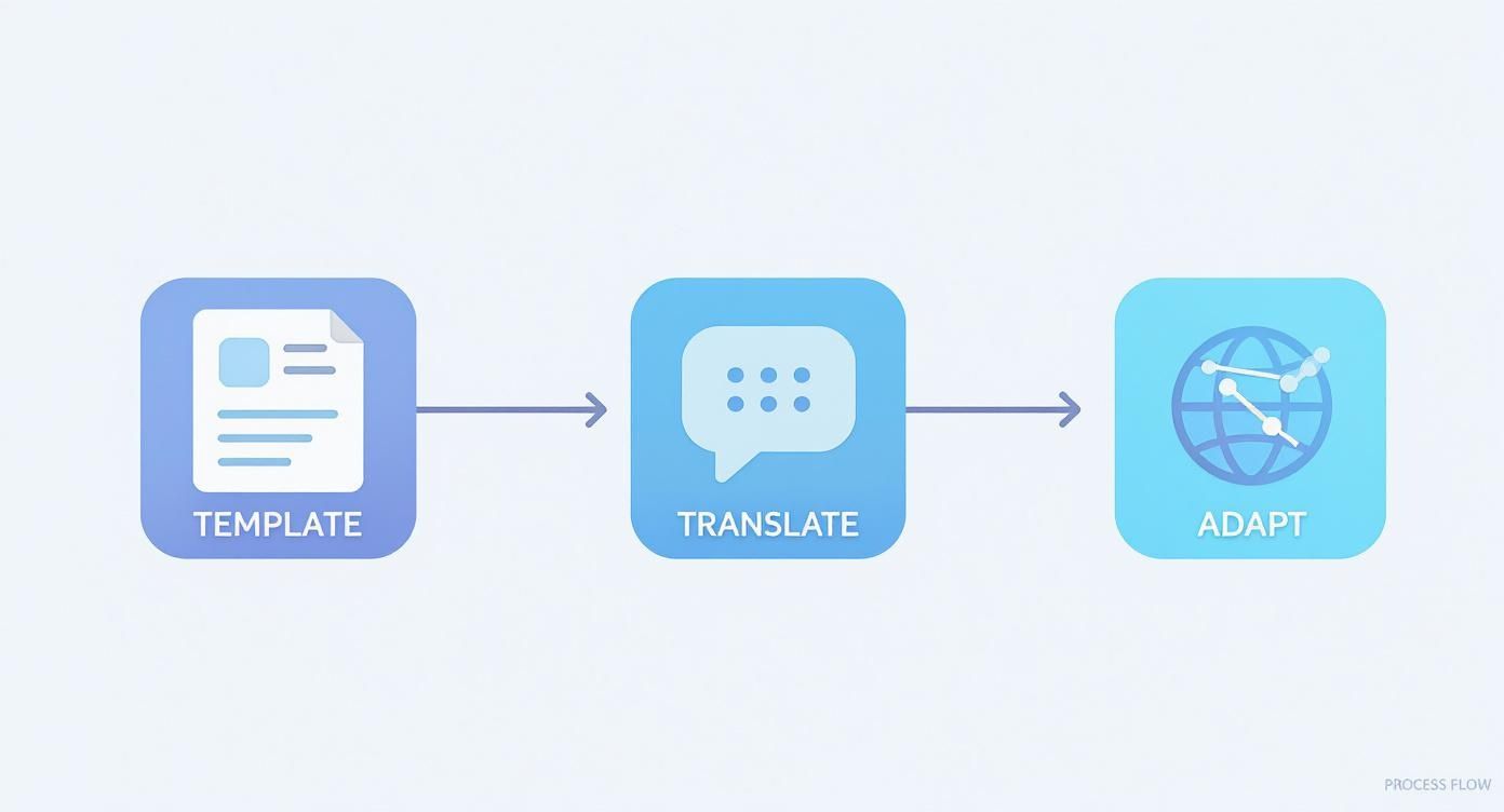
Building an Efficient Localization Workflow
A messy, disorganized localization process is a surefire recipe for missed deadlines, inconsistent branding, and frustrated teams. The absolute key to scaling this efficiently is to separate your text from your background images. Create a solid foundational template where the visuals are locked in, but the text layers can be easily and independently updated.
This simple structure is a game-changer. It lets your designers perfect the layout and visuals, while your translators can focus purely on getting the copy right.
- Design First: Create a master template with your core visual elements like the device frame, background, and UI captures. Get this looking perfect.
- Isolate Text: Place all your captions and callouts on separate, editable layers. This is the only part your translators or localization team will need to touch.
- Collaborate: Share just the text content with your localization team or a translation service. Once you get the translated text back, it’s a simple copy-and-paste job for the designer.
This workflow stops designers from having to manually edit dozens of different image files for each language, which saves a massive amount of time and dramatically reduces the chance of errors.
Actionable Insight: The goal is to build a system where you never have to ask your designer, "Can you just change this one word?" A good template-based workflow makes localization a repeatable, scalable process, not a painful series of one-off design tasks.
Navigating Common Localization Pitfalls
Translating your screenshot captions is the easy part. The real challenge is avoiding the subtle cultural and technical mistakes that can tank your conversion rates.
One of the most common issues is text expansion. German, for example, often uses far more characters to express the same idea as English. If your design has tight, unforgiving text boxes, a simple translation can result in overflowing or awkwardly shrunk text. Always, always leave extra space in your templates to accommodate longer languages.
Another major pitfall is using culturally inappropriate imagery. A hand gesture that’s friendly in one country might be deeply offensive in another. Similarly, the people or scenes you feature should reflect the diversity of your target market. Generic, one-size-fits-all stock photos rarely connect with anyone on a personal level.
The Power of Automated Translation
Manually managing translations for multiple languages quickly becomes a nightmare. This is where dedicated tools become absolutely essential. Using a platform with built-in translation capabilities can completely transform your workflow.
These systems can take your English captions and automatically generate localized versions for dozens of languages in a matter of seconds. This allows you to deploy fully localized Google Play screenshots to multiple markets at once, without the tedious back-and-forth between designers and translation agencies. You can learn more about how to auto-translate device mockups to see how this can streamline your own process.
By combining a smart, template-based workflow with genuine cultural awareness, you can create localized screenshots that feel tailor-made for every user, no matter where they are. This approach not only improves conversions but also shows a deep respect for your global audience, building a much stronger brand presence internationally.
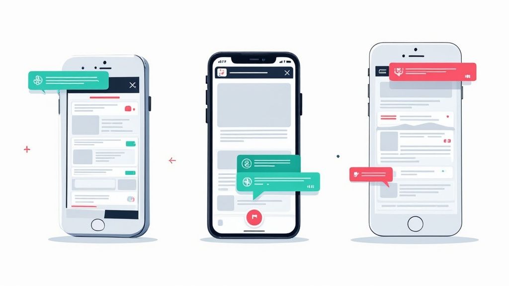
A/B Testing Your Way to Higher Conversions
Great design gets you in the game, but data-driven optimization is how you win. Just launching a set of beautiful Google Play screenshots and hoping for the best is leaving installs on the table. If you want to really maximize your app's growth and conversions, you need to test, learn, and iterate based on what users actually do.
This is where Google Play's Store Listing Experiments tool becomes your best friend. It lets you run controlled A/B tests on your screenshots to see what actually drives more installs. No more guessing which design works best. You get definitive, data-backed answers.
Setting Up a Valid Screenshot Test
A solid A/B test starts with a clear question. The goal is to isolate a single variable to understand its specific impact. A vague test like "let's try new screenshots" is useless because you will not learn why something worked or did not.
Instead, you need a precise hypothesis. Here are a few examples:
- Hypothesis 1 (Style): "Our current feature-focused layouts will be outperformed by a panoramic, connected design that tells a cohesive story."
- Hypothesis 2 (Content): "Adding user testimonials to our screenshots will convert better than images showing only the UI."
- Hypothesis 3 (Copy): "Benefit-driven captions like 'Save Time on Groceries' will get more installs than feature-focused ones like 'Advanced List Sorting'."
Once your hypothesis is locked in, you can create your "Variant B" to test against your current "Control" (Variant A). Head into the Google Play Console, set up a store listing experiment, and decide what percentage of store traffic sees each version.
Actionable Insight: Let your test run long enough to hit statistical significance. Pulling the plug too early means you might be making a decision based on random noise, not a real trend. Google Play will let you know when you have enough data to be confident in the results.
What to Test for Maximum Impact
You can test almost anything, but some changes move the needle way more than others. Always start with big, bold changes before you start fiddling with minor tweaks like button colors.
Key Elements to Test First:
- Overall Design Style: Pit two completely different aesthetics against each other. Think a light theme versus a dark theme, or photorealistic backgrounds versus minimalist, flat-color designs.
- Screenshot Order: Those first one or two screenshots are everything. Test which of your key value props performs best when it is the very first thing people see.
- Caption Copy and Tone: Experiment with your messaging. Try an urgent, action-oriented tone ("Download Now!") against a more aspirational one ("Achieve Your Goals").
- Visual Content: See what happens when you test screenshots featuring people and lifestyle imagery against purely UI-focused shots. For some apps, that human connection can dramatically lift installs.
This simple workflow is useful for all testing, including when you are localizing assets. You build a solid template first, which makes adapting and testing in new markets way more efficient.
This just hammers home that a systematic, template-first approach is key. It is how you scale your creative testing across different markets without reinventing the wheel every time.
Interpreting Your Results and Taking Action
Once the experiment is done, Google Play gives you a report showing how each variant performed. The metric you care about most is the conversion rate, the percentage of people who saw the listing and actually installed your app.
The results will show a likely performance range, something like, "Your new screenshots are likely to increase conversions by +2.5% to +8.5%." If you see a clear winner with a positive lift, the next step is a no-brainer: apply it to 100% of your audience.
What if the results are a wash? If the change is negligible or inconclusive, it’s a valuable lesson. The element you tested was not a major decision-maker for your audience. You can confidently stick with your original version and move on to a new hypothesis.
This entire process removes emotion and guesswork from your design decisions. Every change you make becomes a calculated step toward higher growth. And remember, A/B testing is just one piece of the puzzle. Exploring broader conversion rate optimization strategies will give you even more ideas for improving your app's store presence.
Got Questions About Google Play Screenshots? Let's Clear Them Up.
Even after you have a solid plan, a few tricky questions always seem to pop up when you are actually creating and managing your screenshots. Getting these right can save you from common mistakes and keep your store listing converting. Let's tackle the ones heard most often.
One of the biggest uncertainties revolves around video. It is a powerful tool, but it does not work in isolation.
Can I Just Use a Video Instead of Screenshots?
You absolutely should use a promo video, but it can never replace your screenshots. Google Play is strict about this: you need a minimum of two screenshots, even with a video. They each play a totally different role in convincing a user.
A video is perfect for showing your app in motion, highlighting slick animations, or setting a specific vibe. But screenshots? They are the quick, scannable overview of your app's core value. Most users glance at these static images first to make a snap judgment before they even consider watching a full video.
Should My Screenshots Be Portrait or Landscape?
This one is simple: your screenshot orientation should always match how people actually use your app. This is not just a style choice. It is about authenticity and setting the right expectations from the get-go.
If your app is a game or a video editor that lives in landscape mode, your screenshots must reflect that. Showing portrait images for a landscape-first app just feels disconnected and confusing. For almost everything else, portrait is the standard. It’s how people naturally hold their phones when browsing the Play Store anyway.
Actionable Insight: Never fight the user's natural behavior. Always capture and display your app in the orientation it was designed for. A mismatch creates a jarring experience before they have even hit install.
How Often Should I Update My App Screenshots?
There is no magic number here, but a good rule of thumb is to refresh your screenshots whenever you ship a major update or want to show off a new competitive edge. Stale visuals can make an app feel abandoned or outdated, which is a conversion killer.
Here is when you should definitely plan a refresh:
- Major UI Redesign: If your app looks fundamentally different, your screenshots need to show that off immediately. Old visuals will just confuse people.
- Big New Features: When you add a killer new function that delivers real value, give it its own screenshot. Show users why they should be excited.
- Just Because: Honestly, it’s just good practice to refresh your visuals every 6 to 12 months anyway. It’s the perfect excuse to A/B test new messaging, different vibrant color schemes, or updated design styles to see if you can squeeze out a better conversion rate.
Keeping your Google Play screenshots fresh ensures they stay accurate, compelling, and one of the hardest-working assets for your app's growth.
Stop wasting hours on manual screenshot design. With ScreenshotWhale, you can generate professional, high-converting Google Play and App Store screenshots in minutes using stunning templates and an AI-powered translation engine. https://screenshotwhale.com