
How to Create High-Converting App Store Screenshots for Android & iOS
Learn how to capture a screenshot on Android with our easy-to-follow guide. Tips to help you take perfect screenshots and boost your app visibility.
Taking a screenshot on your Android phone is second nature for most of us. You just press the Power and Volume Down buttons together for a second, and snap: the image is saved right to your gallery. It's a simple, universal shortcut that works on almost every modern Android device.
But what if that simple screenshot could be your most powerful marketing tool for app store growth?
Crafting Your First Impression on Google Play and the App Store
When someone lands on your app's page, your screenshots are not just a gallery of features; they are your visual handshake. They are often the single biggest factor that turns a casual browser into an actual user. Getting this right is the first step to driving real growth and conversions on the Google Play Store and Apple's App Store.
The ability to capture a screenshot on Android has become a fundamental part of how we share and communicate. This feature was not always so straightforward in the early days, but as Android grew to command over 70% of the global market by 2022, a simple, consistent method became essential. You can learn more about how this evolved in the history of the screenshot.
Tell a Compelling Visual Story
Think of your first couple of screenshots as a mini pitch. Do not just show your home screen; that tells people nothing. Instead, lead with a core value proposition that solves a real problem for your user. This approach builds an instant connection by showing them exactly what they will gain.
For example, a fitness app could kick things off with a screenshot captioned, "Your Personalized Workout in 3 Clicks." That is way more compelling than a generic menu. It screams efficiency and personalization right away.
Your primary screenshot has one job: stop the scroll. It must immediately convey your app's core benefit and unique value, making the user curious enough to see more.
To nail this, every first screenshot needs to tick a few boxes. It has to be visually appealing, clearly communicate value, and feel authentic to your brand's identity.
The Primary Screenshot Checklist
Your very first image carries the most weight, so make sure it hits these marks to maximize its impact:
- Highlight the Core Benefit: Does the image and text immediately answer the user's question: "What's in it for me?"
- Use Clear, Legible Text: Keep your captions short, benefit driven, and easy to read on a small phone screen. No tiny fonts!
- Showcase Your Best UI: Feature a clean, engaging part of your app that looks professional and inviting.
- Align with Your Brand: The colors, fonts, and overall vibe should be perfectly in sync with your app's branding.
Let's break down the most critical components for a screenshot that gets people to hit that "Install" button.
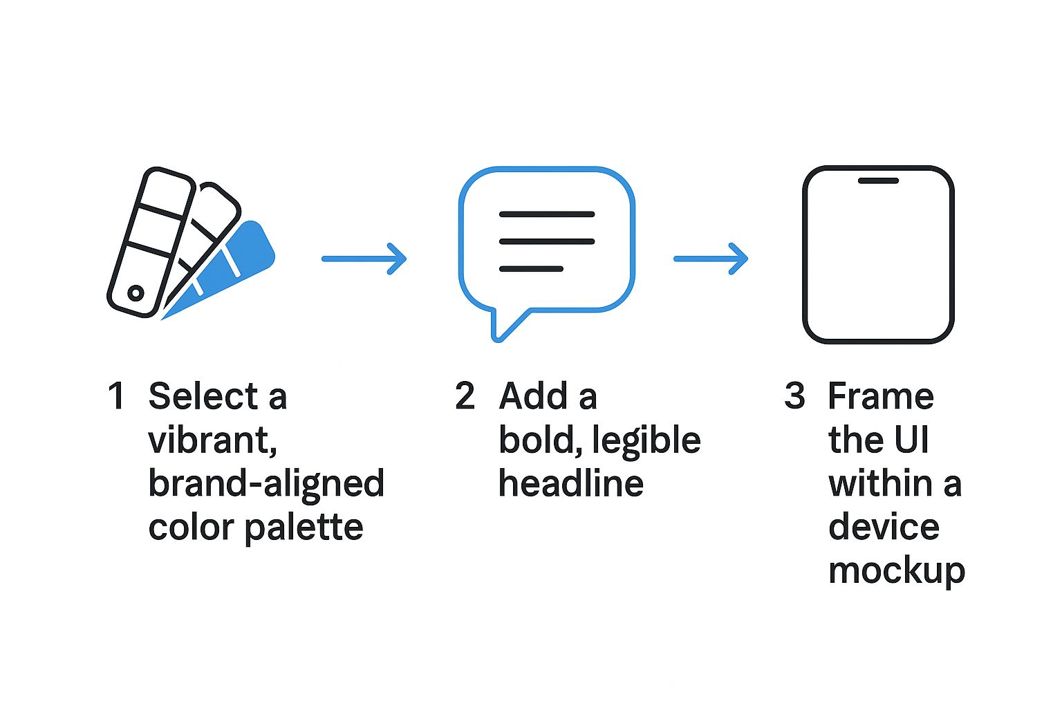
Essential Elements for High-Converting Screenshots
Your primary screenshots on Google Play and the iOS App Store need to work hard for you. This table summarizes the must have elements that will make them effective.
| Element | Why It Matters | Example |
|---|---|---|
| Benefit-Driven Headline | Users scan for value. A headline that solves a problem grabs their attention instantly. | "Master Any Language in 10 Minutes a Day" instead of "Language Learning App." |
| Clean User Interface | A polished UI builds trust and signals a high quality, reliable app experience. | Showcase a visually appealing screen, not a cluttered settings menu. |
| Device Mockup | Placing the screenshot inside a phone frame makes it look professional and tangible. | Use a mockup of a modern Android device like a Pixel or Galaxy. |
| Consistent Branding | Using your app's colors and fonts reinforces brand identity and recognition. | If your app's primary color is blue, use it in your screenshot backgrounds. |
By focusing on these four pillars, you move from simply showing what your app does to showing what your app does for the user. That small shift in perspective makes all the difference for boosting conversions.
Designing Screenshots That Drive Conversions
Okay, so you have mastered the art of grabbing a screenshot on your Android phone. What now? A raw screen grab is just the starting point. Turning that simple image into something that actually convinces people to download your app is where the real work begins.
Let's be honest: a plain screenshot rarely does the trick. You need to guide the user's eye, show them what’s in it for them, and make your app look like a must have.
It all starts with a cohesive look. Pull colors from your app's own branding for your screenshot backgrounds and text. This is not just about looking pretty; it is about building instant brand recognition and trust the second someone lands on your app page.
Focus on Clarity and Context
Next up: your captions. Use bold, easy to read fonts that grab attention. A user should get the main benefit in a blink. Instead of showing a budgeting screen and hoping they figure it out, tell them directly: "Track Your Spending Instantly." You are not just showing a feature; you are explaining its value.
Another pro move is framing your UI inside a device mockup. It instantly makes your app feel more tangible and professional, helping users picture it on their own device. There are tons of great mobile app mockups out there that can give your app that polished, top chart look.
This whole process is actually pretty straightforward.
As you can see, it boils down to three key ingredients: brand aligned colors, benefit driven text, and a clean device frame. Nail these, and you are already ahead of the game.
Putting It All Together: A Practical Example
So, what does this look like in practice? Imagine you are using a site editor to create your screenshots. You would start by uploading your raw screen capture and selecting a Google Pixel or iPhone mockup. Then, you would add a powerful, benefit focused headline above it using a bold font. To make everything pop, you would set the background to a vibrant, contrasting color from your brand palette. Simple, right?
This hands on approach shows that you are not just taking a picture of your app. You are creating an advertisement that communicates value, builds trust, and encourages users to hit the install button.
By following these design principles, you can transform any basic screenshot into a high performing asset for both the Google Play and Apple App Stores. It’s a small effort that can make a huge difference in driving more downloads and growing your app.
Telling a Cohesive Story Across Your Screenshots
A single, beautiful screenshot is a great start, but it cannot do all the heavy lifting alone. To really move the needle on app store growth, your screenshots have to work together to tell a convincing story.
Think of them as a storyboard. You are walking a potential user from a flicker of interest to a confident download.
This narrative flow is everything. It guides users through what makes your app valuable, screen by screen. This idea of a seamless experience should be mirrored in your screenshot gallery.
Structuring Your Visual Narrative
Start your storyboard with your app's core benefit. What is the single most compelling reason someone should download it? Lead with that. Your first screenshot is your hook.
From there, dedicate the next few images to showing off key features that back up that main promise. You are not just listing features; you are proving how your app delivers on its word.
A language learning app is a perfect example of this in action:
- Screenshot 1 (The Hook): Grab their attention with a powerful headline like "Learn Spanish in 5 Minutes a Day."
- Screenshot 2 (The How): Show an interactive lesson, giving them a glimpse of the actual learning process.
- Screenshot 3 (The Proof): Highlight a progress tracking screen. Show them their potential for growth.
- Screenshot 4 (The Trust): Seal the deal with social proof, maybe a glowing user testimonial or a five star rating.
This progression tells a complete story. It addresses a user's need, demonstrates the solution, and builds the trust needed to hit 'Install.'
Your screenshot gallery should feel like a guided tour, not a random collection of images. Each swipe should reveal a new layer of value and bring the user closer to hitting 'Install.'
Creating a Seamless Swiping Experience
Here is a clever technique that can work wonders: the panoramic or connected screenshot. This is where the background or design elements from one screenshot blend seamlessly into the next, creating a single, continuous image as the user swipes.
It is a simple but brilliant trick. It encourages users to swipe through your entire set just to see the complete picture, getting your full message across in the process.
To really nail this, you will want to master some proven visual storytelling techniques that turn static images into a dynamic and persuasive narrative. It’s what helps your app stand out from the noise on the Google Play Store.
Optimizing Your Screenshots for Every Device and Every Country
https://www.youtube.com/embed/749cMjWM54k
Your app does not live in a bubble; it is competing on a global stage. This means your screenshots need to look incredible everywhere, from a foldable phone in Seoul to an older iPhone in London. Getting this wrong is one of the easiest ways to stunt your app's growth before it even has a chance.
The first hurdle is purely technical: device compliance. Simply stretching your phone screenshots to fit a tablet layout results in those awkward, pixelated images that just scream "amateur hour." Every device type: tablets, foldables, even wearables: needs its own set of screenshots designed for its unique screen size and orientation. No shortcuts here.
Go Beyond Simple Translation
Localization is where so many developers miss a massive opportunity. It is not just about swapping out English text for Spanish or Japanese; it is about full blown cultural adaptation. When you do it right, your app feels like it was built specifically for that market.
Think about it. A food delivery app in the U.S. might showcase juicy burgers and pizza. But if you are launching in Japan, those same screenshots should probably feature ramen or sushi. You need to go deeper, too: adjusting UI elements, currency symbols, and even the scenarios you depict to match local expectations.
Effective localization is a sign of respect for your international users. That small effort builds a surprising amount of trust and can give your conversion rates a serious boost in new regions.
A Quick Checklist for Global Success
Before you push your app live in a new country, run through this quick checklist. It will help you make sure your visuals are tuned for maximum impact.
- Cultural Relevance: Do the images, icons, and scenarios in your screenshots align with local customs and preferences?
- Language and Formatting: Is all the text translated accurately, preferably by a native speaker? Are dates, currencies, and numbers formatted correctly for that region?
- Device Popularity: Are you using device mockups that are actually popular in that market? Showing a Samsung device in South Korea just makes more sense than defaulting to an iPhone.
Making sure your visuals meet the exact specifications for every device is crucial. You can find detailed breakdowns of the current requirements in this super helpful guide to app store screenshot sizes, which covers both Apple's App Store and Google Play. Tailoring your visuals is not just extra work: it is how you build a real connection with users around the world.
You have poured countless hours into building an amazing app, but even the best code cannot save a bad first impression. And on the app store, that first impression is almost always your screenshots. It is a painful truth, but many developers are accidentally sabotaging their own growth with a few simple, avoidable screenshot mistakes.
Let's walk through the common pitfalls so you can audit your own store presence and start winning those downloads back.
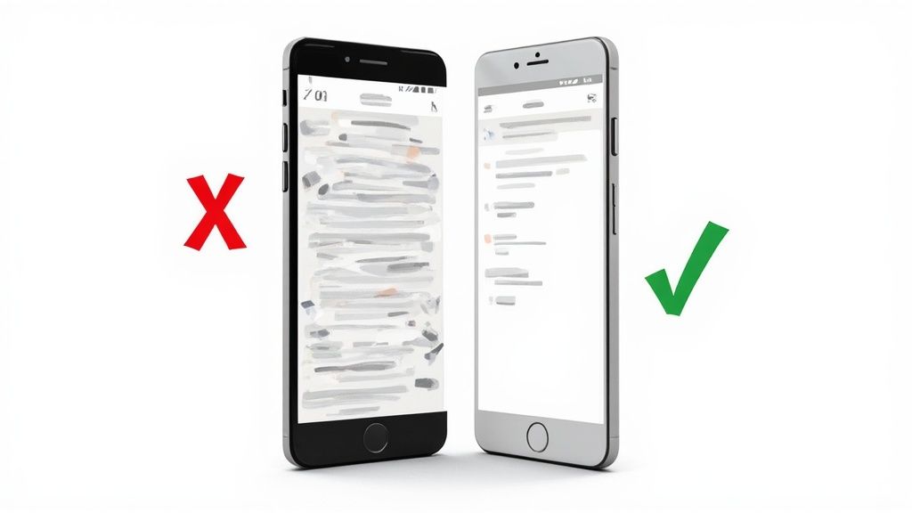
The biggest offender? Showing off features instead of explaining benefits. A screenshot of your settings menu or a generic home screen tells a potential user absolutely nothing. It leaves them asking, "So what? What's in it for me?" This immediately signals that you are more focused on your app's internals than on solving their problem, and their interest dies on the spot.
Then there are the pure visual blunders. I am talking about low resolution images that look blurry on a brand new phone, wildly inconsistent branding from one screenshot to the next, or text overlays so cluttered they are impossible to actually read.
Why Clarity Trumps Complexity
Your one and only goal here is to make the decision to download feel effortless. The second you force someone to squint, zoom in, or try to decipher what your app actually does, you have introduced friction. And friction kills conversions. Every single pixel should have a clear purpose.
A potential user spends only a few seconds scanning your app page. If your screenshots are confusing, cluttered, or unprofessional, you have already lost them to a competitor with a clearer message.
Make sure your screenshots are working for you, not against you, by avoiding these classic missteps:
- Using Unreadable Fonts: That tiny, overly stylized font might look cool in your design tool, but it is a major turn off on a small phone screen. Stick with bold, clean typography that is easy to scan in a split second.
- Hiding the Best Features: Do not bury your "aha!" moment in the fourth or fifth screenshot. Lead with your absolute strongest value proposition. Hook them immediately.
- Ignoring the Narrative: Your screenshots are not just a random collection of images; they should tell a cohesive story. Guide the user from the problem they have to the solution your app provides.
By simply sidestepping these common mistakes, you can make a huge impact on how users perceive your app. A clean, benefit driven visual strategy is your secret weapon for standing out on the crowded app stores.
Answering Your Top App Store Screenshot Questions
Figuring out the exact rules for app store visuals can feel like trying to hit a moving target. But once you nail down a few key details, you will be on the right track to creating screenshots that are not only compliant but also incredibly effective at driving conversions.
How Many Screenshots Do I Actually Need?
For Google Play, you get up to eight slots per device type. My advice? Do not leave them empty. You should be aiming for at least four to five solid, high quality images. This also applies to the Apple App Store, where you can upload up to ten.
This gives potential users a real taste of what your app does without throwing too much at them at once. It is the sweet spot between showing off and overwhelming.
If you want to get into the nitty gritty of platform specs, I have covered the specifics in another guide on how to upload a screenshot for both major app stores.
Should I Show Real People or Just My App's UI?
Honestly, the best approach is a smart mix of both.
You absolutely need pure UI shots. They are non negotiable for showing people exactly what they will be tapping and swiping. But lifestyle photos? They are your secret weapon for making an emotional connection. They help users imagine your app fitting seamlessly into their own lives, which makes the benefits feel so much more real.
Think about a travel app. You could show its slick, easy to use booking screen right next to a stunning photo of a beach in Bali. The UI proves it works, but the lifestyle shot sells the dream. Just make sure the app's value is always the star of the show.
What Are the Most Important Specs to Remember?
When it comes to phones, Google Play has some hard rules. You need at least two screenshots, and they must have a 16:9 or 9:16 aspect ratio.
Pay close attention to the dimensions, too. The minimum size is 320px on the shortest side, and the maximum is 3840px. Staying within these lines is non negotiable for getting your app approved. It’s also worth keeping an eye on how store policies evolve; for context, it is always interesting to read up on things like Apple's App Store guidelines for developers to understand the broader landscape.
Ready to create stunning, high-converting visuals in minutes? With ScreenshotWhale, you can access professionally designed templates and an AI-powered translation engine to make your app shine on every app store, worldwide. Start designing for free at https://screenshotwhale.com.