
High-Converting iOS & Android App Screenshot Design Guide
Transform your App Store presence with our guide to designing a winning iOS app screenshot. Learn tips to boost downloads and drive conversions.
Your app store screenshots are the most powerful sales tool you have. They’re the primary visual pitch you get to make, and you have just a few seconds to convince someone that your app is worth their time.
They are not just pictures; they are a story. And that story has one job: communicate your app's core value in seconds and get that person to tap "Install." This guide provides actionable insights for creating efficient, high-converting screenshots for both the iOS and Android stores to boost your app store growth.
Building Your Visual Story for the App Store
A set of beautiful but aimless screenshots will not convert. It's a classic mistake. Before you even think about opening a design tool, you have to nail down the story you want to tell. Your narrative needs to answer the user's one fundamental question: "How will this app make my life better?"
It all starts with identifying your app’s single most compelling benefit. I'm not talking about a laundry list of features; I mean the ultimate outcome for the user. For a fitness app, it’s not “track calories,” it’s “finally achieve your health goals.” For a finance app, it’s not “view spending charts,” it’s “take control of your money for good.”
Defining Your Core Value Proposition
To build a story that resonates, you first have to know who you are talking to. Learning how to research your target audience effectively is not just a marketing exercise; it's the foundation of your entire visual pitch. Once you get their pain points, you can zero in on the one unique selling proposition (USP) that solves their biggest problem.
Take a meditation app, for example. It might have a dozen features—guided sessions, soundscapes, progress tracking—but for a busy professional, the core value is probably "Find calm in just 5 minutes a day." That becomes the central theme of your entire screenshot sequence.
This is the simple but powerful process I follow: get the value right, map out the story, then execute the design.
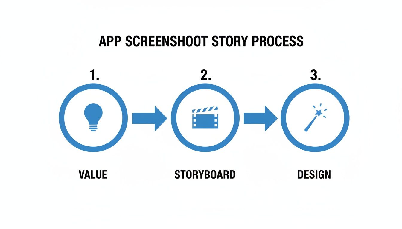
This flow from "Value" to "Storyboard" to "Design" is non-negotiable. A strong concept has to come before any visual work if you want your screenshots to actually perform.
Crafting a Compelling Storyboard
Once your core value is locked in, it is time to storyboard. This is just a simple sequence outlining what each screenshot will show and say. The first three to five images are absolutely critical, as most people will not swipe beyond them. Your goal is to create a logical flow that builds interest and erases any doubt.
A solid storyboard for our meditation app might look something like this:
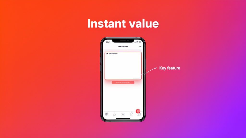
- Screenshot 1: A big, bold headline: "Find Your Calm." Slap it over a serene, vibrant background with the app's home screen. This grabs attention and lands the core benefit immediately.
- Screenshot 2: Zoom in on the "5-Minute Meditation" feature. Caption it with something like, "Stress relief that fits your busy schedule." You are hitting a specific pain point head-on.
- Screenshot 3: Show off the variety of sessions. A caption like, "From focus to sleep, we have you covered," proves the app has depth.
- Screenshot 4: Time for some social proof. Use a testimonial or a stat. "Join 1 million happy users" builds trust instantly.
This kind of narrative structure ensures every iOS app screenshot has a clear job, walking the user from their problem straight to your app's solution.
By focusing on one key benefit per screenshot, you create a clear and digestible narrative. Trying to show too much at once leads to confusion and a lower conversion rate.
From Features to Benefits
Here is one of the most common mistakes I see: developers just showing screens of their app. Nobody cares about the technology behind a feature; they care about what it does for them. You have to translate every feature into a tangible benefit.
If you are stuck, looking at some inspirational app design can help you see how others frame their features visually.
Think about these simple transformations:
Feature: "Encrypted cloud sync."
Benefit: "Your data, safe and accessible anywhere."
Feature: "Customizable widgets."
Benefit: "Your shortcuts, right on your home screen."
This benefit-driven language makes your app's value instantly clear. It shifts the entire conversation from what your app is to what your app does for the user. When you build this story first, your design process becomes laser-focused, setting you up for screenshots that genuinely drive growth.
Mastering Apple’s Technical Requirements
Let's talk about the hard part: Apple's technical rules. Getting your screenshots pixel-perfect is not just a suggestion—it's a requirement. One wrong dimension or file format, and the App Store review team will send you right back to the start. This is not just about avoiding a rejection; it's about making sure your screenshots look sharp and professional on every single device.
Before you even think about design, you need to get familiar with the specific requirements for the devices you’re targeting. Apple's ecosystem is huge, from the massive 6.7-inch iPhone displays all the way down to older models and various iPads. Each one has its own set of rules.
Decoding Screenshot Dimensions and Aspect Ratios
Precision is everything here. Apple does not just recommend sizes; it mandates them. For example, if your app supports the latest iPhones, you absolutely have to nail resolutions like 1290 x 2796 pixels for the 6.7-inch displays. Get it wrong, and you will get an upload error. It's that simple.
And this is not just bureaucratic red tape. A screenshot that is stretched, blurry, or cropped looks unprofessional. It instantly signals a low-quality app and can tank your conversion rates before a user even reads your description.
To help you get started, here is a quick reference guide for some of the most common device sizes you will be dealing with when you upload to App Store Connect.
Essential iOS Screenshot Dimensions for Key Devices
This table is your cheat sheet for the most popular iPhone and iPad models. Nailing these pixel dimensions is the first step to getting your screenshots approved and looking great on the App Store.
| Device | Display Size | Portrait Dimensions (Pixels) | Landscape Dimensions (Pixels) |
|---|---|---|---|
| iPhone 15 Pro Max / 14 Pro Max | 6.7-inch | 1290 x 2796 | 2796 x 1290 |
| iPhone 15 / 14 Pro | 6.1-inch | 1179 x 2556 | 2556 x 1179 |
| iPad Pro (6th Gen) | 12.9-inch | 2048 x 2732 | 2732 x 2048 |
| iPad Air (5th Gen) | 10.9-inch | 1640 x 2360 | 2360 x 1640 |
Keep in mind, this is just a starting point. If your app supports more devices, you will need to provide screenshots for every single size to ensure a perfect display across the entire App Store.
Handling Modern UI Elements Like The Dynamic Island
Newer iPhones come with unique UI features you cannot just ignore. The most obvious one is the Dynamic Island on the Pro models. Your designs have to account for it.
Rule number one: Do not put crucial text or important visuals where the Dynamic Island or the status bar will cover them up. It sounds obvious, but you would be surprised how often this gets missed. A simple fix is to use a clean, full-screen background color or a vibrant gradient. This lets your device mockup and UI pop without fighting for attention with the system elements, ensuring your core message is always crystal clear.
Your goal is to make the design feel native to the device. By respecting the placement of system UI like the Dynamic Island, you create a more seamless and trustworthy presentation for potential users.
Creating an Adaptable Master Template
Look, nobody has time to create unique designs for every single device size. The smart move is to build one adaptable master template in your design tool of choice, whether that is Figma, Sketch, or a specialized tool like ScreenshotWhale.
Here’s how I approach it:
- Design for the biggest screen first. I always start with the largest required dimension, which is typically the 6.7-inch iPhone Pro Max (1290 x 2796 pixels). It gives you the most canvas to work with.
- Use relative positioning. Anchor your text and UI elements relative to the frame's edges. This way, they scale down gracefully without you having to manually nudge things around for every single size.
- Keep text short and punchy. Bold headlines and brief captions are not only more powerful, but they are also much easier to adapt to smaller screens without awkward line breaks or tiny, unreadable font sizes.
This "design once, export many" mindset is a game-changer for producing App Store assets efficiently. For a full breakdown, check out our in-depth guide on App Store screenshot requirements to make sure you have covered all your bases. Once you get these technical rules down and build a scalable workflow, you can spend less time resizing and more time creating visuals that actually drive downloads.
Designing Screenshots That Demand Attention
Let's be honest: a technically perfect ios app screenshot that does not grab someone's attention is just a wasted slot on your App Store page. Once you have ticked all of Apple’s boxes for specs and sizes, the real work begins. This is where you stop being a technician and start being a marketer. Your goal is to use design to persuade, clarify, and ultimately, turn casual browsers into loyal users.
It is a noisy world out there, and your screenshots are fighting for eyeballs. To win, they have to scream value from the very first glance. This all comes down to smart design that guides the user's eye exactly where you want it to go.
Establish a Clear Visual Hierarchy
Think of visual hierarchy as telling a story in a specific order. You want the user to see the most important thing first. For an app screenshot, that is almost always the benefit-driven headline, immediately followed by the part of your UI that actually delivers on that promise.
Here are a few tried-and-true ways to establish that hierarchy:
- Size and Scale: Make your main headline way bigger than any other text. The most important visual on the screen should always be the most prominent. It is that simple.
- Color and Contrast: Use bold, vibrant background colors that make your device mockups and text pop. High-contrast text for your headline ensures it’s the very first thing people read.
- Whitespace: Do not be afraid of empty space. Cramming every pixel with content is a recipe for a cluttered mess. Giving your elements room to breathe makes the whole design feel cleaner and laser-focuses attention where it matters.
Treat each screenshot like a mini-advertisement. The user's eye should flow naturally from the big promise (your headline) to the proof (your app's UI).
Leverage Color Psychology and Branding
Color is so much more than decoration; it is a shortcut to emotion. The colors you choose can trigger specific feelings and hammer home your brand identity. A meditation app, for instance, would probably lean into calming blues and greens, while a high-energy fitness app could go for vibrant oranges and reds.
A consistent color palette across all your screenshots does more than just look pretty. It builds brand recognition and creates a cohesive, professional storefront that people are more likely to trust.
Your background choice plays a huge role here. Solid colors feel clean and modern. Subtle gradients can add a bit of depth and visual flair without being distracting. The trick is to make sure your background complements your app's UI, not competes with it. Get this right, and your entire ios app screenshot will look infinitely more appealing.
Use Device Mockups for a Polished Look
Want a quick way to make your app look more premium? Wrap your UI captures in sleek device mockups. It instantly makes your screenshots feel polished, professional, and tangible. Instead of showing a flat, raw image, you’re presenting the app as it will actually look in the user's hand.
But they are not a one-size-fits-all solution. For some apps, particularly games or tools with complex interfaces, a raw, full-screen capture can be far more immersive and effective.
Think about the context:
- Productivity App: A clean iPhone mockup with a bold headline floating above it is a classic for a reason—it works perfectly to highlight a key feature.
- Immersive Game: Showing off epic gameplay? A full-screen, landscape capture is going to be way more compelling than shrinking it down inside a device frame.
- Utility App: If your app does one simple thing well, a direct UI capture might feel more honest and get straight to the point.
Most of the time, though, a polished device frame adds a layer of professionalism that can give your conversion rates a nice little boost.
Direct the Eye with Smart Annotations
Your app's UI is probably packed with buttons, icons, and features. Smart annotations are your secret weapon for cutting through the noise and directing the user's focus to the one thing that matters in that screenshot. This is not about adding clutter; it's about providing absolute clarity.
Simple arrows, circles, or highlighted boxes can instantly draw attention to the specific button or feature you are talking about in your caption. For example, if your headline screams "One-Tap Booking," a little arrow pointing directly to the "Book Now" button immediately connects the promise to the proof.
This simple act of visual guidance eliminates any guesswork and makes your app's value proposition crystal clear in seconds. You’re turning a static image into a mini-tour of your app's best features, ensuring your message lands with maximum impact.
Writing Powerful Copy That Drives Installs
Your screenshots might grab a user's attention, but it is the words you put on them that truly sell the app. Great copy is what turns a casual glance into a definite install. It has to scream value in the split second a user is deciding whether to keep scrolling.
This is not the time for a long-winded feature list. We’re talking about short, punchy headlines that land with real impact. The goal is instant comprehension—just enough to make someone stop, look closer, and think, "I need this."
Focus on Benefits, Not Features
This is probably the single most common mistake I see developers make. They list what their app does instead of what it delivers for the user. Nobody cares about the "complex algorithm" behind your new photo filter; they just care that it makes them look amazing in their pictures.
You have to frame your copy around what the user actually wants to achieve.
Instead of: "Advanced Calorie Tracking"
Try: "Finally Reach Your Health Goals"
Instead of: "Encrypted Cloud Sync"
Try: "Your Data, Safe and Always Here"
See the difference? That simple shift from a technical feature to an emotional benefit makes your value proposition hit home immediately. You are directly answering the user's silent question: "What's in it for me?"
Your headline's only job is to communicate a powerful outcome. If it takes more than a few seconds to understand, it is not working. Keep it simple, direct, and focused on the user's end game.
One of the best ways to nail this is with the "Feature Highlight Approach." Each screenshot hones in on a single, powerful benefit, pairing a bold headline with some brief supporting text. It’s a tactic that works. Compelling App Store screenshots have been shown to lift conversion rates by up to 35%, helping users make a download decision in under 7 seconds. You can discover more insights about ASO strategies on applaunchflow.com to dig deeper into why this is so effective.
Use Action-Oriented Language
Words have momentum. Using strong, active verbs makes your app feel dynamic and exciting, not like a static tool. You want to inspire action, not just describe a screen.
Think about the feel of these two approaches:
Passive: "Budgeting Tools Included"
Action-Oriented: "Master Your Money"
Passive: "Photo Editing Suite"
Action-Oriented: "Create Stunning Photos in Seconds"
Using verbs like "Master," "Create," "Discover," "Unlock," and "Build" puts the user right in the driver's seat. It suggests they are about to achieve something new and powerful with your app, which is a far more compelling reason to tap that "Get" button.
Go Global with Smart Localization
If your app serves a global audience, just running your text through a translator is a recipe for disaster. Real localization means adapting your copy to fit the cultural nuances of each market. What gets an American user excited might fall completely flat—or even sound weird—to someone in Japan or Brazil.
Imagine a fitness app launching in Spain. The English headline "Crush Your Workout Goals" is punchy and direct, but a literal translation would sound clunky and overly aggressive. A much better, culturally-attuned option would be something like "Alcanza tu mejor versión," which translates to "Achieve your best version." It’s aspirational and connects on a much deeper level.
Good localization goes beyond just the words on the screen. It means thinking about:
- Adjusting currency and units: Displaying local currency symbols and using metric or imperial units where appropriate.
- Using relevant idioms: Swapping out English sayings for local expressions that carry the same intent.
- Adapting cultural references: Making sure any scenarios or examples feel natural and relevant in that region.
This level of detail signals to international users that you built the app with them in mind. It builds a ton of trust and can make a huge difference in your global downloads by making your app feel native, not just translated.
Automating Your Workflow to Stay Sane
Let's be honest. Manually creating every single ios app screenshot for every device, language, and update is a surefire path to burnout. It is tedious, mind-numbingly repetitive, and a massive time sink that pulls you away from what you should be doing: building great features.
This is where a smarter, more automated workflow is not just a nice-to-have; it's essential, especially for lean teams and solo developers.
The old way of doing things—resizing and tweaking assets one by one in a design tool—simply does not scale. Imagine you push a key feature update. Now you have to regenerate screenshots for the iPhone 15 Pro, the latest iPad, and several other sizes. Then, you need to translate and localize the copy for ten different languages. The manual effort snowballs, turning a simple update into days of pixel-pushing.
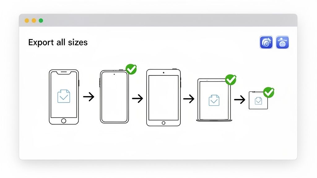
Design Once, Export Everywhere
The core principle of an efficient workflow is simple: design once, export everywhere. Instead of wrestling with dozens of separate files, you build a single, intelligent master template. This becomes your single source of truth for branding, layout, and messaging.
When it is time to generate the assets, a specialized tool can automatically spit out every required size, perfectly formatted for each iOS device. This approach transforms a multi-day slog into a task that takes just a few minutes.
Tools like ScreenshotWhale are built around this exact concept. Within the site editor, you can choose a template, set your brand's vibrant colors and fonts, and add your device mockups. When you need a new set of screenshots, you just drop in the new UI captures, tweak the text, and the platform does the heavy lifting, exporting pixel-perfect assets for every device Apple requires.
The Power of Templating for Brand Consistency
Templates do more than just save you a ton of time. They enforce brand consistency across your entire App Store presence. When every screenshot uses the same fonts, color palette, and layout, it creates a cohesive and professional storefront that builds immediate user trust.
A good template system lets you lock in key brand elements while leaving other areas flexible.
- Locked Elements: Your brand's primary color, logo placement, and headline font style.
- Editable Elements: The headline text itself, the UI capture inside the device mockup, and any specific feature callouts.
This setup ensures that even if multiple team members are creating assets, the final output always feels on-brand and polished. That consistency is crucial for making your app instantly recognizable in a sea of competitors. You can see this workflow in action and learn more about how to generate app screenshots using a template-based system.
Automating Localization for Global Reach
Localizing your screenshots for different markets is one of the highest-leverage things you can do to boost global downloads. But it is also one of the most soul-crushing when done manually. An automated workflow changes the entire game.
Instead of creating separate design files for Spanish, German, Japanese, and so on, you can integrate with translation services or just use a simple spreadsheet.
An automated workflow lets you upload your translations, and the system instantly populates them into your design templates. This generates fully localized screenshots for every language and every device size, slashing production time from days to minutes.
This level of automation makes it genuinely feasible for a solo dev to launch an app in dozens of languages at once. It removes the friction, turning localization from a daunting project into a simple, repeatable step in your release process. To take it even further, you can explore new integrations to automate your workflow, which can dramatically cut down the manual effort in managing your app store visuals.
By adopting an automated, template-driven approach, you free yourself from the grind. This lets you focus on what really matters: testing, iterating, and improving your visual marketing to actually grow your app.
Testing and Iterating Your Way to Growth
Launching your first set of screenshots is just the starting line, not the finish line. One of the costliest mistakes you can make is assuming you’ll get it perfect on day one. Real, sustainable growth on the App Store comes from a relentless cycle of testing, learning, and iterating. What you think is the perfect visual story might not be what actually convinces a user to tap "Get."
The only way to know for sure is to test.
Thankfully, Apple gives us a powerful, built-in tool for this: Product Page Optimization (PPO). This feature lets you A/B test different sets of screenshots against each other to see which ones genuinely drive more installs. It takes the guesswork out of the equation and turns your screenshot strategy into a data-driven process for boosting conversions.
Forming a Clear Hypothesis
A good test always starts with a clear question. You are not just throwing random designs at the wall to see what sticks—you need a hypothesis. This is just a simple, testable statement about what you believe will improve performance and why.
For instance, maybe your current screenshots are very direct, showing only the app’s UI. A solid hypothesis could be: “Showing the app in a real-world, lifestyle context will connect better with our target audience and increase conversions because it helps them visualize using the app in their own lives.”
Here are a few common testing ideas to get you started:
- Lifestyle vs. Feature-Focused: Pit screenshots of people using your app against those that are purely UI-focused. Which one resonates more?
- Benefit A vs. Benefit B: Is your app's main draw its time-saving features or its collaborative tools? Test which benefit is the most compelling hook for your visual story.
- Color Palette Test: See if a brighter, more vibrant background color grabs more attention than a subtle, on-brand one.
- Copy Variations: Try a direct, action-oriented headline (“Master Your Budget”) against a more aspirational one (“Achieve Financial Freedom”).
Running a Test with Product Page Optimization
Setting up a test in App Store Connect is pretty straightforward. You create a "treatment" (your new set of screenshots) and run it against your current "control" version. Apple then automatically splits your App Store traffic, showing some users the original page and others your new version.
You get to decide how much traffic to send to your test. A 50/50 split is usually a good place to start, as it gets you results faster. Just be sure to let the test run long enough to gather statistically significant data. This typically means waiting until you have at least several thousand impressions and a clear trend emerges in the conversion rate.
Do not end a test prematurely. A spike in performance on day one could just be statistical noise. Let the data pile up for at least a week or two before making a confident call.
Analyzing the Results and Taking Action
Once your test is done, Apple gives you the metrics you need to declare a winner. The number one metric you care about is the conversion rate. This tells you the exact percentage of people who saw that set of screenshots and actually downloaded your app.
Look for a clear winner. If your new lifestyle-focused screenshots resulted in a 15% higher conversion rate, that’s a huge victory. Your hypothesis was correct. The next move is simple: promote the winning version to be your new default product page for all users.
But what if the results are flat? Sometimes, there is no clear winner, and that’s valuable data, too. It tells you that the specific change you made did not have the impact you expected. In that case, you can ditch the treatment and go back to the drawing board with a new hypothesis.
This cycle of testing, learning, and improving is how you systematically increase your app’s downloads over time, turning your iOS app screenshot strategy into a powerful engine for growth.
Ready to create stunning, high-converting screenshots in minutes? With ScreenshotWhale, you can access professionally designed templates, an intuitive editor, and an AI-powered translation engine to make your app stand out on the App Store and Google Play. Start creating your perfect screenshots today at https://screenshotwhale.com.