Create an iPhone App Mockup That Converts
Learn to design a high-converting iPhone app mockup. Our guide covers tools, best practices, and App Store optimization to drive real growth.
An iPhone app mockup isn't just a pretty picture; it's a high-fidelity, static visual design that shows exactly how your mobile app will look and feel in someone's hand. It goes way beyond a basic sketch. We're talking a detailed, full-color representation with all the final UI elements, fonts, and images. It's the critical bridge between your napkin-scribbled idea and a real, shippable product.
The Foundation of a High-Converting Mockup
Before you even think about opening a design tool, let's talk about what separates a simple screen design from a powerful conversion asset. A winning iPhone app mockup isn't just about looking good. It’s a strategic tool built to tell a compelling story, guide users, and ultimately, drive your App Store growth. This foundation is built on one thing: putting the user first in a way that aligns your design with real business goals.
Focus on the Core User Journey
The most effective mockups prioritize clarity over clutter. It’s tempting to show off every single feature, but that’s a rookie mistake. Instead, start by identifying the single most important action you want a user to take on each screen. Is it signing up? Making a purchase? Playing a video?
Every single element, from the placement of a button to the contrast of your colors, must support that one primary goal. This focused approach makes your design feel intuitive and effortless, slashing user friction and keeping people engaged.
A great mockup doesn't just show what an app does. It communicates the value a user will get in the first three seconds. It’s your visual elevator pitch for the App Store.
Take a look at this example from Apple's own guidelines. It shows how clean layouts and punchy captions can tell a story almost instantly.
See how the design uses a strong visual hierarchy, bold text, and slick device frames? It's all working together to highlight the app's core value in a way that’s immediately compelling.
From Structure to Visuals
The path from an idea to a polished design always starts with a solid structure. Before you get lost in picking vibrant colors and perfecting your branding, you have to lay a strong structural foundation. This is where creating wireframes comes in. This initial step maps out the user flow and screen layouts without the distraction of visual design, making sure the app is actually usable before you make it beautiful.
The mobile app market is absolutely brutal. With consumer spending soaring to $40 billion in a single quarter and users spending an average of 3.5 hours per day in apps, you have to grab their attention instantly. A well-planned mockup built on a strong foundation isn’t just nice to have; it’s your first and best chance to make an impression that sticks.
A mockup that converts is more than the sum of its parts. It's a carefully crafted asset designed to communicate value at a glance. Below is a quick breakdown of the key elements every high-impact mockup needs.
Key Elements of a Conversion-Focused Mockup
| Element | Purpose in Mockup | Impact on Conversion |
|---|---|---|
| Clear Value Proposition | A short, benefit-driven headline on the first screen. | Instantly tells users why they should care, reducing bounce rates. |
| Visual Hierarchy | Guiding the user's eye to the most important action (e.g., a "Sign Up" button). | Makes the app feel intuitive and easy to use, increasing key actions. |
| Real Content/Data | Using realistic text and images instead of "Lorem Ipsum." | Helps users envision themselves using the app, making it more relatable. |
| Consistent Branding | Applying a consistent color palette, typography, and logo. | Builds trust and brand recognition, making the app feel professional. |
| Contextual Device Frames | Displaying the mockup within an actual iPhone frame. | Shows users exactly how the app will look on their device, increasing trust. |
Ultimately, each of these elements works together to build a visual argument for why your app is worth a user's time and storage space. Get these right, and you're already ahead of the competition.
Choosing Your Tools and Setting Up Your Canvas
Alright, let's get our hands dirty. The first real step in bringing your mockup to life is picking your weapon of choice, your design software. This decision shapes your whole process, so it's worth taking a moment to choose one that fits how you work, what you can spend, and the scope of your project.
For a lot of designers, myself included, Figma is the undisputed king. Its collaboration features are second to none, the community resources are massive, and its free plan is incredibly generous. It's the industry standard for a reason.
But the world isn't just Figma anymore. There's a whole ecosystem of accessible online editors and specialized mockup tools that can get you stunning results without a steep learning curve. The goal here is to find a tool that lets you move fast and stay in the creative flow. If you want to see what else is out there, we put together a guide on the best mockup apps for iPhone that breaks down the options.
This accessibility is a huge deal. Consider that 42% of iOS developers are solo indies and another 17% are students or hobbyists. Modern, cloud-based tools have leveled the playing field, making it possible for literally anyone to build and test an idea from their laptop. You can dig into more iOS development trends on rentamac.io.
Preparing Your Digital Workspace
Once you've settled on a tool, your next move is to set up your canvas, or what most design apps call an "artboard." This is where your mockup will take shape, and getting the dimensions right from the very start is non-negotiable. It’s absolutely critical for a realistic design.
Why the fuss? Because if you design on an incorrectly sized canvas, your final assets will look stretched, blurry, or just plain wrong when you see them on a real device. You have to create your artboard to match the exact screen resolution of the iPhone model you're targeting.
For instance, if you're starting a mockup for an iPhone 15 Pro in Figma, here’s how simple it is:
- Grab the "Frame" tool (or just press 'F').
- Look over to the properties panel on the right. You'll see a list of preset device sizes.
- Click "Phone" and find "iPhone 15 Pro" in the list.
Boom. Figma instantly creates an artboard with the precise dimensions of 393 x 852 pixels. Now every single element you add will be perfectly scaled.
Your artboard is more than just a blank space; it’s the foundation of your design. Using the correct preset dimensions ensures that what you see on your screen is exactly what users will see on their phones.
Supercharge Your Workflow with UI Kits
Staring at a blank canvas can feel blank. It can be intimidating and a massive time-sink. This is where UI kits become your secret weapon. Think of a UI kit as a pre-made box of LEGOs for your app, a collection of buttons, navigation bars, icons, and keyboards, all designed specifically for iOS.
Using an official or a well-made community iOS UI kit is a game-changer. You get all the standard, native elements that iPhone users instantly recognize. This doesn't just save you hours of tedious design work; it guarantees your mockup aligns with Apple's Human Interface Guidelines.
You can simply drag and drop elements like the status bar or a tab bar right onto your artboard. Instantly, your design starts to look and feel like a real, professional app.
Alright, this is where the fun really begins. We’ve done the prep work, chosen our tools, and now it's time to take those abstract wireframes and turn them into something that looks and feels like a real, working iPhone app. This is the moment your idea starts to feel tangible.
The goal here isn't to design every single screen down to the last settings toggle. Instead, we'll focus on building out the key screens that tell your app's story. Think of it as a highlight reel: the onboarding flow, the main home screen, and at least one core feature screen. This approach gives anyone, stakeholders, developers, or early testers, a solid feel for the app without getting bogged down in the minutiae.
Laying Out Core UI Elements
First things first, let's get the foundational pieces in place. In any modern design tool like Figma, this is mostly a drag-and-drop game. You'll want to start by adding the standard iOS components that every user instinctively looks for, things like the status bar at the very top and the navigation or tab bar at the bottom. If you’re using a pre-built UI kit, this part is incredibly fast. Just pull them in and snap them into place.
Once that basic structure is there, you can start adding the primary interactive elements. I'm talking about the main navigation buttons, crucial calls-to-action like "Sign Up" or "Add to Cart," and any necessary input fields. As you place these, pay close attention to spacing and alignment. A clean, organized layout is what separates a professional-looking app from an amateur one. It’s not just about aesthetics; it’s about creating an intuitive experience.
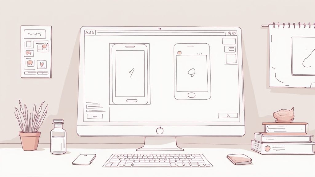
This is a great example of a well-structured layout coming together in a design editor.
Notice how everything, the cards, buttons, text, is arranged neatly on a grid. This creates a visual balance that makes the interface feel stable and easy to scan.
Infusing Your Brand Identity
A mockup should do more than just show where buttons go. It needs to have a personality, your brand's personality. This is the stage where you breathe life into the design by applying your color palette and typography.
Don't just splash color everywhere. Use it with purpose.
- Primary Color: Reserve your main brand color for the most important actions. Think primary CTAs and key interactive elements. This creates a clear visual hierarchy, guiding the user's eye to what you want them to do next.
- Secondary Colors: Use your accent colors for less critical elements like secondary buttons, icons, or illustrations. This adds depth and visual interest without creating chaos.
- Typography: Stick to one or two font families that are highly legible and match your brand's voice. A clear type scale, defining sizes for headings, subheadings, and body text, is non-negotiable for creating consistency.
A consistent visual language is the bedrock of a trustworthy user experience. When colors, fonts, and spacing are applied uniformly across all screens, users feel more confident navigating your app because it feels predictable and professional.
Choosing Your Design Tool
With so many options out there, picking the right tool can feel overwhelming. Some are great for beginners just getting their feet wet, while others are industry-standard powerhouses built for complex team collaboration. The key is to find the one that matches your current skill level and project needs.
Here's a quick comparison of some of the most popular tools I've used over the years to help you decide.
Mockup Tool Feature Comparison
| Tool | Best For | Key Features | Learning Curve |
|---|---|---|---|
| Figma | Collaborative Design & Prototyping | Real-time collaboration, component libraries, auto layout, extensive plugins, vector editing. | Medium. Very powerful, but the sheer number of features can take time to master. |
| Sketch | Mac-Native UI/UX Design | Strong vector editor, reusable symbols, huge library of third-party plugins. | Medium. A long-time industry favorite, intuitive for those in the Apple ecosystem. |
| Adobe XD | Prototyping & UI Design (Adobe Suite Users) | Seamless integration with Photoshop & Illustrator, repeat grid, auto-animate features. | Low-Medium. Fairly easy to pick up, especially if you're already familiar with Adobe products. |
| Canva | Beginners & Quick Mockups | Massive template library, drag-and-drop interface, simple branding tools. | Very Low. Designed for non-designers, making it incredibly easy to start. |
Ultimately, there's no single "best" tool, only the best tool for you. If you're working with a team, Figma's real-time collaboration is hard to beat. If you're a solo designer on a Mac, Sketch might feel like home. And if you just need something fast and simple, Canva is a fantastic starting point. Don't be afraid to try a couple before you commit.
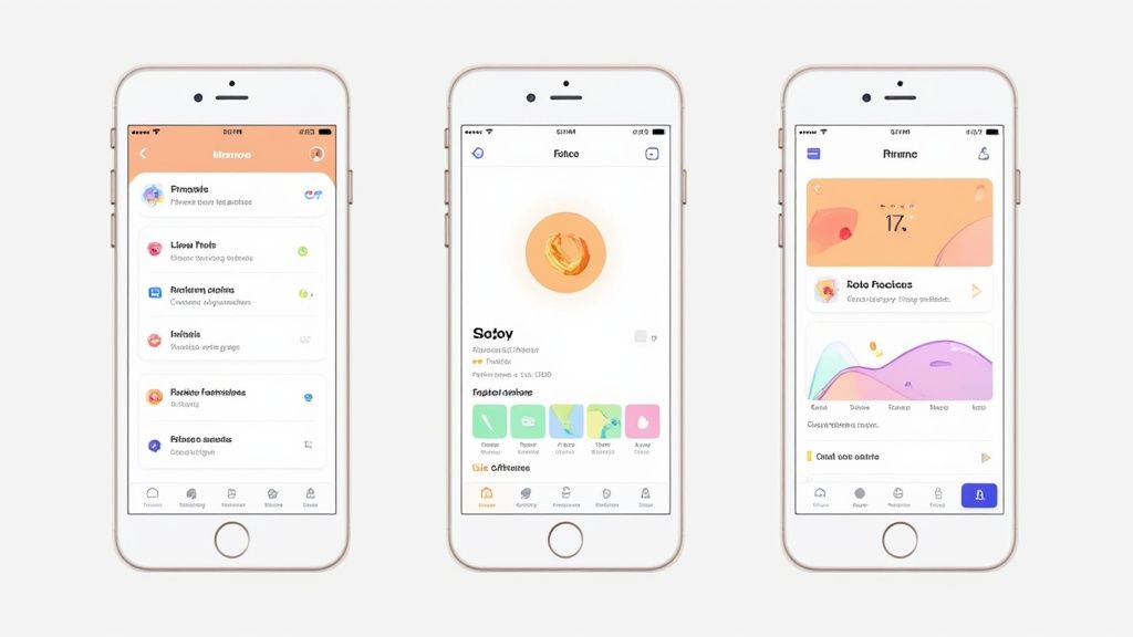
Building Key Screens: A Practical Example
Let’s walk through a simple three-screen flow to make this more concrete: an onboarding screen, a home screen, and a detailed feature screen.
The Onboarding Screen
This is your first impression, so make it count. The screen needs a powerful headline that immediately communicates your app’s value. Pair it with a beautiful background image or illustration and a single, obvious call-to-action like "Get Started." Keep it clean and focused. The goal is to get the user into the app, not overwhelm them with options.
The Home Screen
This is your app’s command center. For a social media app, it’s probably a feed. For a fitness app, it might be a dashboard showing today's stats. The design here must prioritize the most common user actions, making them instantly accessible. What's the one thing people will do 90% of the time they open your app? Put that front and center.
A Core Feature Screen
Now, pick one feature that makes your app special and design its screen in detail. If you're building a music app, this could be the "Now Playing" screen. This is where you can show off your app’s unique functionality and apply your design system to more complex components like sliders, toggles, or media controls.
By focusing on just these three screens, you create a powerful iPhone app mockup that effectively communicates your vision, functionality, and brand. It’s more than enough to start gathering feedback, testing with users, and getting your team aligned.
Designing App Store Screenshots That Convert
So you've poured your heart into a polished iPhone app mockup. That's not just a design asset; it’s the raw material for your single most powerful marketing tool on the iOS and Android app stores. Your screenshots are your digital storefront, and they're what turn passive browsers into active users. This is where your design work directly translates into App Store growth and boosts conversions.
The goal isn't just to show off your UI. It's to make someone feel what it's like to use your app and instantly get why they need it. The first two or three screenshots carry 90% of the weight, so they absolutely have to land.
Crafting a Compelling Visual Narrative
Think of your screenshots like a short comic strip. Each frame should build on the last, walking the user through a mini-story of how your app solves their problem or makes their life better. You have to start with a bang, not a boring login screen.
- First Screenshot: Lead with your single most powerful benefit. Use a punchy, action-oriented caption like "Master Your Day in Seconds" or "Create Stunning Videos Instantly." This is your hook.
- Second Screenshot: Show your core feature in action. If you've built a fitness app, show a dynamic workout screen. For a productivity app, maybe it's a beautifully checked-off to-do list.
- Third Screenshot: Bring in social proof or a secondary benefit. This is a great place for a screen showing a 5-star review, a user testimonial, or another key feature that sets you apart.
A classic mistake is just slapping raw UI captures onto the App Store. Instead, place your mockups inside a device frame and use a vibrant, branded background. This simple trick makes your screenshots pop and look infinitely more professional.
How well these designs connect with users is everything. Data shows iOS users tend to convert faster and spend more, which is why smart developers invest so much time getting their iPhone mockups right. For instance, the 109% year-over-year increase in generative AI app downloads from AppsFlyer's data trends shows just how critical it is for visuals to communicate complex features before anyone even thinks about hitting "install."
Technical Perfection and Sizing
A beautiful screenshot is useless if it's blurry or cropped into oblivion. Apple and Google have strict technical requirements for every device size, and getting them wrong can delay your app’s approval or just make your listing look amateur. Each device size group needs its own set of perfectly rendered screenshots.
For example, the 6.7-inch display on an iPhone 15 Pro Max needs different dimensions than the 6.1-inch display on an iPhone 15 Pro. You have to get this right for a polished look everywhere. For a complete breakdown, check out our guide on up-to-date App Store screenshot sizes.
Of course, great screenshots are just one piece of the puzzle. They work best as part of a broader set of essential mobile app marketing strategies that include ASO, user acquisition, and retention campaigns. When you optimize every piece, you give your app the best possible chance to succeed.
Exporting Your Final Assets for Handoff
A brilliant iPhone app mockup is only half the battle. Once your designs get the green light, the final and arguably most critical step is exporting everything for the teams that will bring it to life. We're talking about developers, stakeholders, and marketers.
This handoff process is where your vision becomes reality. Get it right, and you’ll have a smooth launch where every pixel translates perfectly from your design canvas to the live App Store. Get it wrong, and you're in for a world of headaches.
Your main job here is to arm developers with everything they need in a format that’s dead simple to use. This isn't about sending a single JPG and calling it a day. You need to export individual assets, icons, buttons, images, in multiple resolutions to look sharp on different iPhone screen densities (@1x, @2x, @3x).
If you're in a tool like Figma, this is pretty straightforward. Just select any layer or group, head over to the "Export" panel on the right, and you can add multiple export settings at once. For example, you can tell an icon to export as an SVG for scalability and as PNGs at 2x and 3x sizes, all in one click. This kind of organization is what prevents endless back-and-forth emails with your dev team.
Preparing for the App Store
Beyond the developer handoff, your mockup is the raw material for your most important marketing asset: your App Store screenshots. These visuals are your number-one sales tool, and they deserve more attention than just a quick screen grab.
Instead of exporting raw UI, you should be crafting dedicated, high-resolution images that tell a compelling story about your app's value.
The real insight here is that the best screenshots follow a narrative. They guide potential users from a high-level benefit down to specific, must-have features. To do this, you’ll need crisp, clean exports of your UI. You can either pull these directly from your design tool or learn how to take a screenshot with an iPhone from a working prototype for maximum realism.
Before you export a single thing, do one last sweep. Are your layers clearly named (e.g., "button-primary-signup" instead of "Rectangle 24")? Is your file structure logical? A tidy file saves your developer hours of guesswork and makes you their favorite designer.
The Final Export Checklist
To make sure the handoff is flawless, run through this quick checklist. It's a simple review that can prevent the kind of common technical issues that stall development and kill marketing momentum.
- Asset Slicing: Have you actually marked all the necessary icons, images, and UI components for export? It’s an easy step to forget.
- File Formats: Are you using the right formats for the job? Stick to SVG for simple icons and logos, and use PNG for more complex graphics that need transparency.
- Resolution: Did you remember to export assets at multiple resolutions (@2x, @3x)? This is non-negotiable if you want things to look sharp on all Retina displays.
- Shareable Prototype: Have you created a shareable link to an interactive prototype? This is huge for stakeholders who need to click through the user flow to really understand it.
Nailing these steps ensures your vision is built exactly as you intended, turning your iPhone app mockup into a true catalyst for a successful launch.
Got Questions About App Mockups?
Diving into the world of app design can feel like you're learning a new language. When you’re trying to build an iPhone app mockup that actually converts, a few questions always seem to pop up. Getting those sorted out first saves a ton of headaches down the line.
Let's clear the air on some of the most common ones I hear.
What’s the Difference Between a Wireframe, Mockup, and Prototype?
It’s super easy to get these terms mixed up, but they’re actually three very distinct steps on the path from idea to final product.
- Wireframe: This is your bare-bones blueprint. Think simple black-and-white boxes and lines. It’s all about structure and user flow, nothing more.
- Mockup: Now we're talking visuals. An iPhone app mockup is a high-fidelity, static picture of your app. It has all the colors, fonts, and images, showing exactly what it will look like.
- Prototype: This is where your mockup comes to life. It's an interactive, clickable simulation that connects your screens, letting people tap through the app as if it were real.
A good way to remember it is: blueprint (wireframe), realistic photo (mockup), and a working model (prototype).
Do I Actually Need to Be a Designer to Create a Mockup?
Not like you used to. While having a designer's eye is a huge advantage, today’s tools have made creating professional-looking mockups accessible to just about anyone.
Platforms like Figma and Canva have completely changed the game with their intuitive interfaces and massive template libraries. If you focus on a clean layout and a clear user journey, you can absolutely create a mockup that looks fantastic and gets your vision across.
The most important skill isn't mastering complex design software. It's understanding your user and designing a clear path for them to follow.
What Are the Must-Have Screens for a Mockup?
You don't need to design every single screen to tell a compelling story. To give stakeholders and developers a solid feel for your app, just focus on the core user journey.
I always recommend starting with these essential screens:
- Onboarding/Sign-Up Flow: This is your app's first impression, the digital handshake.
- Main Home Screen or Dashboard: This is the command center where users will spend most of their time.
- A Primary Feature Screen: Show off the main reason your app exists, whether that's a product page, a video player, or a creation tool.
- Settings or Profile Screen: This shows users how they can customize their experience and manage their account.
With these four, you’ve covered the look, feel, and core purpose of your app without getting bogged down in edge cases.
How Many Rounds of Revisions Are Normal?
This definitely varies, but for most professional projects, you can expect 2-3 major rounds of feedback. The real goal is to get input early and often, not to aim for a specific number.
My process usually starts with internal reviews with the team. Once we’re aligned, we move to user testing with the interactive prototype. This iterative approach is crucial. It helps you refine the design based on real-world feedback and saves you from making expensive changes after the code has already been written.
Ready to turn that polished mockup into high-converting App Store visuals? With ScreenshotWhale, you can generate professional, on-brand screenshots in minutes using a simple drag-and-drop editor. Start creating for free!