How to Use an iPhone Mockup Template to Boost App Store Conversions
Learn how to use an iphone mockup template to craft compelling app screenshots that boost downloads and conversions.
An iPhone mockup template is more than just a pretty picture. It is a design asset that frames your app's screenshots inside a realistic device, like an iPhone 16 Pro Max. This single change can make your App Store and Google Play visuals look instantly more professional and persuasive, directly impacting your app store growth.
Using a high quality mockup is one of the quickest wins for boosting credibility and driving more downloads. It is how you turn a raw UI capture into a compelling story about your app's value, creating high converting app store screenshots for both Android and iOS.
Why Your App Store Screenshots Need Professional Mockups
Think of your App Store screenshots as your primary sales tool. Long before a user bothers to read your description or sift through reviews, they are scanning your visuals. That first impression happens in a flash, and it heavily sways their decision to tap "Get."
This is where a polished iPhone mockup template is not just about aesthetics, it is a strategic move to signal quality and build trust from the word go.
Plain, unstyled screenshots can make even the most brilliant app feel unfinished or thrown together. Mockups, on the other hand, provide context. They show potential users exactly how your app will look and feel on their device, creating an immediate, personal connection. This visual handshake makes your app seem more legitimate and well supported, which is a massive advantage in a ridiculously crowded market.
The Impact on App Store Growth
The right visuals translate directly to better numbers. It is not just a hunch; the data consistently shows that app store pages with device specific, realistic mockups crush those with generic screenshots.
ASO case studies have shown that optimizing screenshots with high quality mockups can lift click through rates by 10% to 35% and even bump install conversion rates by 8% to 25%. One series of experiments found a median install increase of 12% for lifestyle apps after just one screenshot redesign. It is a real, measurable difference.
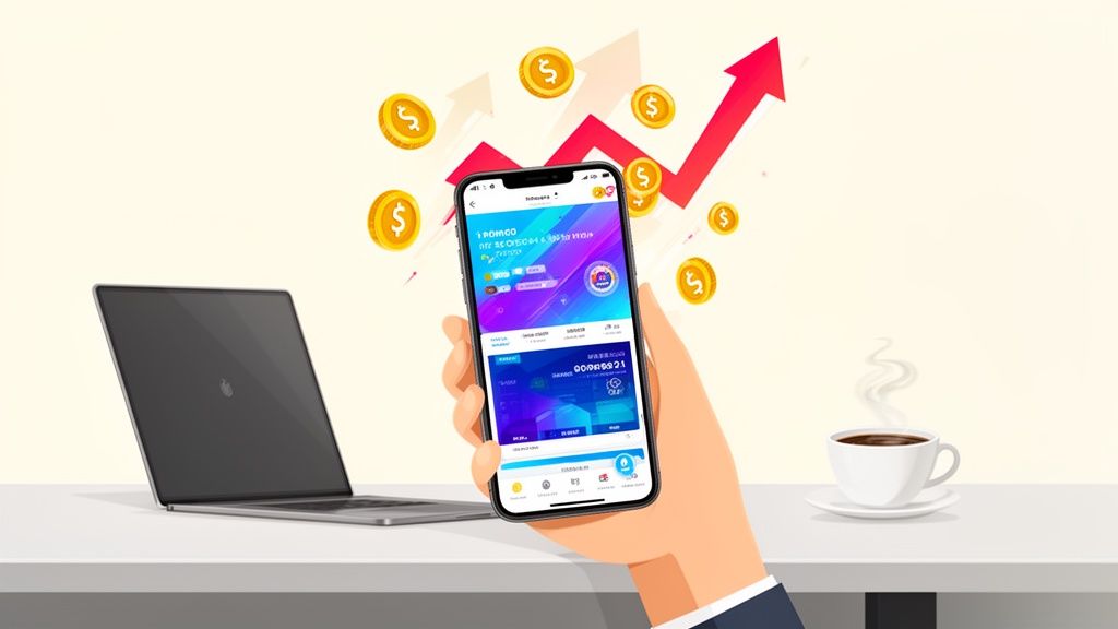
This image, created in an editor like ScreenshotWhale, shows exactly what this looks like in practice. A well designed template combines the device frame, a punchy headline, and a clean, vibrant background to grab attention and boost conversions.
This setup turns a simple screen capture into a miniature ad that communicates value in a heartbeat. Our guide on crafting effective https://screenshotwhale.com/blog/iphone-app-mockups dives into more practical examples if you want to see this in action.
By framing your app's core features within a familiar iPhone, you are not just showing what your app does. You are helping users visualize a better experience on a device they already love. This is the key to turning casual browsers into loyal users.
Before you touch a single pixel in a design tool, you need a strategy. The best app store mockups are not just pretty pictures; they are the result of a deliberate plan to tell a visual story. This is the part of the process that separates listings that convert from those that just get scrolled past.
First things first: picking the right hardware. You should almost always lead with the latest flagship model, like the newest iPhone Pro Max. It is a subtle signal, but it tells potential users that your app is modern, well maintained, and built for the best experience. Sure, check your analytics, but leading with aspirational hardware just works.
Map Out the User's "Aha!" Moments
Once you have your device picked out, it is time to storyboard the core journey. You are not trying to document every single button and feature. Instead, you want to zero in on the key "aha!" moments that make someone hit that "Get" button. Pick your top three value propositions and give each one its own screenshot.
Put yourself in a new user's shoes:
- Screenshot 1: This is your hero shot. It has one job: to instantly answer, "What does this app do for me?" Pair your most compelling UI with a sharp, benefit driven headline. No jargon, just results.
- Screenshot 2: Now you show how you deliver on that promise. Showcase a key feature in action. This builds trust and makes the value proposition tangible.
- Screenshot 3: Time to seal the deal with some social proof or another major benefit. This could be a screenshot highlighting a 5 star review, a user testimonial, or an integration that your audience loves.
This simple one two three narrative hooks people from the get go, answering their biggest questions before they even have a chance to ask. If you really want to nail this, digging into powerful visual storytelling techniques will help you craft screenshots that genuinely capture attention.
Get Your Canvas and Dimensions Right
All that careful storytelling goes out the window if the technical details are sloppy. Using the correct canvas size is non negotiable. A mismatch leads to blurry, awkwardly cropped, or flat out rejected assets, and it just looks unprofessional.
The goal here is a seamless visual narrative that guides someone from discovery to download. A well planned storyboard, using the right device and dimensions, is your blueprint for making that happen.
For the Apple App Store, you have to supply screenshots for the 6.7-inch iPhone display (that is the Pro Max size). For Google Play, things are a bit more flexible, but sticking to a 16:9 aspect ratio is your safest bet. And a pro tip: always double check the latest official guidelines from Apple and Google. They do change. Setting up your iPhone mockup template with these dimensions from the very beginning will save you a world of headaches later on.
Designing Mockups That Drive Downloads
Alright, you have got your plan. Now it is time to roll up your sleeves and bring that visual story to life in an editor. This is where the magic happens, where you take raw UI screens and transform them into polished, persuasive assets that will do the heavy lifting for your app's growth.
The goal here is to build a reusable iPhone mockup template that not only looks professional but screams value the second someone sees it.
Let's kick things off with your most important screenshot: the hero image. Forget about boring, plain backgrounds. An actionable insight is to use a vibrant, eye catching color gradient or a subtle pattern that aligns with your brand. That little bit of visual pop is your secret weapon for standing out in a crowded App Store. For example, within a site editor, you could select a two color gradient from your brand palette to create a dynamic and appealing backdrop.
Once you have your background, drop a clean, modern device frame right on top. The contrast between a dynamic background and a crisp device mockup creates an instant feeling of quality and care. You are setting a powerful first impression before the user even reads a single word.
Crafting Captions That Convert
Your headline and captions are your sales pitch. They need to be short, punchy, and focused on solving a real problem for the user. Do not just list features; sell the outcome.
For instance, instead of saying "Customizable Filters," a much better caption would be "Find Your Perfect Match Faster." See the difference? One describes a tool, the other sells a solution.
Here are a few actionable tips for writing captions that actually work:
- Lead with the Benefit: Always start with the most important result. People scan quickly, so you have to hook them right away.
- Use Action Words: Kick off your captions with strong verbs like "Create," "Discover," "Track," or "Share" to get people imagining themselves using your app.
- Keep It Short: Aim for no more than 5-7 words for your main headline. Sub captions should be even shorter. Brevity is everything on a small screen.
Remember, a great visual paired with a powerful caption is what drives downloads. This one two punch should make your app's value crystal clear in under three seconds. To see how different layouts and captions can really change user perception, our detailed guide on mockups for mobile apps is packed with real world examples.
Key Elements of a High-Converting Screenshot
To truly nail your design, you need to understand the role each component plays. Think of it as a recipe where every ingredient has a specific job. Here is a breakdown of what you should be including and why.
| Element | Purpose | Best Practice Example |
|---|---|---|
| Headline | Grab attention and communicate the primary benefit. | "Plan Your Week in 60 Seconds" |
| Device Mockup | Showcase your app's UI in a realistic, professional context. | A clean iPhone 15 Pro mockup with a high fidelity screen. |
| App Screenshot | Visually demonstrate a key feature or user flow. | The main dashboard or a feature that solves a core problem. |
| Background | Create visual interest and reinforce branding. | A subtle gradient using your brand's primary colors. |
| Social Proof | Build trust and credibility with potential users. | "Trusted by 50,000+ users" or a 5 star rating icon. |
By making sure each of these elements is thoughtfully designed and working together, you create a screenshot that is much more than just a pretty picture. It becomes a powerful conversion tool.
Establishing a Clear Visual Hierarchy
Visual hierarchy is just a fancy way of saying you need to guide the user's eye to the most important stuff first. A well designed screenshot has a natural flow that makes the information easy to scan and understand.
Your headline should always be the most dominant element, followed by the device mockup, and then any supporting text.
Your design should answer three questions, in this order: What is the main benefit? What does the app look like? What other details are important? If your mockup is visually cluttered, you risk confusing potential users and losing the download.
You can achieve this by playing with size, color, and placement. In a site editor, you would set your headline to the largest font size. Use your brand’s primary color for key text or graphic elements to make them pop. And please, leave plenty of negative space around the device and text so nothing feels cramped or rushed.
Maintaining Brand Consistency
Finally, remember that your app store screenshots are a direct extension of your brand. Using your brand's specific colors and fonts creates a cohesive, professional look that builds recognition and, more importantly, trust.
A practical step is to import your brand’s hex codes and custom fonts directly into your design tool. It is a small action, but it ensures every screenshot feels like it belongs to your app's ecosystem. A consistent visual language signals to users that your app is polished, well maintained, and trustworthy, a critical factor in their decision to hit that "Install" button.
Meeting App Store Guidelines and Best Practices
Look, a killer iPhone mockup template is worthless if it never actually makes it onto the App Store. Getting through the review process on both Apple and Google is the first, most critical step. It is ground zero for good App Store Optimization (ASO). It is a surprisingly common mistake to ignore the rules, and it almost always leads to frustrating rejections and delays.
Most rejections are for simple, avoidable things. Think using an outdated iPhone frame when a new one is out, or showing UI that looks like it is promising something the app cannot deliver. Both stores are obsessed with an authentic user experience, so your screenshots must be an honest reflection of what people will see inside your app.
Beyond Compliance to Conversion
Just ticking the boxes to get approved is not the real goal, though. The magic happens when you blend compliance with design that is built to convert. Your screenshots need to do more than just show what your app looks like; they have to tell a story. A very, very short story.
This is why the order of your screenshots is so important. Your first one or two images do all the heavy lifting. They have to instantly answer a user’s core question: “How does this app make my life better?” Lead with your absolute strongest feature or benefit, wrapped in a clean, professional mockup.
For a really detailed breakdown of all the technical rules, our guide on app store screenshot requirements is the perfect checklist.
Practical Tips for High-Converting Screenshots
To make sure your designs get approved and drive downloads, your focus should be on clarity and authenticity. You are trying to build trust while showing off your app's best side.
- Showcase Your Real UI: Do not ever use fancy illustrations or animations that are not part of the actual in app experience. People want to see the real product, and earning that trust right away is a huge factor in getting them to tap "Install."
- Prioritize Readability: Make sure any text on your screenshots is big and bold enough to be read on a small phone screen at a quick glance. High contrast colors and a super legible font are your best friends here.
- Use Accurate Device Mockups: Always, always use an up to date iPhone mockup for the iOS App Store and a modern Android device for Google Play. Showing the wrong device is a dead giveaway to the review teams and to savvy users that you are cutting corners.
When you are putting your visuals together, it is also helpful to be familiar with broader content guidelines, as they often share the same principles of being clear and honest in your marketing.
At the end of the day, your app store screenshots are doing two jobs at once. They have to pass the platform's technical inspection while also convincing a real person that your app is worth their time and phone storage.
When you start treating your screenshots like a vital piece of your marketing funnel, you create efficient and high converting app store screenshots that not only sail through the approval process but also actively work to grow your user base.
Go Global in a Click with AI Localization
You have built an app that could be a hit anywhere in the world, but are your App Store screenshots speaking the same language? If you are only showing English text, you are leaving a massive opportunity on the table.
Scaling globally used to mean hiring translation agencies and sinking countless hours into redesigning every single screenshot for every new market. It was a budget killer, especially for smaller teams. But that is all changed.
Today’s design tools have AI baked right in, letting you translate your perfectly polished captions and headlines into dozens of languages instantly. Picture this: you nail the design for your US audience, and then with a single click in a site editor, you generate a full set for Germany, Japan, and Brazil. The soul crushing work of manually copying, pasting, and resizing is just… gone.
It is Not Just About Swapping Words
But hold on, true localization is more than a simple find and replace for text. To genuinely connect with a global audience, you have to think visually. The images, colors, and even the features you highlight can carry completely different meanings across cultures.
A few things to consider:
- Color Palettes: That cool, sleek blue you are using? It might signify trust in the West, but it could have a totally different vibe in an East Asian market.
- Imagery: The lifestyle photos that work perfectly for a German audience might fall completely flat with users in South America.
- UI Norms: Some regions might be more drawn to data heavy feature screens, while others prefer seeing social proof and testimonials.
When you adapt both the text and the visuals in your iPhone mockups, you are sending a powerful message to international users: "We built this for you." That little bit of cultural awareness can be the difference between a quick exit and a loyal new user.
The Great Equalizer for Indie Devs
This is a huge deal, especially for small teams and solo developers. It levels the playing field.
Suddenly, you can launch in multiple countries at once. You can run localized A/B tests to see which headlines actually resonate in France versus South Korea. You might even uncover a massive, untapped market you never would have considered before.
Instead of treating localization as this big, scary, expensive thing you will get to "someday," you can weave it right into your design process from the start. What used to be a major roadblock is now a streamlined strategy to reach millions of new people.
Time to Automate and Streamline Your Workflow
If you are on a busy team that is constantly pushing updates, you know the pain. The manual grind of creating app store screenshots is a huge bottleneck. A new feature is ready to ship, or a seasonal campaign needs to go live, and suddenly you are stuck in a creative backlog.
This is where you stop designing by hand and start building an automated, scalable system.
The real power move is using an Application Programming Interface (API) to generate entire screenshot sets programmatically. Just imagine: updating a key feature image across 15 different languages with a single command. Or running an A/B test with five new captions, all triggered instantly. This is not about just saving time; it is about shifting your team's focus from pushing pixels to driving growth.
When you go global, the process can feel overwhelming, but automation boils it down to a simple, repeatable flow. You start with one source and end up with countless targeted assets.
This kind of flow turns a labor intensive design chore into a straightforward, three step process. Suddenly, global launches do not feel so out of reach, even for a small team.
What This Looks Like in the Real World
Automating your iPhone mockup production is not just a neat trick. It opens up some seriously powerful ways to move faster and be more agile in the market. It is a game changer for teams that ship often or manage a portfolio of apps.
Here are a few actionable examples:
- App Updates: You just released a new version. Instead of manual updates, an API call automatically slots the new UI screens into your branded templates. A complete, updated set of App Store visuals? Done in minutes.
- A/B Testing: Want to know what really converts? Programmatically spit out dozens of variations of your first screenshot. Test different headlines, backgrounds, and feature callouts to find the magic combination that actually drives downloads.
- Seasonal Campaigns: Black Friday is coming up. An API can automatically overlay holiday branding or promotional text onto your existing screenshots. No manual design work needed.
Once you build a repeatable, automated system, screenshot production stops being a reactive chore. It becomes a proactive growth engine. You can test, iterate, and deploy faster than anyone still stuck in Photoshop.
There is a reason this template driven approach is becoming the industry standard. The numbers do not lie: recent surveys show that 60-85% of app store creative assets now start from a template, not a custom photo shoot. Teams report that switching to a ready made iPhone mockup slashes production time from days down to under an hour, which obviously brings costs way down too.
You can dig deeper into the efficiency gains from using iPhone mockup templates and see exactly how the top teams are pulling it off.
Got a solid plan but still have a few lingering questions? Perfect. When it comes to creating iPhone mockups, a few common queries always pop up. Getting these details right is what separates an okay looking app store page from one that genuinely converts.
Let's dig into some of the most frequent ones.
What’s the Best iPhone Model for My Mockups?
Go with the latest and greatest. Right now, that means using a flagship model like the newest iPhone Pro for your primary screenshots. It just gives off a modern, premium vibe that users notice.
More than that, Apple actually requires you to submit screenshots for their largest iPhone display (currently 6.7 inches). So, starting with that size is not just a good idea, it is a practical move that makes the submission process way smoother. While it is always smart to check your analytics to see what devices your audience uses, leading with the newest model is almost always the right call for app store growth.
How Many Screenshots Do I Actually Need?
You can upload up to ten screenshots, but let's be real: the first three to five are what truly matter. Most people just do not scroll past that point.
Your energy is best spent making those first few images absolutely killer. Think of them as your storefront window. Use them to tell a quick, compelling story: introduce your core value, show off a key feature, and maybe toss in some social proof. It is all about quality over quantity here.
Can I Just Use the Same Mockups for iOS and Android?
Please do not. This is one of those small details that makes a huge difference. You absolutely need to use an iPhone mockup for the Apple App Store and a distinct Android device, like a Google Pixel, for Google Play.
When a user sees a device they recognize, it builds instant trust and signals that you have put care into the platform specific experience. Besides, each store has slightly different dimension requirements anyway. Tailoring your templates for each platform is a non negotiable step for a professional look that actually drives downloads.
Ready to stop wrestling with templates and start creating stunning, high converting screenshots in minutes? Give ScreenshotWhale a try and see just how easy it is to design professional mockups that get your app noticed.