Create a High-Converting Mobile Application Mockup
Learn to design a mobile application mockup that drives downloads. Our guide offers actionable strategies for creating App Store and Google Play screenshots.
Your app mockup is not just a pretty picture. It is your single most important sales pitch on the App Store and Google Play. Think of it as your app's movie trailer. You have just a few seconds to grab someone's attention in a sea of competitors and convince them your app is worth their time.
A sloppy mockup can kill a brilliant app before it even gets a chance. It screams "unprofessional," and users will scroll right past without a second thought.
This guide is not about fluffy design theory. It is a no nonsense, practical approach to creating efficient and high-converting app store screenshots that actually drive downloads and boost app store growth. We will walk through how to transform your static screenshots into a compelling story that works on both the App Store and Google Play.

Why Great Mockups Are a Conversion Machine
A well designed mockup does more than just show what your app looks like. It starts solving the user's problem before they even tap "Install." When you showcase your best features inside a clean, benefit driven frame, you make your app feel like the obvious answer. This is a direct path to boosting conversions.
Here is what a solid set of mockups really does for your App Store Optimization (ASO):
- Shows Value in an Instant: A sharp visual paired with a punchy caption like "Track Progress in Seconds" tells a potential user exactly what they are getting. No guesswork needed.
- Builds Instant Trust: Professional, polished mockups send a clear signal: this is a high quality app built by people who care. That little bit of reassurance can make all the difference.
- Highlights Your 'Secret Sauce': This is your chance to show off what makes you different. Whether it is a cleaner interface or a game changing feature, your mockups put it front and center.
- Drives Up Conversion Rates: At the end of the day, it is all about turning lookers into users. Compelling visuals are one of the most reliable ways to bump up that install rate and achieve app store growth.
A great mobile application mockup bridges the gap between seeing and believing. It transforms abstract features into tangible benefits, giving users a clear reason to choose your app over thousands of others.
Setting Yourself Up for ASO Wins
Throughout this guide, we will dig into how modern tools can help you get that professional look without needing a design degree or expensive software. The plan is to focus on the fundamentals of visual storytelling and conversion first design.
Our goal is simple: create efficient, high-converting app store screenshots that lay the groundwork for long term growth.
Laying the Groundwork for a Killer Mockup
Before you even think about opening an editor, you need a plan. A great mobile application mockup does not just show off your app's screens; it tells a story that grabs your target user and convinces them to hit "Install." This initial strategy work is what separates mockups that convert from those that just sit there.
The first thing you need to do is figure out your app's "hero" features. I am talking about the core functions that solve your user's biggest headache. Forget wasting that first screenshot on a boring sign up screen. Lead with the one thing that makes your app a must have.
Pinpoint Your App's True Value
Step back and ask yourself: what is the one problem my app solves better than anyone else? Does it save people time? Help them nail a personal goal? Or maybe it is just pure, unadulterated fun? The answer to that question becomes the central theme for your entire set of app store screenshots.
For a fitness app, that hero feature might be its custom tailored workout plans. For a budgeting app, it is probably the dead simple expense tracking. You have to nail these key value props down because they are going to be the stars of your visual story.
Talk Benefits, Not Features
Here is a hard truth: nobody downloads an app for its "features." They download it for the outcome, the solution, the feeling it gives them. A tiny but powerful shift is to reframe every single feature as a clear, tangible benefit for the user. It is a small change in wording that makes a massive difference in conversion rates. Your captions need to speak directly to what the user wants to achieve.
Every mockup caption should answer the user's unspoken question: "What's in it for me?" Focus on the result, not the tech.
This is a simple trick I use all the time to turn dry, technical descriptions into captions that actually sell.
Feature-Focused vs. Benefit-Driven Screenshot Captions
| Feature | Benefit-Driven Caption Example |
|---|---|
| GPS Tracking | Never Lose Your Way Again |
| Dark Mode | Easy on the Eyes, Day or Night |
| 256-bit Encryption | Your Data, Always Secure |
| AI-Powered Suggestions | Get Smarter Recommendations Instantly |
See the difference? One describes what it is, the other describes what it does for you. Always aim for the latter.
Settle on a Visual Style
Once you know the benefits you are highlighting, you can pick a visual style that actually grabs attention and reflects your brand's vibe. Bright, punchy colors? Perfect for a game or a social app that wants to feel energetic. A clean, minimalist design with a muted color scheme? That builds trust and feels right at home for a productivity or finance app.
Modern mockup tools have tons of templates that make this part a lot easier.
Choosing a template with a bold, vibrant background and crisp device frames, like the one above, makes your UI pop right off the page. It is a professional touch that encourages people to stop scrolling and take a closer look.
While you are laying this groundwork, it is also smart to think about the bigger picture. If you are building for more than one platform, checking out a guide on Multiplatform Mobile App Development early on will save you headaches later by ensuring your design language stays consistent everywhere.
Designing for Every Device Out There
Let us be real, the app world is fragmented. You have got countless screen sizes and devices to think about. The rise of cross platform tools like Flutter which now has 1 million monthly active developers and powers 30% of iOS apps shows just how important it is to preview your app's experience everywhere. Mockups are your secret weapon here, letting you test how your layouts hold up on the newest iPhones, Android flagships, tablets, and even wearables, all before a single line of code is written. If you are curious, you can learn more about the future of mobile apps and development trends.
By putting in this strategic work upfront, you stop just showing screens and start building a genuine sales tool. Every single element, from the hero feature you pick to the caption you write, works together to make a powerful case for why your app deserves that precious space on someone's phone. This is how a simple mockup becomes your best asset for App Store Optimization.
A Practical Guide to Designing Your Mockups
Okay, strategy's locked in. Now for the fun part: turning those ideas into polished mockups that actually get people to download your app. This is where your design choices come together to tell a story and nudge a potential user toward that "Install" button.
Let us walk through building that visual narrative, piece by piece.
It all starts with context. Just showing a raw UI screen feels… naked. It is disconnected from reality. But when you place your app inside a familiar device frame like an iPhone 16 Pro Max or a Google Pixel it suddenly feels real and tangible. It helps people instantly imagine your app running on their own phone.
Select the Right Device Frame and Template
First up, you need to pick a device frame that your target audience actually uses. If you know most of your customers are on iPhones, showcasing your app on the latest model lends it a premium, up to date feel. If your app is Android first, a popular Samsung Galaxy or Pixel frame is the obvious choice. Modern mockup tools like ScreenshotWhale have a huge library of device frames, so you can find the perfect fit.
Once you have the device, it is time to choose a template. A good template does not just hold the screenshot; it makes your UI the star of the show with a clean, vibrant layout.
Look for designs with:
- Bold, Appealing Backgrounds: A simple gradient or a striking solid color can make your screenshots pop, helping them stand out in a crowded app store.
- Clear Caption Placement: The template needs a designated spot for your text that is easy to read and does not cover up important parts of your UI.
- Balanced Composition: The best templates guide the user's eye naturally from the caption down to the relevant feature on the screen.
Customize Your Visuals for Brand Cohesion
A generic template is just the starting point. The real magic happens when you inject your brand's personality into the design. This creates a cohesive story that builds brand recognition and, more importantly, trust.
Start with the background. If your brand has a specific color palette, use it here. A subtle gradient with your primary brand colors looks professional and is surprisingly effective. Next, think about typography. The font you pick for your captions should be super legible but also match your brand’s vibe whether that is modern and clean or bold and playful.
A consistent visual identity across all your app store screenshots sends a powerful message: this is a polished, professional product. It is a subtle cue that builds user confidence before they even download the app.
When you are fine tuning the details, getting a second opinion from an expert UI/UX design consultant can be a game changer. They can help you create mockups that are not only beautiful but also built around how users actually think and behave.
Arrange UI Elements and Captions to Tell a Story
Think of each screenshot as a single scene in a larger story. Do not just throw random screens at the wall and see what sticks. You need to arrange them in a logical sequence that walks someone through your app's core value.
For instance, your very first screenshot should show off your app's main "aha!" moment. What is the one thing that makes people go, "Wow, I need this"? Start there. Then, follow it up with screens that highlight secondary benefits or show how easy it is to get started.
Place your benefit driven captions where they make the most sense, explaining what the user is seeing and why it matters to them. If a screenshot displays a progress tracking feature, a caption like "Visualize Your Success" connects the visual to a powerful emotional outcome.
This simple process flow breaks it down: define your message, choose your visuals, and write copy that sells.
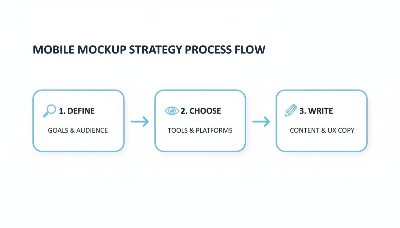
Stick to this three step approach, and you will ensure every design decision is intentional and laser focused on getting more downloads.
The entire app world is shifting toward efficiency. By 2026, ready made templates and mockups will be the standard, as developers ditch repetitive work for high quality foundations built for speed. This is especially true for ASO teams and indie founders. With low code expected to account for 75% of new apps and AI personalizing UIs on the fly, mockups are the critical bridge between an idea and a store ready visual. Just look at Flutter's 30% iOS market share and 1 million developers tools with drag and drop editors like ScreenshotWhale let you prototype high converting visuals for any device in minutes, all while staying within platform guidelines.
Creating a High-Converting Example
Let us make this real. Imagine you are building mockups for a new meditation app. Here is an actionable way to put these principles into practice using a simple site editor.
- Choose an iPhone 16 Pro Frame: Right away, this gives the app a modern, high end vibe.
- Select a Calming Gradient Background: In the editor, find a template with a soft blue to purple gradient. The color choice should reflect the app's tranquil purpose.
- Craft a Benefit-Driven Headline: For the first screenshot, type a clear, powerful caption like "Find Your Calm in 5 Minutes." It speaks directly to a core user need.
- Showcase the Core Feature: Underneath that caption, place a clean screenshot of the app's main meditation player. Make sure the "Play" button is visible to hint at the action.
- Maintain Brand Consistency: Use the same font and color scheme for the rest of the screenshots, which might highlight features like "Track Your Progress" or "Guided Sleep Sessions."
This approach transforms a simple screen into a compelling pitch for a calmer life, making the value proposition crystal clear in seconds and driving app store growth.
If you want to go even deeper on creating visuals that perform, check out our full guide on app store mockups and best practices. By following these practical steps, you can create mockups that do not just look amazing but also become a powerful engine for your app store growth.
Mastering App Store Guidelines and Best Practices
Look, creating a mobile app mockup that actually gets downloads is about more than just slick design. You have to know the rules of the game the ones set by Apple and Google. An app store rejection is a painful, totally avoidable delay that can kill your launch momentum before it even starts.
Nailing the technical guidelines for both platforms is your first line of defense. It ensures all your hard work gets seen on the first try. But just scraping by with the minimum is not the goal here. The real magic happens when you start optimizing your visuals to perform, using the same App Store Optimization (ASO) tricks the top charting apps do. It is about turning passive viewers into loyal users.
Navigating Apple App Store Requirements
Apple runs a tight ship, and their screenshot guidelines are no joke. Getting these right is non negotiable if you want a smooth approval process. The single biggest deal breaker? Dimensions. Get them wrong, and you’re looking at an instant rejection.
You have to provide screenshots for the largest devices: the 6.7-inch iPhone and the 12.9-inch iPad Pro. From there, the system automatically scales them down for smaller screens.
Here are the technicals you cannot ignore:
- File Format: High quality JPG or PNG only. No messing around with other formats.
- Color Space: Keep it simple with RGB.
- No Transparency: Your images need to be fully opaque. Forget about alpha channels.
- Content Focus: This is a big one. Your screenshots must accurately show what your app does. Misleading visuals are a fast track to rejection.
A rejected submission is more than just a delay. It’s lost momentum, lost revenue, and a whole lot of frustration. Treat the App Store guidelines as your pre flight checklist, not a hurdle. Double checking every detail before you hit 'submit' is one of the most productive things you can do.
Understanding Google Play Store Policies
Google Play is generally a bit more relaxed than Apple, but they still have their own set of rules to ensure a quality experience for users. Do not blow them off, or you risk getting your app suspended. Unlike Apple, Google wants you to upload screenshots for a few different device types, including phones, 7-inch and 10-inch tablets, and wearables if your app supports them.
Here is what you need to get right for your mockups:
- Dimensions: You need at least two screenshots. The shortest side must be at least 320px, and the longest cannot exceed 3840px.
- Aspect Ratio: Do not get too creative here. The ratio cannot be more extreme than 2:1 or 1:2.
- Content Authenticity: Just like with Apple, the visuals have to show the real in app experience. Steer clear of pure marketing fluff unless it is clearly framed within a device mockup.
For a much deeper dive into the nitty gritty details, you can read our complete guide to app store screenshot requirements for both stores.
Optimizing Mockups for Maximum Conversion
Compliance gets your foot in the door. Optimization is what wins you the game. Once you have checked all the technical boxes, it is time to shift your focus to ASO strategies that turn your mockups into conversion machines.
A killer technique is to sequence your screenshots to tell a compelling story. Your very first screenshot should scream your app's main value proposition. From there, walk the user through key features, build trust with social proof (like awards or testimonials), and finish with a strong call to action if it fits the design. This narrative flow is what takes a user from "hmm, interesting" to "I need this."
App Store vs. Google Play Screenshot Checklist
To make things easier, I have put together a quick cheat sheet. This table breaks down the core requirements for each store so you can see the differences at a glance and make sure your mockups are good to go.
| Requirement | Apple App Store | Google Play Store |
|---|---|---|
| Minimum Screenshots | 1 (up to 10 allowed) | 2 (up to 8 allowed) |
| Required Sizes | 6.7" iPhone & 12.9" iPad | Phone, 7" tablet, 10" tablet |
| File Type | JPG or PNG | JPG or 24-bit PNG |
| Transparency | Not allowed | Not allowed |
| Content Policy | Must show actual UI | Must reflect app experience |
Think of this as your quick reference guide. It helps ensure you are not just compliant, but also setting your app up for success from the moment a potential user lays eyes on it.
Finally, do not forget to adapt your visuals for different devices. A mockup designed for a phone screen will look lazy and stretched on an iPad. Use that extra real estate on tablets to show off more complex features or dashboard views. It shows you have put thought into the user experience on every device, which builds a ton of confidence and makes people way more likely to hit that install button.
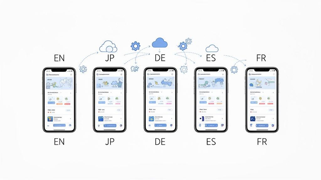
Taking Your Mockups Global, Without the Grind
Going global with your app does not mean you have to manually recreate every single screenshot for every new language. To scale internationally, you need to work smarter, not harder. This is all about using localization features to generate stunning, culturally relevant mockups for different markets in a fraction of the time.
Picture this: your fitness app is crushing it in the US and now you are ready to launch in Japan, Germany, and Spain. Instead of locking yourself in a design tool for days, you can use smart templates and translation tools to produce localized screenshots in minutes. This is how you make sure your value proposition connects with users in every region, which is a straight line to better growth and conversions.
Streamline Localization with Smart Templates
The secret to efficient global production is a solid set of templates. A well designed template lets you swap out UI screens and caption text for any language without wrecking your entire layout. This is where purpose built tools like ScreenshotWhale really shine.
By setting up one master design, you can:
- Translate Text Instantly: Use built in tools to convert your benefit driven captions into dozens of languages, getting the grammar and cultural nuances right.
- Keep Your Brand Consistent: Lock in your fonts, colors, and device frames across all markets. This reinforces your brand identity, no matter the language.
- Adapt to Text Expansion: Automatically tweak font sizes and layouts to handle languages that take up more space than English, like German or Russian.
Localization is so much more than just swapping out words. It is about presenting your app in a way that feels native and trustworthy to a local audience a critical factor for driving installs in new markets.
To really nail this, it helps to understand the subtle differences in phrasing. We dive much deeper into adapting your content in our article covering the nuances of localise vs localize in our detailed article.
Automate Everything with an API
For teams that need to move even faster especially those managing multiple apps or frequent updates API automation is the end game. An API lets you programmatically generate a fresh mobile application mockup whenever you need it, completely hands off.
This opens up some seriously powerful workflows. You could hook your continuous integration (CI) pipeline directly to an API to automatically create new, fully localized screenshots for every app version you push. Think about the time you would save on seasonal campaigns or A/B tests. A simple script can spit out hundreds of visual assets tailored for each market instead of you doing it all by hand.
This programmatic approach locks in brand consistency and frees up countless hours, letting your team focus on strategy instead of getting bogged down in repetitive design work.
Of course, here is the rewritten section with a more natural, human written tone, following the style of the provided examples.
Answering Your Top App Mockup Questions
Even with the best guide, a few questions always pop up when you are deep in the design process. I get asked these all the time by developers and marketers, so let us clear up some of the most common sticking points to help you sidestep a few common mistakes.
What Are the Biggest Mistakes People Make?
The most common trap I see is designing for looks alone. A slick, beautiful mockup is great, but if it does not instantly tell people what your app does for them, it is just a pretty picture that will not convert. You have mere seconds to grab their attention and communicate value.
Another huge one is ignoring the platform you are on. An iOS style design in a Google Play listing just feels... off. It is a subtle thing, but it can create a tiny bit of distrust for Android users. You have got to tailor your visual language to the store you are targeting.
Lastly, people try to cram way too much in. A single screenshot loaded with text, UI elements, and multiple ideas just overwhelms the user. My rule of thumb? One screen, one key benefit. Keep it clean, clear, and impactful.
How Often Should I Be Updating My Mockups?
There is no magic number here, but you should absolutely refresh your mockups whenever you ship a big new feature or give the UI a major facelift. Your app store page should be a living, breathing reflection of what users actually get when they download.
I also recommend giving them a quick update for seasonal campaigns or big events in your industry. It is a simple way to signal that your app is active and relevant, not gathering dust. A/B testing is another great reason if you find a new design that pulls in more downloads, make it the new standard.
Your app store screenshots are a core part of your marketing, not a set it and forget it asset. Stale visuals hint at a neglected app, and that is a major red flag for potential users. Fresh mockups show you’re still invested.
Can I Just Use the Same Mockup Design for Both Stores?
You can definitely use the same core UI screens, but you should never use the exact same finished mockup for both the Apple App Store and Google Play. It is a small detail that makes a huge difference. Each platform has its own design language, its own user expectations, and its own technical quirks.
- For the App Store: Stick with iPhone device frames (like the latest iPhone 16 Pro Max) and lean into Apple’s clean, minimalist vibe.
- For Google Play: Feature popular Android phones, like a Google Pixel or Samsung Galaxy. The design here can often be a bit more colorful and flexible.
Customizing your mockups for each store shows you respect the platform and makes your app feel native to the user's phone. It is a bit of extra work, but it builds instant familiarity and trust, which can give your conversion rates a serious boost. It shows you care about the details, and users pick up on that.
Ready to create stunning, high-converting screenshots in minutes? With ScreenshotWhale, you can access professionally designed templates, a simple drag-and-drop editor, and powerful localization features to make your app stand out on both the App Store and Google Play. Start building your perfect mockups today at https://screenshotwhale.com.