A Guide to Creating the Perfect Mobile Apps Mockup
Create a high-converting mobile apps mockup with our guide. Learn how to design stunning app store screenshots that boost downloads and conversions.
Think of your mobile app mockup as the window display for your digital storefront. Its one and only job is to turn casual browsers into loyal users. These visuals are often the first, and sometimes only, thing a potential user sees of your app on the App Store or Google Play. A killer mobile apps mockup gets your app's core value across in an instant and pushes that download button.
Why Your Mobile Apps Mockup is the Ultimate Conversion Tool
The app store page is where snap judgments happen. People scroll through endless options, and your screenshots are what grab their attention. It is not just about showing what your app looks like; professional, on-brand visuals tell a story about the experience it delivers and are critical for app store growth.
This first impression is everything. If your images are blurry, cluttered, or just plain confusing, users will scroll right past without a second thought. Your mobile app mockup is probably the most powerful tool you have for boosting downloads and driving conversions.
The Make-or-Break First Impression
Let's be honest about how we all browse for new apps. You see the icon, maybe the title, and then your eyes jump straight to the screenshots. It is a split-second decision that determines whether you tap for more info or keep scrolling.
- Show the Value, Fast: Your visuals have to answer the user's silent question: "What's in it for me?" And they need to do it within the first couple of images.
- Build Instant Trust: Polished, high-quality mockups send a clear signal that your app is professional and reliable. It is a small detail that builds a surprising amount of trust.
- Get Noticed in the Crowd: In a marketplace packed with alternatives, a unique and visually sharp screenshot gallery is a massive competitive advantage.
Before we dive deeper into crafting that perfect visual story, let's break down the core components that every high-converting screenshot needs. Focusing on these elements from the start saves a ton of time and leads to much better results.
Core Elements of a High-Converting Screenshot
| Element | Impact on Conversions | Best Practice Example |
|---|---|---|
| Clear UI | Shows the app is intuitive and easy to use, reducing user friction. | A screenshot of a simple, clean dashboard from a fitness app. |
| Benefit-Oriented Caption | Translates features into tangible user benefits, answering "What's in it for me?" | Instead of "Task Manager," use "Organize Your Life in Minutes." |
| Branded Device Frame | Creates a professional look and helps users visualize the app on their own device. | An iPhone frame with a subtle, branded color glow. |
| Compelling Call-to-Action | Guides the user on what to do next and highlights a key feature. | A caption like "Track Your Progress" over a stats screen. |
| Social Proof/Awards | Builds credibility and trust by showing external validation. | A badge saying "Featured on TechCrunch" or "Editor's Choice." |
Keeping these five elements in mind provides a solid framework. You do not need to cram them all into every single image, but they should be strategically woven throughout your screenshot gallery.
Driving Downloads With a Visual Story
Those first few screenshots carry almost all the weight. On the Apple App Store, the first three images are visible in search results without any scrolling. Since we know users scan instead of read, if those visuals do not immediately click, your conversion rates will tank.
Think of your screenshot gallery as a mini-story. Each image should build on the last, guiding the user from initial curiosity to a confident tap on the "Get" button. Showcase a problem, then present your app as the solution.
Getting this right can be tricky, and it is where the details really matter. To take your mockups from pretty good to a genuine conversion machine, it is often worth bringing in some outside expertise. Investing in specialized UX Design services ensures your visuals do not just look great, but are also built on a deep understanding of user psychology that gets people to install.
Choosing Device Frames and Layouts That Resonate
The device frame you pick for your app mockup does more than just hold the screenshot. It is the very first signal you send about your app's quality and relevance, directly impacting app store growth.
Think about it: using the latest hardware, like an iPhone 16 Pro Max or a flagship Samsung Galaxy, instantly tells a potential user your app is modern, premium, and actively maintained. It is a subtle but powerful cue that builds credibility before they have even seen a single feature.
But picking a shiny new device is just step one. The real magic happens when you compose a layout that has a clear purpose. A great layout guides the user’s eye, tells a story, and makes a case for your app without a single word. This is where you directly impact conversions.
Single vs. Multi-Device Layouts
Your layout choice should be a direct reflection of your app's core function. There is no single right answer here; the goal is to match the visual strategy to the experience you're selling.
A clean, single-device mockup is perfect for apps that center on one powerful experience. Picture a minimalist productivity app or a meditation guide. This approach keeps the user’s attention locked on a single screen, highlighting the elegance and simplicity of your UI. No distractions, just pure focus.
On the other hand, a dynamic multi-device layout is your best bet for showing off connectivity and collaboration. For a social media platform or a project management tool, arranging several devices can brilliantly demonstrate how the app works seamlessly across different screens or between multiple users. It is a visual way of saying, “This app connects people.”
A great mobile apps mockup isn't just a static image; it's a narrative. It guides the user through the app's key benefits, making a compelling case for why they should hit the download button before they even read the description.
Getting a handle on the principles of visual arrangement is crucial. You can dig deeper into structuring these visuals by exploring the fundamentals of what is a layout design.
Telling a Story with Panoramic Layouts
One of the most powerful techniques for creating high-converting screenshots is the panoramic layout.
This method involves creating a single, continuous background image that stretches across multiple screenshots. When a user swipes through your gallery, it creates a seamless, almost cinematic experience. It feels intentional and polished.
This approach is especially effective for telling a linear story or walking someone through a specific workflow. For example:
- The Onboarding Journey: The first screenshot shows the sign-up screen, which flows into the main dashboard on the second, and then reveals a key feature in action on the third. It is a mini-tutorial.
- A Feature Showcase: Instead of isolated images, a single expansive graphic with vibrant colors can highlight how different features connect, creating a cohesive visual narrative that is far more engaging.
- Setting the Brand Vibe: Use a panoramic background to establish a strong brand mood. A fitness app might use an energetic, sweeping landscape, while a finance app could use a clean, professional graphic that instills confidence.
By thinking of your screenshots as a connected canvas instead of individual slides, you create a more immersive and persuasive preview. This thoughtful composition helps users actually visualize themselves using your app, a critical step in getting that download.
Crafting Captions That Convert
Your visuals might catch someone's eye, but it's the words that truly reel them in. A killer caption is what turns a casual browser into an active user, bridging the gap between what your app does and what they desperately need.
Let's ditch the generic fluff. Phrases like "Easy to use" or "Beautiful design" are just noise. We're aiming for every single word to earn its spot, turning each screenshot into a tiny, powerful billboard for your app's true value.
The best captions are short, punchy, and solve a problem. Think five words or less. You need to communicate the core benefit so fast that it is instantly understood. This is your moment to spotlight your app’s killer feature without making the screen feel cluttered or overwhelming.
A classic example? Instead of a vague caption like ‘Manage your schedule,’ try something much more compelling: ‘Plan your week in 60 seconds.’ See the difference? That simple tweak shifts the focus from a generic feature to a tangible, desirable user achievement.
From Features to Benefits
This is the most common trap developers fall into: writing captions that just describe a feature on the screen. Nobody downloads an app for its "advanced filtering options." They download it to find a solution to their problem. Your job is to translate every feature into a real-world benefit.
Here's a simple mental trick: for every feature you list, ask yourself, "So what?"
- Feature: "Advanced filtering options."
- So what? Benefit: "Find your perfect match instantly."
- Feature: "Real-time collaboration."
- So what? Benefit: "Work together from anywhere."
This little exercise forces you to step into your user's shoes. It ensures your mockups speak directly to their goals and frustrations, making the download feel less like a choice and more like an obvious next step.
A great caption doesn't just describe the screen. It tells the user what they can accomplish with it. Focus on the outcome, not the functionality.
Writing with a Formula
When you are staring at a blank canvas and the words just are not coming, leaning on a simple formula can be a lifesaver. One of the most effective I've found is the Verb + Benefit structure. It is direct, it is action-oriented, and it is incredibly easy for people to scan and absorb.
Using this approach creates a clear call-to-action right there in the screenshot. It guides the user through your app's story, showing them exactly what they can do and why it even matters. You can find even more advanced techniques for creating high-impact app store images that really drive conversions.
Here’s how this simple formula can transform your captions across different app categories:
| App Category | Generic Caption | Verb + Benefit Caption |
|---|---|---|
| Fitness | Workout Plans | Crush Your Fitness Goals |
| Finance | Budget Tracking | Save Money Effortlessly |
| Productivity | To-Do List | Organize Your Entire Life |
| Social | Chat with Friends | Connect with Your Community |
Notice how the improved versions just feel more dynamic and aspirational? They are not just stating a boring fact; they are selling a result. That is the secret to writing captions that actually drive action and fuel your app's growth.
Integrating ASO for Maximum Visibility
Your app screenshots are more than just pretty pictures. They're one of your most powerful tools for climbing the ranks, and this is where killer design meets the hard science of App Store Optimization.
A stunning mobile apps mockup might catch someone's eye, but a design that actually gets discovered is what moves the needle. Great design is only half the battle. Your screenshots need to be perfectly aligned with what the store algorithms are looking for.
This means you have to think beyond just aesthetics. Every single screenshot should hammer home your app's core value and subtly weave in your main keywords. This gives both real people and the app store bots a crystal-clear idea of what your app is all about.
Don’t Waste Your Screenshot Slots
One of the biggest missed opportunities is developers not using all their available screenshot slots. Just tossing up two or three images and calling it a day is leaving a ton of potential on the table. You're missing out on telling a complete story and feeding the algorithms more context about your app.
Apple lets you upload up to 10 screenshots for each device and language. You do not necessarily need all ten, but the sweet spot is usually around 5-7 well-crafted visuals. Each extra slot is another chance to convince a user to download. It is no surprise that 96% of top-performing apps stick to a vertical orientation because it is clean, scannable, and gets right to the point.
Think of your screenshot gallery as a mini-storyboard to create efficient, high-converting app store screenshots:
- First 1-2 Screenshots: Hook them immediately with your unique selling point.
- Screenshots 3-5: Dive into the key features and show the benefits.
- Screenshots 6-7: Close the deal with social proof like awards, glowing reviews, or testimonials.
Nail the Technical Details for Every Device
ASO is not just about keywords and pretty visuals; it is also about getting the technicals right. Both the App Store and Google Play have strict size requirements for every single device, from the newest iPhone down to older Android models. Uploading blurry or poorly sized images is a huge red flag that can tank your ranking.
Your mobile apps mockup has to be pixel-perfect on every device you target. It's a small detail that signals quality and professionalism, building instant trust with both users and store reviewers.
This is where manually resizing assets becomes a nightmare. It is tedious, and it is way too easy to make a mistake. Using a dedicated tool is a no-brainer here. A platform built for this ensures every mockup you create meets the exact specs Apple and Google demand, saving you from hours of frustration and potential rejections.
When you pair strong visual storytelling with this kind of technical precision, your screenshots become an unstoppable force. To get a better handle on the entire process, you can learn more about how to master app store optimization (ASO) in our guide. This combination is the key to climbing the search rankings and driving real, sustainable growth.
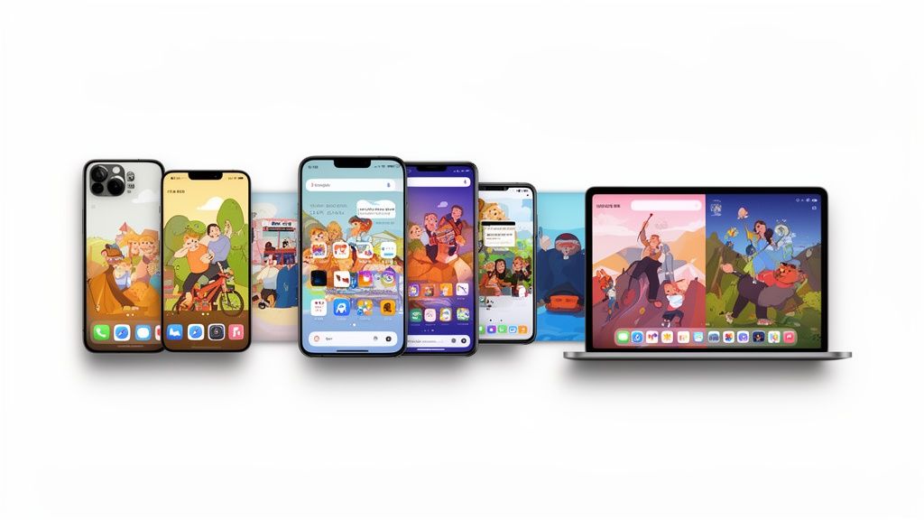
Taking Your Mockups Global
If you're thinking about taking your app worldwide, just translating your captions is not going to cut it. To really connect with users in different countries, your entire approach to mockups needs to change. What crushes it in the US might totally bomb in Japan.
This goes way beyond swapping out a few words. We're talking about everything from colors and imagery to the phone models you use. A clean, minimalist vibe might be perfect for a German audience, while bold, vibrant colors could be the key to winning over users in Brazil. True localization is about making your visuals feel like they were made specifically for that market.
It's All About Cultural Details
Your mockup visuals have a language of their own. A simple color or image can mean wildly different things from one culture to the next, and if you get it wrong, you can turn off the exact people you’re trying to attract. This is where paying attention to the small stuff makes a huge difference.
Here are a few things to always keep in mind:
- Color Meanings: In the West, white often means clean and simple. But in many parts of Asia, it is the color of mourning. You can see how that might send the wrong message.
- People and Places: The people in your screenshots should look like your target users. If you can sneak in a local landmark or a culturally relevant scene, your app will feel instantly more familiar and trustworthy.
- Phone Choices: It is easy to just default to the latest iPhone, but in many markets, Android is king. Using a popular local Android model can make your app feel much more accessible and relatable to the majority of users there.
How to Localize Without Losing Your Mind
Let’s be real: manually creating dozens of unique screenshot sets for every language and region is a nightmare. It is slow, expensive, and a complete pain to keep updated. The secret to scaling globally is building a smart, efficient workflow that does the heavy lifting for you.
This is exactly what modern mockup tools are built for. Imagine designing your main set of screenshots and then, with just a few clicks, spitting out fully localized versions for 10, 20, or even 50 different languages. The right tool can handle the text translation automatically, making sure the new copy fits perfectly inside your design without any weird line breaks or text overflowing the screen.
A smart localization strategy is not about creating more design work; it is about building a better system. When you automate the tedious stuff, your team is free to focus on the cultural nuances that actually move the needle in new markets.
This completely changes the game. Localization goes from being this massive, intimidating project to a simple, repeatable process. You can test new markets in a fraction of the time, push updates across all languages at once, and make every single user feel like your app was built just for them. That is how you unlock serious growth without getting buried in endless design tickets.
Automating Your Screenshot Production Workflow
If you are managing multiple apps or just trying to keep up with frequent updates, you know the pain of manually creating screenshots. It is a massive bottleneck. Every new feature, seasonal campaign, or OS update sends you right back to Figma, burning hours on tasks that feel like Groundhog Day.
This manual grind is not just slow, it is a direct roadblock to shipping faster and staying competitive. The real nightmare is the ripple effect. A tiny UI tweak can force a complete overhaul of your visuals across a dozen different devices and languages. This constant churn ties up your design team and leaves marketing waiting in line, unable to launch campaigns on time.
Building a Scalable System
The only way out is to stop treating screenshots like a one-off design project and start treating them as a product of a scalable system. Imagine being able to programmatically generate a full set of App Store-ready screenshots by hitting an API. This is not some futuristic fantasy; it is how the top app publishers keep their edge.
This workflow is a great way to visualize how automation can simplify a global rollout.
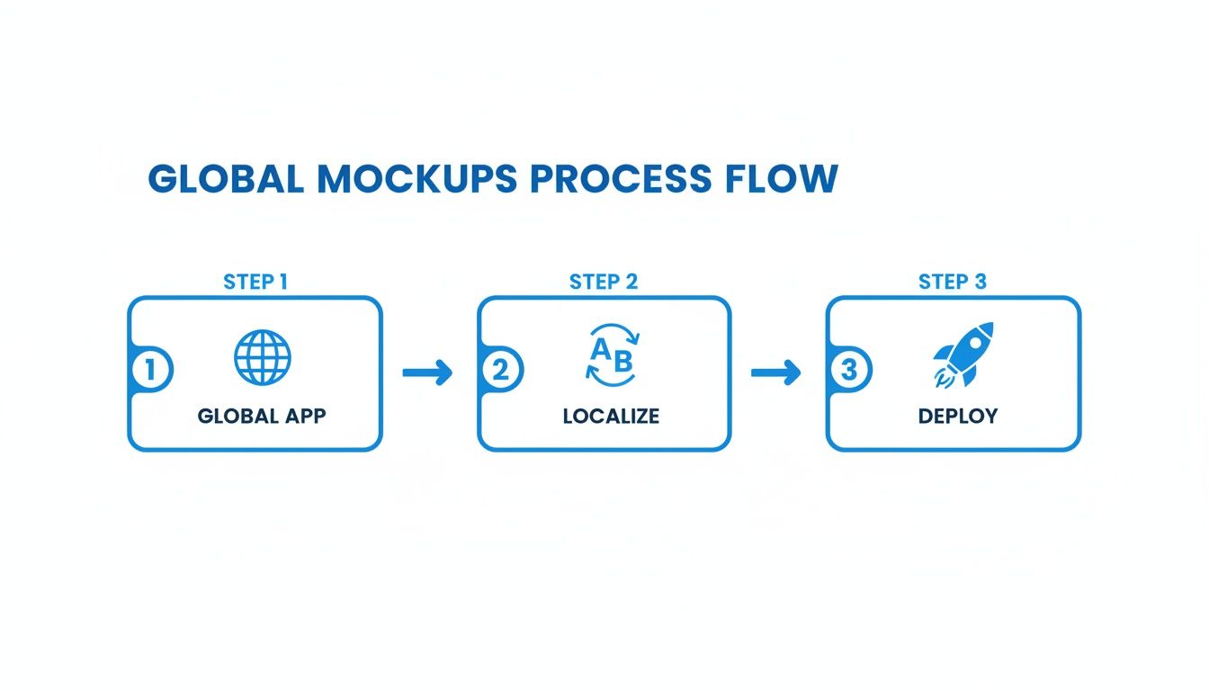
You can see how a single design template can be instantly localized and deployed across multiple markets, completely cutting out the manual rework.
When you build an automated pipeline, you can connect your design templates directly to your data source. This means when you update a caption or a feature callout, the changes automatically populate across every single mobile apps mockup in your entire portfolio. It is a total shift from manual labor to an efficient, hands-off workflow.
The Real-World Benefits of Automation
Automating your screenshot production delivers some serious advantages that go way beyond just saving time. It is about creating a more agile and consistent brand presence everywhere.
- Absolute Brand Consistency: Automation guarantees that every screenshot, for every app, in every language, perfectly follows your brand guidelines. No more rogue fonts or off-brand colors slipping through the cracks.
- Empower Your Marketing Team: Marketers can instantly generate fresh visuals for A/B tests, ad campaigns, or seasonal promotions without ever needing to file a design ticket and wait.
- Ship Updates Faster: When a new iOS or Android version drops, you can update your entire visual portfolio in minutes, not days. This agility means you can be first to market with a polished, up-to-date store presence.
The real goal of automation is to decouple your growth from your design team's bandwidth. It frees up your designers to solve high-impact creative problems instead of churning out repetitive assets.
Ultimately, an automated workflow for your mobile apps mockup is an investment in speed and quality. It helps you maintain a professional, high-converting storefront with a fraction of the effort, letting you focus on what actually matters: building a great app.
Ready to stop wasting time and start automating your screenshot production? With ScreenshotWhale, you can create high-converting, on-brand app store visuals for every device and language in minutes. Explore our templates and see how easy it is to build a scalable workflow at https://screenshotwhale.com.