What Is a Layout Design Explained for Better Visuals
Discover what is a layout design and how it transforms your visuals. Learn core principles and create high-converting app store screenshots that drive growth.
Layout design is the strategic arrangement of everything you see on a screen: the text, images, and buttons. It’s not just about making things look nice; it’s the invisible architecture that guides a user's eye, delivers information clearly, and makes the whole experience feel effortless.
A great layout tells a story, directing attention exactly where you want it to go.
The Blueprint for Visual Communication
Think of layout design like the window display of a storefront. A cluttered, confusing window makes it impossible to tell what the store even sells. You’ll just walk right by. A well designed window, on the other hand, uses strategic placement, lighting, and just the right amount of empty space to draw your eye to the best products, sparking that desire to step inside.
So, what is a layout design in the digital world? It’s the same idea. It’s the thoughtful plan that organizes content to hit a specific goal, whether that’s getting a user to tap "Download," making a blog post easy to read, or showing off an app's killer features in an app store gallery. It’s the intentional structure that turns a jumble of elements into a clear, compelling message. A great way to see this in action is by checking out the best layouts for websites and seeing how different structures solve different problems.
Why Layout Is More Than Just Aesthetics
A truly effective layout does three things that directly boost app growth and conversions:
- Clarity: It organizes information so logically that users find what they need without thinking. A clear layout cuts through the noise and builds trust.
- Guidance: It carves out a visual path, telling users where to look first, then second, then third. This is absolutely critical for steering them toward important actions, like signing up or making a purchase.
- Engagement: An intuitive, balanced layout just feels good to use. It removes friction and makes people want to stick around and interact with your content.
Effective layout design is the silent conversation you have with your user. It answers their questions before they even ask them and makes their journey feel intuitive, not instructed.
At the end of the day, a solid grasp of layout is fundamental to creating a user interface that actually works. To see how these principles come to life in mobile apps, our detailed guide on mobile app UI design breaks down how layout decisions directly impact user experience and performance.
The Building Blocks of an Effective Layout
To build layouts that really work, especially in the cutthroat app store environment, you need to get a handle on the core principles that guide a user's eye. These aren't just abstract art school rules; they're practical tools that can turn a jumbled screen into a clear, persuasive experience. Nailing them is the secret to designing app store screenshots that convert.
Think of these principles like ingredients in a recipe. Each one has its own job, but they all have to work together to create a final dish that’s balanced, intuitive, and genuinely appealing. When you apply them with a bit of thought, you can build a visual structure that grabs attention and pushes people to hit that download button.
This little flowchart breaks down how layout design actually works. It all starts with guiding the user, which informs the structure, and ultimately shapes how the whole experience feels.
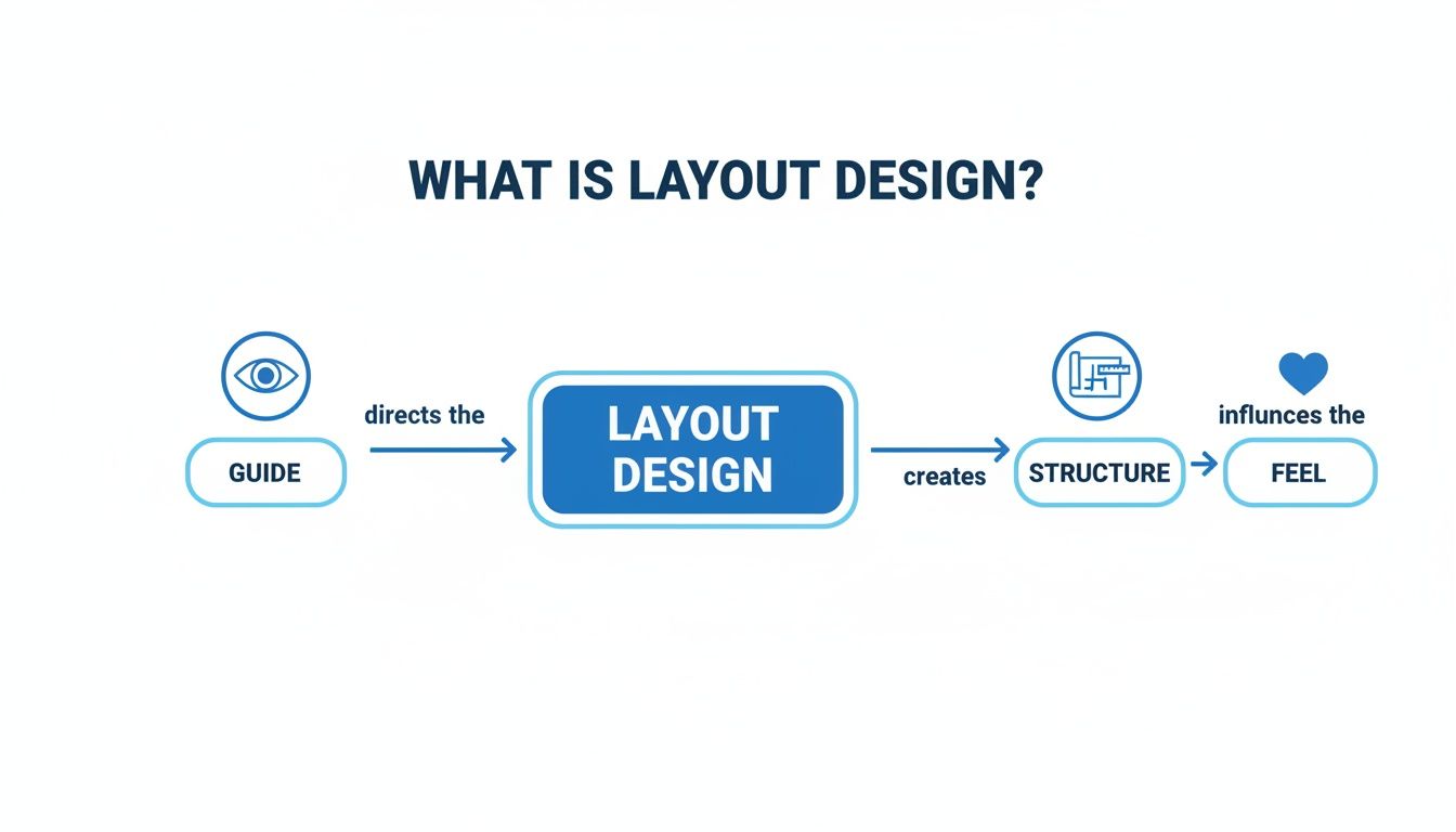
As you can see, it’s a process. You start with a clear intention to guide, build on a solid structure, and end up creating an emotional connection with the user.
Guiding the User with Visual Hierarchy
Hierarchy is all about making the most important thing on the screen look like the most important thing. It’s your way of telling the user, "Hey, look here first!" You create this effect by playing with size, color, and placement to give more visual weight to your key features or calls to action.
In an app store screenshot, for instance, your main headline explaining a killer benefit should be the biggest, boldest text on the screen. If you've got a "Download" button in a UI mockup, it needs a contrasting color that makes it jump out. This ensures people instantly get the main message without having to think about it.
Creating Stability and Structure
Once you’ve established what’s important, you need to arrange everything so it feels stable and organized. This is where balance, alignment, and proximity come into play. They’re the unsung heroes of clean design.
- Balance: This is what gives your design visual stability. A symmetrical layout can feel formal and sturdy, while an asymmetrical one often comes across as more dynamic and modern. Neither is better than the other, but the goal is to make sure the screen doesn't feel lopsided or just plain messy.
- Alignment: Lining elements up on a common grid is the fastest way to look professional. Instead of scattering text and images all over the place, snap them to shared vertical or horizontal axes. This simple trick brings an immediate sense of order and sophistication.
- Proximity: Grouping related items together tells the user they belong together. It's an intuitive shortcut. Put a caption right next to its image, or cluster a few user testimonials in one spot. This tidies up the screen and helps people process information in logical chunks.
A well structured layout feels effortless. It uses alignment and proximity to create invisible connections, making the design intuitive and easy to follow.
Enhancing Clarity and Focus
Finally, repetition and white space are the finishing touches that take your layout from good to great. Repetition means using consistent styles, colors, and fonts across all your app screenshots. This consistency isn't just for looks; it builds brand recognition and makes your entire gallery feel like a cohesive, trustworthy story.
White space, that empty area around your design elements, is anything but wasted. It's an active ingredient that cuts down on clutter, makes text easier to read, and draws the eye directly to your most important content. Giving your key features room to breathe makes them stand out and feel more significant.
If you want to go deeper on putting these ideas into practice, check out our guide on mobile app design best practices.
How Layout Design Works in the Real World
The principles of layout design aren't just theory; they're the bones of every website, app, and magazine you interact with. But knowing the rules is one thing; knowing how to apply them is another. The way these principles come to life changes drastically depending on where the design will live.
A layout for a sprawling e-commerce website is a completely different beast from a mobile banking app. Each has its own goals, its own constraints, and its own audience.
Think about it. A website layout is often built for a big screen and a mouse pointer. The designer has room to play, guiding the user's eye down a long, scrolling page. It’s all about creating a journey. On the other hand, a mobile app has to be ruthlessly efficient, designed for thumbs on a tiny screen where every single pixel counts.
Adapting Layouts for Different Platforms
Context is king. A print magazine, for example, might use dense columns of text and beautifully overlapping images to pull you into a story. The entire layout is designed to encourage you to slow down, to get lost in the page. It's an immersive, physical experience.
Now, flip to a productivity app on your phone. The layout is probably minimalist, with tons of clean white space, obvious icons, and a single, unmissable button on each screen. The goal here is pure speed and clarity. Get the user from point A to point B with zero friction. You see this challenge firsthand when adapting layouts from website to mobile app.
This is the magic of layout design. The core ideas like hierarchy, balance, and alignment never change. But how you use them is tailored completely to the user's needs and the device in their hand.
The Impact of UI and UX in Digital Layouts
In the digital world, layout is the absolute foundation of User Interface (UI) and User Experience (UX). A great layout makes a user feel smart and in control. A bad one makes them feel confused and frustrated.
This isn't just about aesthetics; it’s big business. The global design services market blew past $250 billion in 2023, largely because companies know that a solid visual layout matters. In fact, 58% of consumers say they prefer websites with strong, appealing layouts. It’s why 62% of companies are now investing more in design than in traditional marketing; they’ve seen that a great layout can drive 40% higher engagement.
A successful layout doesn’t just show you information. It anticipates what you want to do next and makes that action feel completely obvious and natural. That’s the heart of intuitive design.
Ultimately, whether you're designing an app, a landing page, or even just a set of app store screenshots, your layout choices are quietly shaping the entire user journey. Once you start seeing how these principles work in different contexts, you'll begin to spot what makes a design truly effective and how to build one yourself.
Designing App Store Screenshots That Convert
In the ridiculously crowded world of app stores, your screenshots aren't just pictures; they're your storefront. Think of them as a lightning fast sales pitch. Good layout design here isn't about making things pretty; it's about turning casual browsers into loyal users and giving your app store growth a serious boost. This is where all those design principles you've learned translate directly into downloads.
A potential user gives your page just a few seconds before swiping on. In that tiny window, your layout has to scream your app's core value. This isn't the time for a boring feature list. It's time to show off the benefits.
Crafting a High-Converting Visual Narrative
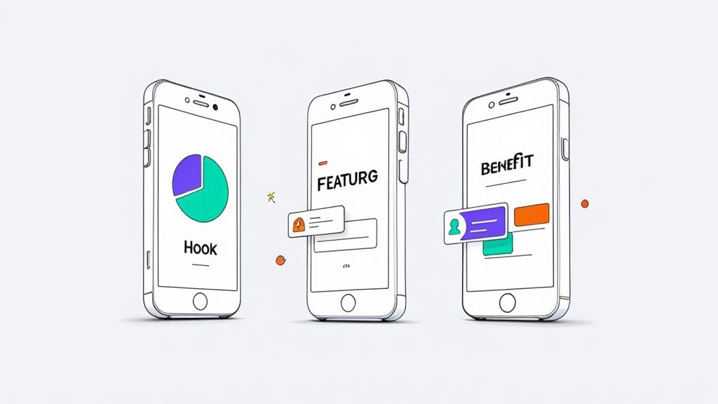
Treat your screenshot gallery like a mini story with a beginning, middle, and end. The idea is to create a seamless flow that takes someone from "Hmm, what's this?" to "I need this." Each image should build on the last, hammering home what makes your app special.
The Hook (Screenshot 1): This is it. Your most important asset. It has to grab attention immediately by showing off your app's single most compelling benefit. Use a punchy, benefit driven headline and a clean visual that shows the result of using your app, not just the interface.
The Features (Screenshots 2-3): Okay, you've got their attention. Now show them how you deliver on that promise. Spotlight two or three key features, using professional looking device mockups to frame the UI. Keep your captions short, sweet, and focused on action.
The Proof (Screenshot 4+): Time to build some trust. Use later screenshots to flash social proof like testimonials, awards, or impressive stats. This little bit of credibility can be the final nudge someone needs to hit download.
This simple, structured approach turns a gallery from a random collection of images into a well oiled conversion funnel.
Practical Steps for Building Your Screenshots
You don't need to be a Photoshop wizard to create polished, high converting screenshots anymore. Platforms like ScreenshotWhale bake layout design best practices right into their templates and editors, making the whole process incredibly efficient.
For example, when using a screenshot editor, focus on these actionable layout elements:
- Pick a Solid Template: Start with a professionally designed template that fits your app's vibe. This gives you a great foundation where the spacing and hierarchy are already figured out for you.
- Nail Your Captions: Use the text editor to write short, snappy headlines that focus on benefits. Choose a big, readable font that pops against the background. Scannability is everything.
- Use Vibrant Colors: Pull from your brand's color palette to create visual energy and guide the user's eye. A bold background color can make your device mockups stand out and catch attention in crowded search results.
- Stay Consistent: This is huge. Make sure your fonts, colors, and device styles are the same across every single screenshot. That repetition builds a cohesive brand identity and makes your app look far more professional and trustworthy.
A great app store layout doesn't just display features; it sells a solution. By focusing on a clear visual story and using vibrant, consistent design, you make your app's value proposition impossible to ignore.
Getting this strategic layout right is a cornerstone of app store optimization (ASO). To see how the top apps structure their visual galleries and get a deeper look into driving installs, you can learn more about creating effective mobile app screenshots. Applying these principles will help you create a compelling visual pitch that captures attention and fuels conversions on both the iOS and Android stores.
Common Layout Mistakes That Hurt Conversions
Even tiny mistakes in your layout can absolutely tank your app's success. It’s a harsh truth. A confusing or cluttered design doesn't just look bad; it actively pushes users away and kills conversions before they even get a chance to see what your app is about.
Think of it like this: a bad layout creates friction. And every bit of friction is another reason for a potential user to just keep scrolling. Learning to spot these common mistakes is the first step to creating visuals that pull people in, not scare them off.
These slip ups often creep into designs completely unnoticed. But once you know what you're looking for, they become glaringly obvious and, thankfully, easy to fix.
Overloading the User with Information
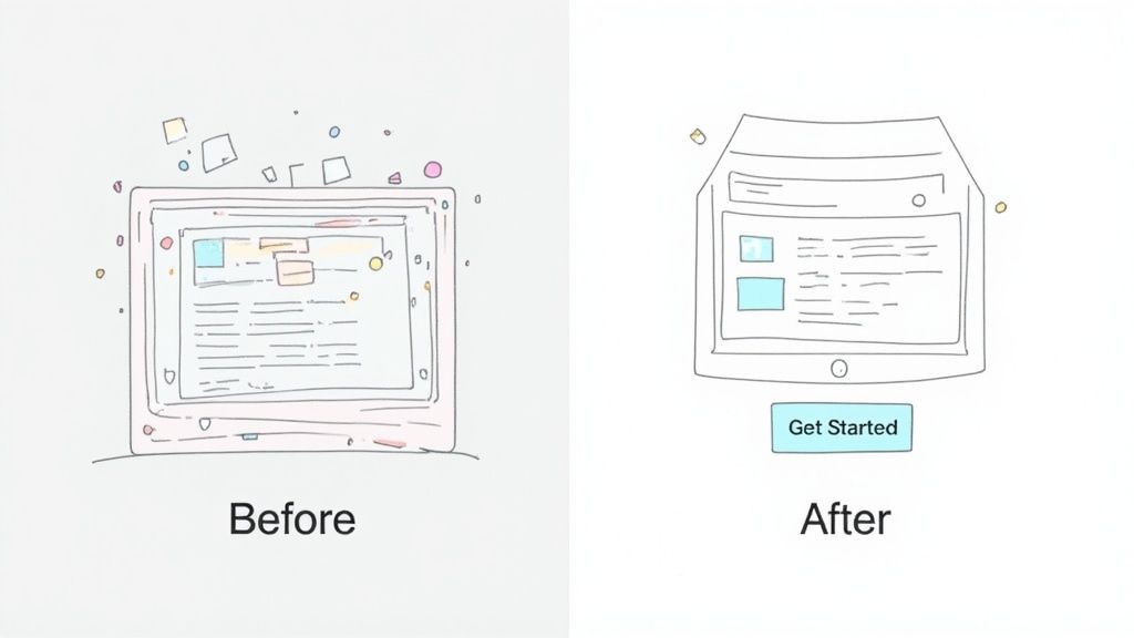
This is probably the most common sin of app store screenshot design: trying to show everything at once. When you cram too many features, text boxes, and buttons into one image, you create instant information overload. The user has no idea where to look, feels overwhelmed, and is gone in a split second.
A cluttered screen is a stressed screen. Instead of making your app look powerful, it just forces the user to work way too hard to figure out what’s important. They won't.
The rule of thumb for screenshots that actually convert is simple: one primary message per screen. Dedicate each screenshot to a single, powerful benefit. This tells a clear, scannable story that someone can digest in the two seconds you have their attention.
Weak Visual Hierarchy and Inconsistency
The next big conversion killer is a weak visual hierarchy. This is what happens when every single element on the screen is screaming for attention with the same volume. The headline is the same size as the subtext, and the call to action button just fades into the background. Nothing stands out, so the core message is completely lost in the noise.
Just as damaging is inconsistency. When you use different fonts, clashing colors, or random button styles across your screenshot gallery, it erodes trust. It makes your brand look unprofessional and sloppy, which makes people wonder if your app is just as messy.
To fix this, make sure your layout has one clear hero.
- Give it a real headline: Make it the biggest, boldest thing on the screen. No question what the user should read first.
- Use contrast to your advantage: Your main benefit or call to action needs to pop right off the screen.
- Stick to your brand: Use the same fonts and color palette across every single screenshot. Consistency builds credibility.
Getting these fundamentals right is what separates screenshots that get ignored from those that drive downloads on both Android and iOS. A clean, focused, and consistent layout doesn't just look better; it guides the user’s eye straight to that download button.
Your Go-To Checklist for a Flawless Layout
Knowing the principles is one thing, but applying them consistently is what separates the pros from everyone else. Before you hit ‘publish’ on your app store screenshots, run them through this final quality check. Think of it as your last line of defense against sloppy design.
This isn't about abstract theory. It’s a series of simple, direct questions to audit your own work and make sure every pixel is working to drive conversions.
Core Design Audit
- Hierarchy: Does the most important message grab you by the collar? A user should know the main benefit in a single glance. No exceptions.
- Clarity: Is the design clean, or is it a cluttered mess? Be ruthless with your use of white space. Give your key features room to breathe so they can actually stand out.
- Proximity: Are related elements grouped together? It seems basic, but this is how you create intuitive connections that make the layout just feel right to the user.
- Alignment: Do things line up on a grid? This isn't just for neat freaks. A consistent grid is the invisible scaffolding that brings a sense of order and professionalism to the entire design.
App Store Screenshot Specifics
When it comes to the iOS and Android stores, the stakes are even higher. A few small tweaks here can make a huge difference in your conversion rates. Ask yourself these questions:
- Value Proposition: Is the main user benefit screaming from that very first screenshot? That first image is your hook. If it doesn't land, they're gone.
- Readability: Are your captions short, bold, and focused on benefits? Ditch the jargon and feature lists. Users scan for seconds, so make every word count.
- Consistency: Do all your screenshots look like they belong to the same family? Using the same fonts, colors, and device mockups across the set builds a cohesive story and, more importantly, brand trust.
Running your designs through this checklist is how you shift from just arranging things on a screen to strategically guiding a user’s eye. It’s the final step in turning a good layout into a high converting one.
A Few Common Questions About Layout Design
Let's tackle a few common questions that pop up when designers are first getting the hang of layout. Getting these concepts straight will give you a ton of confidence when you start your next project.
What’s the Single Most Important Principle in Layout Design?
If I had to pick just one, it would be visual hierarchy. Hands down.
While all the principles work together like a team, hierarchy is the captain. It’s what tells the user’s eye where to look first, second, and third. Without a clear hierarchy, your design is just a jumble of elements shouting for attention, and your core message gets completely lost. Master how to use size, color, and placement to create a focal point, and you'll make any design, especially something as crucial as an app store screenshot, instantly understandable.
How Is Layout Design Different from Graphic Design?
This is a great question. Think of it like this: graphic design is the entire orchestra. It’s the practice of creating the logos, illustrations, and icons, choosing the typefaces, and defining the color palette. All the individual instruments.
Layout design is the conductor. It’s the specific art of arranging all those graphic elements on the page or screen to create a single, powerful composition. One discipline creates the assets; the other strategically places them to make them sing.
Do I Need Expensive Software to Learn Layout Design?
Not at all. The principles we've talked about are universal; they don't care what tool you use. You can practice them with a simple pencil and paper or jump into fantastic free tools like Canva or Figma. The real goal isn’t to master software; it’s to train your eye to see what works and what doesn't.
Once you get a feel for what a good layout should do, you can apply that knowledge to any tool you pick up, from a basic drag and drop editor to the most advanced design software out there.
For instance, when you're using an app screenshot generator, you’re putting layout principles into practice every time you pick a template (the structure) and decide how to arrange your captions and images (the hierarchy). The software is just the vehicle. It's your understanding of the fundamentals that will create visuals that actually get people to download your app.
Ready to put these principles into action? ScreenshotWhale gives you professionally designed templates and a dead simple editor, so you can create stunning, high converting app store screenshots in minutes. Skip the steep learning curve and start boosting your app store growth today at https://screenshotwhale.com.