Mastering Mockup App Mobile Design for High Conversions
Level up your app store presence. This guide breaks down the mockup app mobile strategy to create stunning screenshots that drive installs on iOS and Android.
When it comes to app store growth, a polished strategy for your mockup app mobile screenshots is one of the most powerful tools you have. It's about more than just grabbing a few static images; it's about turning them into a compelling sales pitch. By placing your app’s UI inside realistic device frames, like an iPhone or Android phone, you create professional, high-converting visuals that are crucial for boosting conversions on both the App Store and Google Play.
Your App Screenshots Are Your Strongest Sales Pitch
Think of the app stores as a massively crowded digital mall. In this environment, your screenshots aren't just pictures; they're your visual elevator pitch. A well-designed mobile mockup can grab a user's attention in seconds and is often the final nudge they need to hit "Install." It’s about building instant trust through professionalism, and that alone can send your conversion rates soaring.
This isn't just a design chore to check off your list. It's a core component of App Store Optimization (ASO) and user acquisition. There's a direct line connecting high-quality visuals to install velocity, which in turn is a huge factor in how the app stores rank you. Simply put, better screenshots mean better visibility and more growth.
Why First Impressions Matter
The competition out there is brutal. With hundreds of thousands of new apps hitting the stores every month, a tiny fraction, around 0.5%, actually find real success. That stark reality puts a ton of weight on your app's first impression.
Consider this: by 2025, a staggering 90% of users won't even bother scrolling past the third screenshot. That gives you a tiny, make or break window to win them over. You have roughly seven seconds to hook someone, and a set of optimized screenshots can boost your conversions by 20-35%.
Your app page is a digital storefront, and your screenshots are the window display. They must instantly communicate value, usability, and professionalism to turn a casual browser into a loyal user.
Just look at what's possible when you move beyond raw UI captures and tell a visual story with vibrant, appealing imagery.
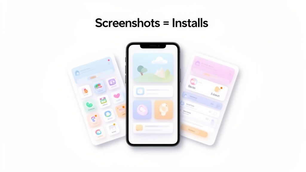
Here, the combination of vibrant backgrounds, punchy captions, and modern device frames works together to highlight the app's key benefits at a single glance. It just works.
Streamlining Your Growth Driver
Creating these critical assets shouldn't slow you down. For a solo founder or a small team, a dedicated mockup tool turns this high-stakes process from a bottleneck into a streamlined growth driver, making professional design accessible to everyone. Our own guide to creating compelling mobile app screenshots walks through this in more detail.
Ultimately, the goal is to efficiently produce visuals that don't just look good but actually perform. They need to turn passive views into valuable installs and fuel your app's journey up the rankings.
Crafting a Visual Story That Converts Browsers to Users
Let's get one thing straight: random UI captures don't work. Your app store screenshots need to tell a story, guiding anyone who stumbles upon your page from idle curiosity to a confident download.
This whole visual narrative kicks off with choosing the right device mockups. Are you targeting a tech-savvy crowd? Go with the latest iPhone. Aiming for broader appeal? Pick a popular Android model. The idea is to make your app look like it already belongs on their screen.
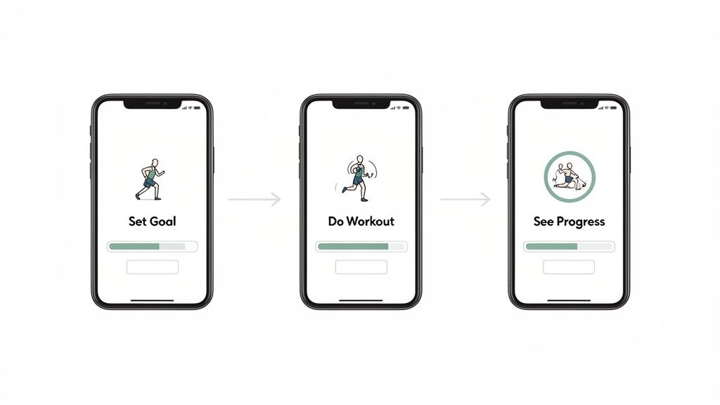
From there, it’s all about arranging your screenshots in a sequence that builds excitement and makes your app’s value crystal clear. A fitness app, for example, wouldn't waste space showing a settings menu. Instead, you'd create a journey. The first screen might show someone setting a goal, the next captures a workout in progress, and the third reveals a chart tracking their achievements. That progression makes the app’s purpose obvious in seconds and drives app store growth.
Building a Compelling Narrative
To really nail that visual flow, you have a few storytelling tactics to choose from. Each one presents your app a bit differently, so think about which one fits your app best. Knowing the basics of good layout design is your starting point here.
Here are a few popular approaches that deliver high-converting app store screenshots:
- Panoramic Layout: This is where you connect multiple screenshots into one seamless, wide image. It's perfect for creating an immersive feel, guiding the user's eye smoothly from one feature to the next.
- Feature-Per-Screenshot: A more direct, punchy approach. Each screenshot is laser-focused on highlighting one core feature. This delivers amazing clarity and is my go-to for apps with distinct, powerful functions.
- Problem-Solution Story: This one’s a classic for a reason. The first screenshot shows a common user pain point, and the next few show exactly how your app swoops in to solve it. It’s a super effective way to build an immediate connection.
Customizing Your Visual Identity
Once you've got a narrative structure, it’s time to inject your brand’s personality into it. This is where a mockup app mobile tool like ScreenshotWhale really gives you an edge. It’s packed with templates designed for specific categories, think fitness, dating, or AI chat apps. These aren't just generic placeholders; they're solid starting points built on what we know converts.
For example, you could start with a "Fitness Tracker" template, then use the editor to change the background from a generic gradient to a vibrant, high-energy image of someone running. This small change makes the design uniquely yours and instantly more appealing. Tweak the colors to match your brand palette, pick fonts that reflect your app's vibe, and arrange the device mockups to perfectly frame your UI. This isn't just about making things look pretty; it's about building trust and boosting conversions.
A well-composed set of screenshots signals professionalism and an obsessive attention to detail. It tells users you’ve invested in their experience before they even hit "install," which makes them far more likely to convert.
In fact, mobile app screenshots have become must-have marketing assets. They have a direct line to your conversion rates, especially as global app revenues are on track to hit $1 trillion by 2026. Platforms like ScreenshotWhale are becoming indispensable for ASO teams, helping them generate the 5 to 7 well-structured screenshots needed to show off core features while playing by the strict rules of the iOS and Android stores. It’s a strategic move that ensures your visuals aren't just for show; they're engineered to drive real growth.
Writing Persuasive Captions That Drive Installs
Your stunning visuals might grab their attention, but it’s the words that will seal the deal. Think of your captions as the final piece of the puzzle, the thing that turns a casual glance into a decisive tap on the 'Install' button. This is your chance to speak directly to the user and drive home your app's value.
The best captions are short, punchy, and benefit-driven. They should feel like a natural extension of your mockups. Instead of just listing a feature like "Calorie Tracker," frame it as a benefit: "Track Your Meals in Seconds." That small shift makes your app's value immediately obvious and boosts app store conversions.
This approach turns your screenshots from a simple gallery into a powerful sales tool. You're crafting micro-copy that answers the user's unspoken question: "What's in it for me?"
A Framework for High-Converting Copy
To write captions that consistently get results, it helps to stick to a simple framework that prioritizes action and clarity. This ensures every word is pulling its weight.
- Lead with Action Verbs: Kick off your captions with strong verbs like "Create," "Discover," "Track," or "Share." These words are direct. They immediately tell the user what they can do with your app.
- Weave in ASO Keywords: You're already doing keyword research for ASO, so put it to work here. If your app is a "photo editor," a caption like "Create stunning edits with pro filters" seamlessly works in your keywords without sounding robotic.
- Showcase Social Proof: If you've won an award or been featured somewhere cool, mention it! A simple line like "As seen in TechToday" or "Editor's Choice Winner" builds instant trust.
The core principles here are pretty similar to writing compelling ad copy. The goal is always the same: inspire action through clear, benefit-focused language.
Styling Text for Maximum Impact
How your text looks is just as important as what it says. When you're working in a mockup app mobile editor, you have full control over the typography, so use it to your advantage. Make sure your message pops.
Your caption's design should amplify its message, not obscure it. Aim for high contrast, clear fonts, and a color scheme that aligns with your brand identity while ensuring readability on any device.
When you're styling, pick vibrant colors that stand out against both light and dark backgrounds. Choose a font that is not only on-brand but also highly legible even at small sizes. For a practical example, inside a site editor, you could apply a subtle text shadow to your captions. This simple effect makes the text 'lift' off the background, dramatically improving readability against a busy or colorful image. The text should be big enough to be easily read on a phone screen but not so big that it completely overwhelms the UI in your screenshot. It's all about finding that perfect balance to get your message across and persuade users to download.
Localizing Screenshots to Maximize Global Reach
Thinking about taking your app global? Your app store page has to lead the way. Just making your app available in a new country isn't enough. You have to speak the local language, both with your words and your visuals, to really connect with people and earn their trust.
This is where localization becomes your secret weapon for growth. It’s not just about running your captions through a translator. True localization means adapting your text, your imagery, and even the features you choose to highlight so they click with different cultures. A killer feature in North America might not be the main draw in Japan, where users could be looking for something entirely different.
The Power of Speaking the Local Language
Good localization shows people you’ve actually put some thought into their experience. When a potential user lands on your store page and sees screenshots with captions in their own language, it instantly makes your app feel more accessible and welcoming. It says, "Hey, this is for you." That little bit of effort builds immediate credibility and can seriously bump up your install rates in new markets.
Thankfully, with a solid mockup app mobile tool, this doesn't have to be a massive headache. ScreenshotWhale, for instance, uses an AI translation engine that can instantly switch your copy into over 100 languages. This saves your team from countless hours of manual work and cuts out the need for pricey translation services, at least for your store assets. For bigger, company-wide localization projects, it's always smart to research some good translation software for your localization needs.
In an app store where people make decisions in seconds, localized screenshots are a sign of respect for your international audience. They prove you understand their market, and that’s often the final nudge someone needs to hit the download button instead of bouncing.
To really drive home how much this matters, let's look at the data. Localizing your app store assets isn't just a nice to have; it directly impacts key growth metrics.
Localization Impact on App Store Performance
| Metric | Impact of Localization | Example Region |
|---|---|---|
| Conversion Rate | A significant increase as users better understand the app's value proposition in their native language. | Localizing an app's screenshots for the Brazilian market (Portuguese) can lift conversion rates by up to 40%. |
| User Engagement | Higher engagement and retention because the app feels more intuitive and tailored to local preferences. | In Japan, highlighting features that emphasize community or social proof can increase Day 7 retention. |
| Downloads | More organic downloads driven by improved visibility from localized keywords and culturally relevant visuals. | Translating screenshot captions into German and Spanish can increase downloads in Germany and Spain by 25% and 32% respectively. |
| Return on Ad Spend | Better ROAS from paid campaigns, as localized creative resonates more strongly and leads to more cost-effective installs. | A campaign in South Korea using localized creatives can see a 20% lower cost-per-install compared to English assets. |
As you can see, the effort pays off. Adapting your visuals isn't just about translation; it's about connecting with users on a cultural level, which ultimately drives better business results across the board.
Automating for Speed and Consistency
Okay, now let's talk about scaling this whole operation. Imagine manually updating screenshots for every single app update or seasonal campaign, across a dozen different languages. It’s a fast track to burnout and a messy, inconsistent brand presence. Automation is how you maintain a polished, up to date look around the world without derailing your development sprints.
This is more critical than ever. Mobile traffic now accounts for 62.66% of all web visits, but it comes with sky high mobile bounce rates of up to 60.19%. People lose interest fast. With user acquisition costs constantly on the rise, any tool that helps you create guideline compliant mockups quickly is a game changer.
The real power move here is leveraging an API to automate your entire asset production workflow.
- Trigger Updates Automatically: Hook the API into your CI/CD pipeline. Every time you push a new build, fresh, translated screenshots can be generated without anyone lifting a finger.
- Ensure Brand Consistency: Need to roll out a new brand look or a holiday theme? You can apply it programmatically across every single localization with one command. No more chasing down outdated assets.
- Ship Faster: You can finally kill the endless back and forth between design and marketing. This lets you get your updated store listing live way faster and with fewer mistakes. If you want to dive deeper, you can learn how to generate app screenshots automatically and really speed things up.
This approach flips your ASO strategy from being a slow, manual chore into a proactive, scalable system built for global growth.
Finalizing and Publishing Your Mockups
You've poured hours into designing a beautiful set of mockups. The finish line is in sight, but there's one final, tricky hurdle: getting them published on the app stores without hitting any technical snags. This is where the devil is truly in the details.
Both Apple and Google have strict requirements, and a rejection over something as simple as the wrong file format can be infuriating. Let's make sure that doesn't happen.
Meeting the Technical Specs for iOS and Android
The biggest headache usually comes from the different technical rules between the App Store and Google Play. Apple, in particular, is notorious for its precise resolution requirements that change across different iPhone and iPad models. Google gives you a bit more breathing room, but your assets still need to look sharp on a huge variety of Android screens.
When you're ready to export, keep these details front and center:
- File Format: Stick with JPEG or 24-bit PNG (without transparency). I usually lean towards PNGs because they keep text and UI elements looking crisp.
- Screenshot Count: You get up to 10 slots on the App Store per language and up to 8 on Google Play. You should absolutely use as many of these as you can to build a compelling narrative for your app.
- Device-Specific Sizes: This is the big one for iOS. You must provide screenshots at the native resolution for key devices, like the 6.7-inch iPhone Pro Max and the 12.9-inch iPad Pro. Forgetting just one can get your entire submission blocked.
I treat the export process as one last quality check. Honestly, the easiest way to handle this is with a tool that does the heavy lifting for you. Platforms like ScreenshotWhale can generate the full, compliant set for all required devices in one go, which completely removes the guesswork.
This lets you stop fussing with resizing images in Photoshop and focus on what actually matters: your app.
This infographic breaks down the core ideas for taking your app's visuals global.
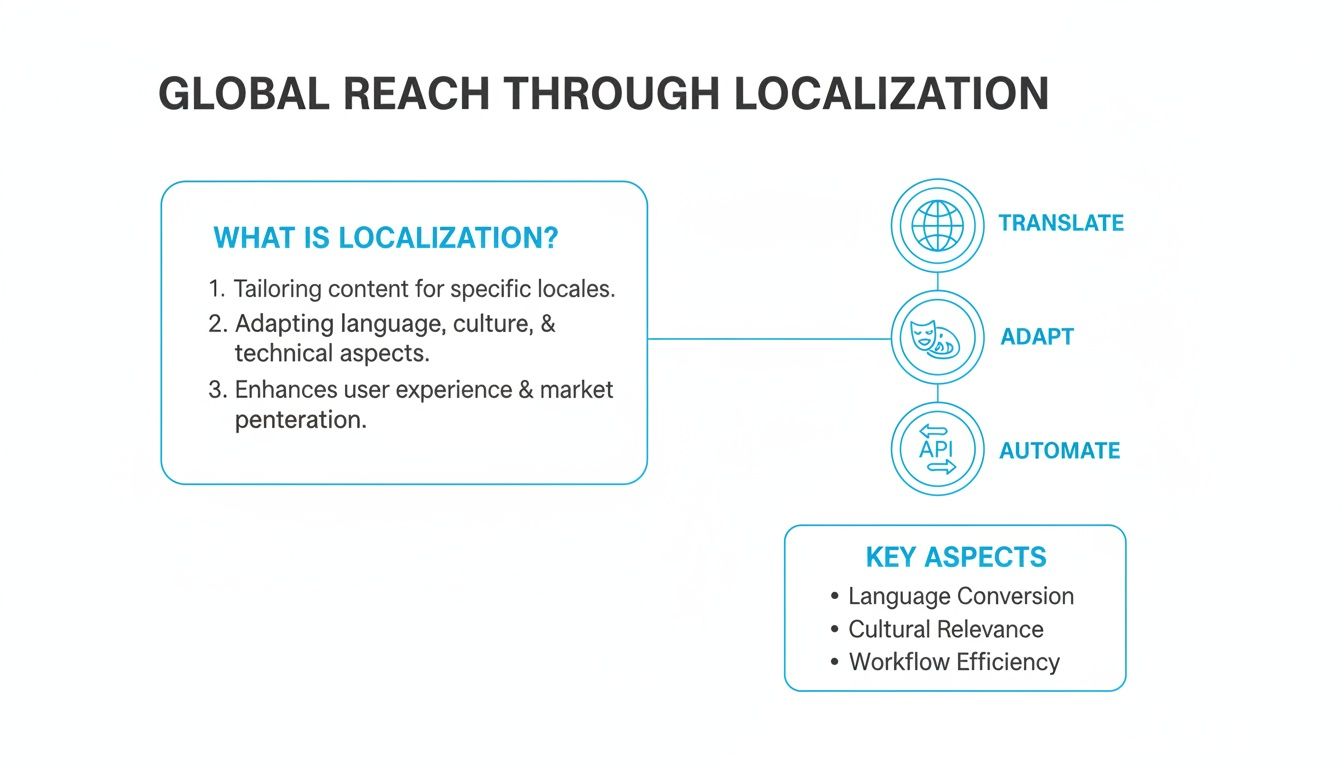
The main takeaway here is pretty simple: a solid global strategy is a mix of smart translation, cultural awareness, and automating as much of the production work as possible.
Getting Through the Review Process
Beyond just the file specs, your screenshots also have to follow content guidelines. Breaking these rules is a fast track to rejection, so it pays to know what they are before you hit "submit."
Apple’s review process is famously thorough. They demand that your screenshots accurately show the current version of your app. If you include mockups of features that don't exist yet or use misleading text, you're almost guaranteed to get flagged.
Google’s review is typically faster and more automated, but they're still on the lookout for deceptive or spammy content. Both stores want to see your real UI. You can, and should, add benefit-driven captions and creative backgrounds, but the app itself must be an honest depiction of the user experience.
Stick to these guidelines, and you'll set yourself up for a much smoother launch day.
Common Questions About Mobile App Mockups
Even with the best tools in hand, you're bound to hit a few roadblocks when creating your app store visuals. It happens to everyone. Let's walk through some of the most common questions I hear from developers and marketers putting together their mobile app mockups.
Nailing these details is the difference between a smooth launch and a frustrating one.
How Many Screenshots Should I Actually Use?
Apple gives you up to 10 slots and Google Play gives you 8, but don't feel like you have to max them out just for the sake of it. The real sweet spot is usually between 5 and 7 high-impact images. That’s enough real estate to tell a convincing story about your app without just adding noise.
Focus everything on those first two or three screenshots. They're what users see without swiping, so they have to do the heavy lifting. Use them to show off your app's killer feature or core value. After that, it's always better to fill the remaining slots with quality visuals rather than leaving them empty. It just looks more professional and complete.
Portrait or Landscape?
This one’s simple: follow your app's natural orientation.
If you’ve built a game, a video editor, or a streaming app that’s meant to be used horizontally, your screenshots have to be in landscape. Anything else just feels weird and disconnected from the real experience.
For pretty much every other kind of app, social, productivity, utilities, portrait is the way to go. It’s what users expect. A good mockup app mobile tool will let you toggle between both so you can see what frames your UI best and makes your features pop.
What Are the Biggest Design Mistakes People Make?
I see the same few mistakes over and over again, and they can instantly make an app look cheap. Blurry UI captures are a big one. So are captions that are too long, use a tiny font that no one can read, or, worst of all, showcasing an outdated version of your interface.
But the single biggest error? Just uploading raw, unedited screenshots. No device frame, no background, no story. It screams "amateur" and gives users zero reason to stop scrolling.
Also, don't forget the platform specific rules. Apple and Google are picky about text size, content, and framing. Violate them, and you risk getting your submission rejected. The easiest way to avoid all this is to start with a solid template built by someone who already knows the rules.
How Often Should I Update My Screenshots?
As a rule of thumb, you should plan to update your screenshots any time you push a major UI redesign or launch a game changing new feature. Your store listing should always be an honest reflection of what’s inside the app.
It’s also a great idea to refresh them for seasonal events or holidays to show your app is current and active. A/B testing different screenshot concepts every few months is another pro move for dialing in your conversion rates. For teams that ship updates all the time, an API that automates the whole process can be a lifesaver, syncing your visuals with every new release without the manual grind.
Ready to create stunning, high-converting visuals for your app in minutes? With ScreenshotWhale, you can access professionally designed templates, a simple drag-and-drop editor, and powerful automation features to boost your app store growth. Start for free on ScreenshotWhale.
Skip the blank canvas
Start from a professional App Store screenshot template and swap in your own app.
Browse templates