Your Guide to a High-Converting Play Store Feature Graphic
Master the Play Store feature graphic with expert design tips, technical specs, and strategies to boost your app's visibility and drive conversions.
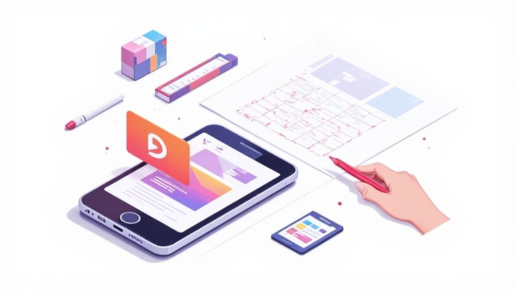
If you have ever uploaded an app to the Google Play Store, you know there is a checklist of assets you have to provide. One of the most important and mandatory is the feature graphic.
So, what is it exactly? It is the 1024x500 pixel banner that Google requires for your app’s store listing. But thinking of it as just a technical requirement is a huge mistake.
A better way to think about it is as your app’s movie poster. It’s the visual hook that grabs attention and often doubles as the cover image for your all important preview video.
Your App’s First Visual Handshake
Imagine walking through a bustling market. Dozens of stalls are vying for your attention, but your eyes are drawn to the one with the most vibrant, compelling sign. That sign is your Play Store feature graphic.
In a sea of apps, it is often the first major visual a potential user engages with. This single image does a lot of heavy lifting: it sets the tone for your app, communicates its core value proposition, and gives people a reason to stop scrolling. A well designed graphic acts as a powerful billboard, practically begging people to tap that play button on your preview video.
Why The Feature Graphic Is a Conversion Machine
Let us be clear: a strong feature graphic is directly tied to your app’s growth. This is not just about making your store listing look pretty; it is about pure conversion. A dynamic and clear graphic can dramatically increase how many users watch your promo video, which is a key step on the path to more downloads.
The image below shows this in action. The feature graphic is not just a static banner; it becomes a clickable thumbnail for your video, making its design absolutely critical for engagement.
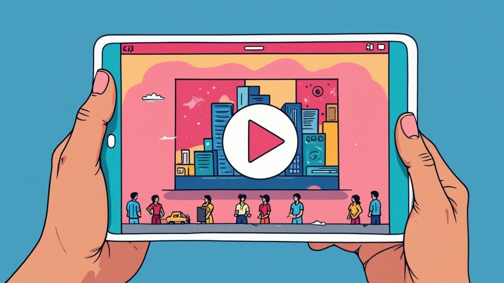
This visual handshake is your best shot at conveying emotion and excitement, turning a passive browser into someone who is genuinely interested. It’s a non negotiable part of any serious App Store Optimization (ASO) strategy. For a full rundown of all the visual assets you will need, check out our comprehensive guide on Google Play graphics.
To put it simply, here’s a quick breakdown of its role.
The Feature Graphic's Role At a Glance
This table summarizes the core function and key impact areas of the feature graphic, giving you a quick reference before we dive into the details.
| Aspect | Description | Impact on ASO |
|---|---|---|
| Primary Function | Acts as the cover image (thumbnail) for your app's preview video. | Directly influences video play rates, a key engagement metric. |
| Visual Hook | The first large format creative users see, designed to grab attention. | A strong visual can stop users from scrolling past your listing. |
| Value Proposition | Quickly communicates the app's core purpose, tone, and main benefit. | Improves click through rates from browse/search to your store page. |
| Brand Identity | Establishes brand consistency and sets the user's initial expectation. | Reinforces brand recognition and trust, leading to higher conversions. |
As you can see, every aspect of the feature graphic is engineered to drive one thing: conversions.
A Shift in Placement, But Not in Power
True veterans of the Play Store will remember a time when the feature graphic held an even more prominent spot. Before the big Google Play Store redesign back in 2018, this banner was the very first thing you saw at the top of every app page.
After the redesign, Google moved it to its current role as the cover for preview videos. But do not let the change in placement fool you. Its power to attract and convert new users is as significant as ever. It frames the entire experience that follows, from watching the video to, ultimately, hitting that install button.
Getting the Technical Requirements Right
Before you let your creativity run wild, you’ve got to get the fundamentals right. Nailing the technical specs for your Play Store feature graphic from the get go saves you from the headache of submission rejections and ensures your hard work looks sharp on every device.
Think of these requirements not as restrictive rules, but as the canvas for your app's first impression. Messing up the dimensions or file type is a surefire way to delay your launch or update. Google is strict about this stuff for a reason, it keeps the Play Store experience consistent and high quality for everyone.
Core Technical Specifications
Alright, let us start with the non negotiables. Your feature graphic has to follow a few hard and fast rules. Keep this checklist handy:
- Exact Dimensions: The graphic must be 1024 pixels wide by 500 pixels tall. No wiggle room here. Set your design file to these exact numbers.
- File Format: Stick to either JPEG or 24 bit PNG (without alpha). This is a key detail, if you are using a PNG, it cannot have any transparency.
- File Size: Make sure your final export is under 1 MB. This helps it upload smoothly and load quickly for potential users.
Getting these three things right is step one. It’s the baseline for a compliant and effective feature graphic.
Designing Around the Play Button Overlay
This is one of the most common trip ups I see. If you add a preview video to your store listing, Google slaps a big, semi transparent play button right in the middle of your feature graphic. Any crucial text, logos, or key visuals you’ve placed in that central area will get completely covered up.
This image shows exactly what I mean by "safe zones." You need to respect them.
As you can see, you need to keep your important stuff away from the very center and the edges, which can get cropped on some screens. Your main message and branding should live in those surrounding safe areas to make sure they are always visible.
Key Takeaway: Always, always design with that play button overlay in mind. Treat the center of your graphic as a "no go" zone for anything essential. This keeps your message clear and your design effective, encouraging people to watch your video instead of being confused by what is hidden behind the button.
Adhering to Google Play Content Policies
Beyond the pixels and file types, your feature graphic also has to play by Google’s content rules. Breaking these can get your app rejected or, in worse cases, even removed from the store. It is not just about what you show, but how you show it.
Here are the big policy guidelines to remember:
- Avoid Misleading Claims: Do not use text or images that imply a ranking, award, or performance you have not actually earned. Slapping on a badge like "Editor's Choice" or "#1 App" is a huge no no unless Google officially gave it to you.
- No Price or Promotional Information: Your graphic is not the place for sales, discounts, or other time sensitive offers. That info belongs in your app's description, not plastered on your main visual.
- Keep It Relevant and Accurate: The visuals have to be an honest representation of your app or game. Using imagery that has nothing to do with your app's core function is just deceptive.
- No Unnecessary Clutter: Resist the urge to cram the graphic with tiny text or a million design elements. A clean, bold design that is easy to grasp in a second is always going to perform better.
These technical and content policies do not just apply to your feature graphic, they cover all your store listing assets. For a closer look at the requirements for your other visuals, our guide on app store screenshot requirements breaks down everything you need to know for both Android and iOS. Getting these guidelines down is a fundamental part of a smooth submission process and a winning ASO strategy.
How a Great Graphic Drives App Store Growth
In a marketplace flooded with millions of apps, just having a killer product is not enough. Think of your app’s store listing as its digital storefront and your feature graphic as the main window display. It’s the single most powerful tool you have to stop users mid scroll and pull them in, directly impacting whether they download your app or just keep swiping.
It all comes down to the psychology of choice. When we are faced with endless options, our brains make snap judgments based on visuals. A killer Play Store feature graphic uses color, composition, and a bit of emotional punch to telegraph your app's value in a split second. Before a user even reads your description, the graphic answers their subconscious question: "Is this app for me?" A strong visual builds instant trust and gets them excited, making them choose you over a competitor.
The Ripple Effect Across the Play Store
Your feature graphic does not just sit on your main app page. Google splashes it all over the Play Store in various promotional spots, multiplying its reach. A visually stunning graphic can land your app in curated collections, editor's picks, or even thematic recommendations.
Each of those placements is a fresh chance to grab users who were not even looking for you. This turns your graphic into a workhorse for organic discovery, constantly marketing your app to new eyeballs. It is a critical lever for boosting your entire marketing funnel, from that first glance to the final tap on "Install."
Your feature graphic is way more than a banner; it is a strategic asset that amplifies your visibility. A single, well designed graphic can generate thousands of impressions in places you might not even expect, making it a critical piece of your app store growth puzzle.
The numbers alone show you what you are up against. As of early 2025, there are roughly 4.2 million apps chilling on the Google Play Store, with hundreds more added every single day. In a space this crowded, where only a tiny fraction of apps ever break through, every single visual element matters. You can find more stats on this highly competitive environment on sqmagazine.co.uk.
From First Glance to Conversion
The best feature graphics are masters of storytelling. They bottle the entire user experience into a single, static image. Does your app help people relax? The graphic should feel calm and serene. Is it a high octane game? The graphic needs to explode with energy.
This immediate emotional connection is what drives conversions. It works by:
- Getting More Video Plays: Since it is the thumbnail for your preview video, a magnetic graphic dramatically boosts play rates. More people watching your video means more people who get what your app does.
- Boosting Click Through Rates: When your app pops up in search results or a featured list, a standout graphic gets more people to tap through to your full store listing. Simple as that.
- Improving Install Rates: A professional, polished graphic sends a clear signal: this is a professional, high quality app. It builds confidence and removes that last bit of hesitation before the install.
Of course, the graphic is just one piece. The overall success of an Android app depends on a whole range of things, including carefully considering all the key factors for Android app development from the very beginning.
The Silent Sales Pitch
At the end of the day, your Play Store feature graphic is your silent sales pitch. It works 24/7 to represent your brand, show off your value, and convince users to take action. It is not some afterthought or a box to tick off during submission; it’s a central pillar of your App Store Optimization (ASO) strategy.
By putting real time and creativity into this one asset, you are investing in higher engagement, better visibility, and ultimately, more downloads. It is the visual handshake that starts the relationship with your user, and you only get one chance to make a great first impression.
Actionable Design Practices for High Conversions
Creating a Play Store feature graphic that actually converts is part art, part science. It’s not enough to just tick the boxes on the technical specs. Your design needs to be a visual powerhouse, something that can stop a user mid scroll and make them genuinely curious about your app. This is where you turn a simple banner into your hardest working conversion asset.
The very first rule? Establish a single, undeniable focal point. Users scan app store pages in milliseconds, so your graphic has to land its core message almost instantly. Do not fall into the trap of a cluttered design that pulls the eye in ten different directions. Instead, pick one powerful visual or a killer tagline to be the hero of your composition.
This whole process, from grabbing attention to driving a download, is the critical funnel for growing your app.
As you can see, the feature graphic is often the key that unlocks the rest of that user journey. That makes getting the design right a make or break first step.
Establish a Clear Visual Hierarchy
Visual hierarchy is all about guiding the user's eye to the most important stuff first. Your app's name or logo, a compelling bit of UI, and that killer tagline should be at the top of the list. Think of it like telling a story in order of importance.
You can pull this off with scale, color, and contrast. The most critical element, whether it is an exciting character from your game or a snippet of your app’s slickest UI, should be the largest and most vibrant. Any supporting text can be smaller, but it still has to be perfectly legible. This ensures your main value proposition hits home first.
Use a Vibrant and On Brand Color Palette
Color is a shortcut to emotion and brand identity. Your feature graphic should use a palette that’s both eye catching and totally in sync with your app’s overall branding. Bold, high contrast colors can really help your graphic pop in crowded search results and curated lists.
But "vibrant" does not mean chaotic. Stick to two or three primary colors that complement your app icon and screenshots. This creates a cohesive, professional look that builds trust with potential users before they have even opened your app. This is not just an app store trick; for a deeper dive into building visuals that drive action, it’s worth exploring broader conversion-focused website design principles.
Craft a Single Powerful Tagline
You have very little real estate here, so every single word counts. Resist the urge to cram in a list of features. Instead, craft one short, punchy tagline that nails your app’s biggest benefit or unique selling proposition.
A great tagline does not describe what your app does; it describes what your user can achieve with it. Focus on the outcome, not the features.
For instance, instead of "Advanced Photo Editing Tools," go for something like "Create Stunning Photos in Seconds." The second one is all about the benefit and creates an immediate emotional spark. Just make sure the text is bold, easy to read, and positioned safely away from that central play button overlay.
Showcase Your Core Value Instantly
Your graphic is the perfect place to show, not just tell. If you’ve got a game, feature the most exciting moment of gameplay. If it is a productivity tool, highlight that "aha!" moment where the user's problem gets solved. Use dynamic imagery and characters that ooze action and emotion.
The goal is to give users a snapshot of the positive experience waiting for them inside your app. This kind of visual proof is far more convincing than a bulleted list of features ever could be. It helps users see themselves using the app, thinking, "Yes, that is exactly what I am looking for."
Feature Graphic Design Do's and Don'ts
Nailing the design comes down to making smart choices. This quick checklist can help you stay on track and avoid common pitfalls that tank conversion rates.
| Design Element | Do | Don't |
|---|---|---|
| Focal Point | Choose one "hero" element (e.g., character, UI snippet, device). | Clutter the space with multiple competing visuals or messages. |
| Color Palette | Use 2 3 bold, high contrast, on brand colors. | Use muted, low contrast colors or a chaotic rainbow of shades. |
| Text/Tagline | Write one short, benefit driven tagline in a large, readable font. | List features or use small, hard to read text. |
| Imagery | Show dynamic, in context action or the app's core benefit visually. | Use static, generic stock photos or boring UI screens. |
| Branding | Ensure the style is consistent with your app icon and other assets. | Create a graphic that feels disconnected from your overall brand. |
| Composition | Keep key elements away from the edges and the central play button area. | Place critical text or visuals where they might get cropped or hidden. |
By following these simple rules, you will be well on your way to a graphic that not only looks great but also works hard to bring in new users.
For teams managing tons of visual assets, our guide on creating compelling images for the app store offers more tips on crafting a consistent and high converting visual story. When you focus on these core design practices, you create a Play Store feature graphic that does not just look good, it drives downloads.
Advanced Strategies for a Competitive Edge
Getting a solid, well designed feature graphic onto your Play Store listing is a huge first step. But the work does not stop there. The most successful apps treat their store assets less like static images and more like dynamic marketing tools that are always evolving.
If you really want a competitive edge, you need to think beyond a one size fits all graphic. It’s time to move from simply having a great graphic to having the right graphic for the right person, at the right time. By embracing localization, seasonal updates, and relentless A/B testing, you can turn that banner into a precision tool for driving global growth.
Go Global with Smart Localization
Your app might be available worldwide, but is your marketing? A feature graphic that totally nails it with a user in the United States might fall completely flat with someone in Japan or Brazil. Localization is so much more than just translating text, it’s about adapting your entire visual message to fit local cultures, preferences, and even events.
Think about it: a fitness app could show someone jogging through a snowy park for its Canadian audience, but switch to a sunny beach scene for users in Brazil. This kind of cultural tailoring creates an instant connection. It sends a powerful signal that your app was made with their world in mind, not just as an afterthought.
This strategy can give you a serious lift in conversion rates in your international markets. It shows a level of polish and consideration that builds trust right away, making users far more likely to tap that install button.
Keep Your Listing Fresh with Seasonal Updates
A store listing that never changes can start to feel old and neglected. One of the easiest ways to signal that your app is alive and kicking is to refresh your Play Store feature graphic for holidays and seasonal events. It’s a simple change that can make your app pop and grab timely user interest.
A great rule of thumb for feature graphics is to think about the calendar. Swapping in visuals for big moments like Christmas, Valentine's Day, or Halloween is a proven way to boost engagement and conversions.
This is a huge opportunity when you remember the Google Play Store has more than 2.5 billion monthly active users around the globe. That’s a massive audience with diverse holidays and interests. You can dig deeper into global user trends on scaleupally.io.
Putting this into practice is pretty straightforward:
- Gaming Apps: Throw some Santa hats or spooky ghosts on your main characters.
- Shopping Apps: Design a special Black Friday or Cyber Monday graphic to shout about your deals.
- Productivity Apps: Kick off January with a "New Year, New Goals" design to inspire action.
These timely updates do not just catch the eye; they create a sense of relevance and urgency that can directly lead to more downloads.
Stop Guessing and Start Testing with A/B Experiments
So, how do you really know if your bold, character focused graphic is better than that sleek, UI driven one? You test it. The Google Play Console has a fantastic built in tool called Store listing experiments that lets you scientifically measure how your creative assets perform.
You can run an experiment pitting your current feature graphic (the "control" version) against a new challenger. Google will then show each version to a different slice of your store visitors and tell you exactly which one drove more installs.
This data driven process takes all the guesswork out of the equation. Instead of going with a gut feeling, you’re making decisions based on actual user behavior. You might be shocked to find that a tiny change, like a different background color or a new tagline, could lead to a 5 10% jump in conversions. This cycle of continuous testing and iteration is the real secret to long term, sustainable growth on the Play Store.
Got Questions About Feature Graphics? We've Got Answers.
Even with the best strategy, you are bound to run into a few specific questions when you are in the weeds managing your app's creative assets. Let us clear up some of the most common ones developers have about the Play Store feature graphic.
Can I Just Use a Screenshot for My Feature Graphic?
Technically, you could if it meets the 1024x500 pixel size, but that’s like using a billboard space to post a flyer. You’re missing a huge opportunity, and I strongly advise against it.
A plain screenshot just does not have the visual punch or clear messaging needed to stop a user from scrolling. Your feature graphic is prime marketing real estate, a purpose built banner designed to tell a story and convince someone to hit that play button. Do not waste it.
What Happens If I Don't Upload a Feature Graphic?
Simple: you can not publish. Uploading a Play Store feature graphic is mandatory. You literally cannot submit a new app listing or push an update without one in the Google Play Console.
Even if you do not have a preview video, Google still requires the graphic. They might use it in other promotional spots across the Play Store, like in curated collections or "featured app" lists. It is a non negotiable part of the deal, so you might as well plan for it from day one.
How Often Should I Update My Feature Graphic?
There is no magic number here, but a good rule of thumb is to update it any time you have something new and important to say. A fresh graphic signals to both users and the algorithm that your app is alive, kicking, and constantly getting better.
Think about swapping it out for these key moments:
- Major App Releases: Dropping a huge new feature or a slick redesign? Your graphic should be the first thing to show it off.
- Seasonal Campaigns: Tying into holidays like Christmas, big events like the World Cup, or sales like Black Friday can make your app feel incredibly relevant.
- A/B Test Wins: If your experiments show a new design is converting better, roll it out immediately. Do not leave those extra downloads on the table.
I would suggest reviewing your graphic at least quarterly, or whenever your product roadmap hits a major milestone. This keeps it from getting stale and ensures it always reflects your app's best self.
What Are the Best Tools for Creating a Feature Graphic?
You do not need a fancy design degree or a wallet busting software subscription to make a great looking graphic. There are plenty of powerful, accessible tools out there. For creating efficient and high-converting app store screenshots for Android and iOS, a specialized editor is often the best choice.
Here are a few of my go to options:
- For Speed and Simplicity: A dedicated app screenshot editor lets you quickly select a vibrant background, add a device frame, and place your tagline with precision. You can often save your branding as a template to create consistent visuals for every app update in minutes.
- For Ultimate Creative Control: If you (or your designer) need to get granular, nothing beats professional grade software like Adobe Photoshop or Figma. They offer total freedom but come with a steeper learning curve.
- For Automation at Scale: If you are managing a whole portfolio of apps or localizing for dozens of languages, specialized ASO tools that help automate creative production are a game changer.
The best tool is the one you will actually use. A polished graphic made in a simple tool is always better than a half finished mess from a complicated one you can not figure out. The goal is a high converting asset, and any of these can get you there.
By keeping these answers in mind, you are in a much better position to manage your feature graphic strategy from start to finish. Now you have got the knowledge to make smarter decisions that will directly help your app grow.
Ready to create high-converting app store visuals without the design overhead? ScreenshotWhale combines professional templates with a simple editor, helping you generate polished screenshots and graphics that drive downloads. Start designing for free today at ScreenshotWhale.com.