A Guide to Play Store Screenshot Size and Specs for App Growth
Master the correct Play Store screenshot size, dimensions, and specs. Create high-converting visuals for phones and tablets to boost app store growth.
Getting your screenshot sizes right for the Google Play Store is a small detail that makes a huge difference in your app's growth. If you get it wrong, Google might reject your upload. Worse, your store listing could display distorted images that scream "unprofessional" to potential users. This is not just about checking a box for Google; it is about making a strong first impression and boosting conversions.
You need to ensure your visual assets meet Google’s latest guidelines to look sharp and trustworthy across the massive, fragmented world of Android devices. Let's break down the actionable insights you need to create efficient, high-converting screenshots for both the Android and iOS stores.
Core Specifications For Phones and Tablets
For phone screenshots, the rules are pretty straightforward. Each side must be at least 320px but no larger than 3840px. The most important constraint, though, is the aspect ratio. The longest side cannot be more than twice the length of the shortest side. You must upload a minimum of two screenshots, but you can go up to eight.
To help you check your assets at a glance, here is a visual breakdown of the essential requirements for phones and tablets.
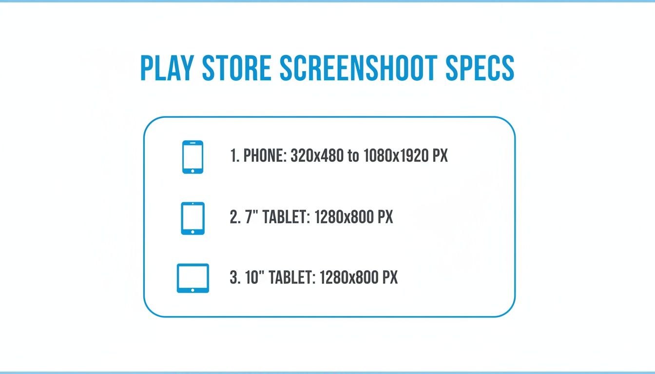
It is crucial to get these device-specific dimensions right. Google actually uses this data to figure out if your app is optimized for larger screens. This can directly affect whether tablet users ever even see your app in the store, impacting your app store growth.
Google Play Screenshot Specifications At a Glance
To make your life even easier, here is a quick reference table with the non-negotiable specs for the most common device types. Keep this handy to double-check your work before you hit upload.
| Device Type | Minimum Dimension | Maximum Dimension | Aspect Ratio | Required File Types |
|---|---|---|---|---|
| Phone | 320px | 3840px | Not to exceed 2:1 | JPEG or 24-bit PNG |
| 7-inch Tablet | 1080px | 3840px | Not to exceed 2:1 | JPEG or 24-bit PNG |
| 10-inch Tablet | 1080px | 3840px | Not to exceed 2:1 | JPEG or 24-bit PNG |
Treat this table as your final checklist. Cross-referencing your screenshots against these specs will save you from the most common upload errors and help make every submission a smooth one.
Understanding Core Screenshot Requirements for All Devices
Before we get into the pixel dimensions for every device, a handful of universal rules from Google apply to every single screenshot you upload. Getting these fundamentals right is the first step toward a store listing that not only gets approved but actually looks professional and drives app store growth.
First, you need to upload at least two screenshots just to get your app published. But you can, and should, use up to eight. Think of those eight slots as a free ad carousel. It is your best shot at telling a visual story that walks a potential user from mild curiosity right to hitting that "Install" button, boosting your conversions.
File Format and Size Limits
The technical specs are straightforward, but Google is strict about them. Your screenshots must be either JPEG or 24-bit PNG. A common mistake is uploading a PNG with transparency (an alpha channel). The Play Store will reject it immediately.
Keep an eye on the file size, too. Each image must be under 8MB. This rule ensures your store page loads quickly, even for users on slower connections. A laggy page is a conversion killer, so do not skip the optimization step.
The Critical Aspect Ratio Rule
This is probably the most important rule of all. The longest side of your screenshot cannot be more than twice the length of the shortest side. This boils down to a simple constraint: no more than a 2:1 aspect ratio for landscape or 1:2 for portrait.
For example, a screenshot that is 2000px wide by 1000px tall is perfectly fine (a 2:1 ratio). But if you try to upload something that is 2500px by 1000px, it will get rejected. This rule is in place to stop weird, super-stretched images that look terrible on most phones and tablets.
This idea of designing visuals for the platform is not unique to Google Play. If you have ever run social media campaigns, you know how important it is to understand the ideal ad sizes and specs for various placements on sites like Facebook. Mastering these platform-specific rules is what separates amateur listings from professional ones that convert.
Mastering Phone Screenshot Dimensions for Maximum Impact
For most people browsing the Google Play Store, your phone screenshots are the entire sales pitch. They are the single most important visual asset you have. Getting the technical specs right is just the first step. The real magic happens when you optimize them to turn a simple store listing into a conversion machine. Nailing these dimensions and design choices is what makes your app look sharp and professional across the thousands of different Android devices out there.
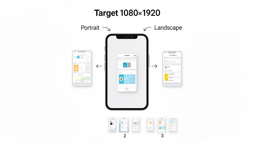
Google gives you a lot of wiggle room on the technical side. Your screenshots need to be at least 320 pixels on their shortest side and can go up to 3840 pixels on their longest. This flexibility is great, but if you want your visuals to look crisp and professional, aim for 1080x1920 pixels for portrait shots. That is the sweet spot for modern, high-res phone screens.
Choosing the Right Orientation
Deciding between portrait and landscape is not just a technical choice. It is a strategic one that shapes how users see your app. The rule of thumb is simple: match the orientation to how your app is actually used. If you have built a utility or a social app that people use vertically, stick to portrait. For games or media players best experienced horizontally, landscape is a no-brainer.
This is about more than just following rules; it is about setting the right expectations. If someone sees landscape screenshots for a productivity app, they might subconsciously assume it is clunky to use with one hand, which could kill your conversion rate. On the flip side, portrait shots for an immersive, cinematic game will not do it justice.
While Google technically allows some extreme aspect ratios, both the Play Store algorithm and the user experience favor standard device dimensions. Sticking to common ratios like 16:9 ensures your visuals show up properly without any weird cropping, which is absolutely critical for making a good first impression.
The Play Store is more relaxed with its rules than Apple's App Store, but that just means smart optimization is even more important. The gold standard is 1080x1920 pixels for portrait and 1920x1080 pixels for landscape. This also helps you look great on Chromebooks and tablets where landscape is king. In fact, games that provide at least three landscape screenshots often get a nice boost in discovery and downloads. You can find more deep dives on the strategic side of app store screenshot sizes on rplg.io.
Showcasing Value in the First Three Seconds
Let's be real: most users will only ever see your first two or three screenshots before they decide to scroll on. You have a tiny window to get your app's core value across. Do not waste it with random UI screens. Tell a story.
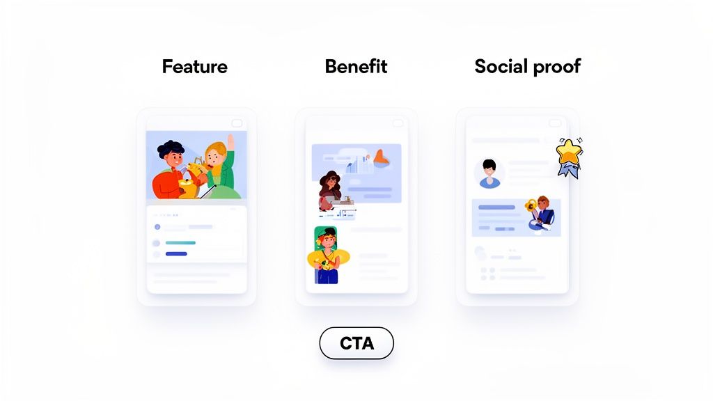
- Screenshot 1: The Hook. Grab their attention immediately with your absolute best feature or biggest benefit.
- Screenshot 2: The "How." Show them how your app delivers on that promise. A clean UI example works perfectly here.
- Screenshot 3: The Proof. Build trust. Show off an award, a great rating, or a key statistic that proves you are the real deal.
This is a perfect example of how to turn a basic UI capture into a high-converting asset using a simple mockup tool or site editor.
By dropping the raw UI into a device frame and adding a benefit-driven headline on top, the image instantly communicates value and looks far more polished and professional.
Getting Tablet and Chromebook Screenshots Right
Optimizing for larger screens is a core part of any serious app growth strategy. One of the most common mistakes developers make is focusing entirely on phone visuals, which is a surefire way to cap your app's reach. Google now puts a massive emphasis on the user experience for tablets and big-screen devices like Chromebooks, and your screenshots are the first thing they look at to judge that quality.
If you skip these larger formats, your app listing might get a warning telling users it is not optimized for their device. That is a guaranteed way to lose a download. This is your chance to show off how your app uses all that extra screen real estate, demonstrating features like a clean landscape mode or a more detailed UI.
Key Tablet and Chromebook Screenshot Dimensions
To get that "optimized" checkmark for tablets, Google needs you to upload dedicated screenshots. You cannot just throw your phone screenshots in there and hope for the best. They will not hit the resolution requirements or, more importantly, they will not accurately show the tablet experience.
Here are the hard and fast rules you need to follow for both 7-inch and 10-inch tablets:
- Minimum Screenshot Count: You must provide at least four screenshots for each tablet size (so, four for 7-inch and four for 10-inch).
- Minimum Dimension: The shortest side of the image must be at least 1,080 pixels.
- Maximum Dimension: The longest side cannot be more than 7,280 pixels.
- File Format: Stick to JPEG or 24-bit PNG (with no alpha/transparency).
These rules are non-negotiable. Failing to provide these dedicated assets is a major red flag for both Google’s algorithm and your potential users. For a deeper dive, check out our guide on creating great screenshots for Android tablets.
The way these requirements have changed shows how important they are. Google's 2021 Play Console update made the four-image minimum and a 1,080px resolution floor mandatory for tablets. This shift directly boosted app growth, especially in markets where tablets were taking off, and it proved that screenshot quality is a key piece of any distribution strategy.
Your tablet screenshots should do more than just meet the technical specs. Use them to tell a story. Show how your app's features truly shine on a bigger display, highlighting multi-pane layouts or enhanced functionality that is not possible on a cramped phone screen. This visual proof is your single most powerful tool for converting tablet users.
Creating High-Converting Screenshots That Boost Installs
Getting the technical Play Store screenshot sizes right is just the price of entry. It gets you listed, but it does not guarantee downloads. To really turn your store listing into a growth engine, you need to think of your screenshots as powerful marketing assets. This is where good App Store Optimization (ASO) comes in, shifting the focus from just showing your UI to using design and messaging that actually converts.
The best screenshots tell a story. Instead of dumping a bunch of random screens, they guide a potential user through a quick, compelling narrative that shows off the app's real benefits. Each image should build on the last, creating a visual journey that takes someone from mild curiosity to hitting that "Install" button.
Use Captions to Highlight Core Value
Your UI is important, but a bold, benefit-driven caption is what truly sells your app. Do not just describe a feature; spell out what it helps the user achieve. A killer headline can communicate your app's entire value proposition in a split second.
Here is a practical example. A plain screenshot of a fitness app's dashboard is boring. But frame it in a site editor with a powerful caption like "Track Your Progress, Crush Your Goals," and you have instantly reframed a static image into an aspirational message. It connects directly with what the user wants. This single tactic is a cornerstone of creating effective Google Play app screenshots that deliver real results.
Design with On-Brand Mockups
Raw screenshots often look flat and a little lazy. Dropping your UI inside a professionally designed device mockup using a site editor instantly elevates your entire listing. It makes your app feel more tangible and polished, which builds trust with new users.
Use vibrant, on-brand colors and backgrounds that grab the eye and reinforce your app's identity. Keeping this visual style consistent across your whole screenshot gallery creates a cohesive, professional look that sets you apart from the competition.
A huge mistake developers make is treating screenshots as an afterthought. They are your primary sales tool on the Play Store. A polished mockup with a strong headline can dramatically boost conversion rates by turning a simple UI view into a compelling ad for your app’s benefits.
Incorporate Social Proof to Build Trust
It is human nature: people trust other people. Your screenshot gallery is the perfect place to show off social proof that validates your app's quality and popularity. This is a powerful psychological trigger that can sway a user's decision to download.
Here are a few actionable ways to bake social proof into your visuals:
- Showcase Awards: If your app won something or got featured, dedicate a screenshot to highlighting it.
- Feature Testimonials: Pull a great quote from a user review or a well-known influencer.
- Highlight Key Metrics: Display impressive numbers like "Trusted by 1 Million Users" or "50,000 Five-Star Reviews."
When you combine compliant dimensions with smart ASO tactics like storytelling, compelling captions, and social proof, you are on your way to a high-converting store listing. This strategic approach ensures your visuals do not just meet Google's guidelines. They actively work to grow your app.
Efficiently Localizing Screenshots for a Global Audience
Taking your app global means more than just translating text. Your screenshots must speak the local language too, and that is about more than just swapping out words. Real localization is about adapting your entire visual story to connect with different cultures, a move that can seriously kickstart your growth in new markets.
It is the difference between an app that feels foreign and one that feels like it was built just for them. Getting the cultural details right, like colors, imagery, and even which features you spotlight, builds instant trust and makes users feel right at home.
Common Localization Pitfalls
Trying to manually create unique screenshot sets for dozens of languages is a recipe for a headache. It is painfully slow, shockingly expensive, and an absolute nightmare for version control. Every single time you tweak your UI, you are stuck repeating the entire design process for each language, which can easily delay your global releases.
Without a smart system, teams inevitably run into the same old problems:
- Massive Design Overhead: Creating assets for 10 languages turns into 10 separate, resource-draining design projects.
- Inconsistent Branding: When you are doing everything by hand, it is easy for styles, colors, and messaging to drift apart across different regions.
- Slow Time to Market: The sheer slog of localizing visuals can become the biggest bottleneck holding up your release schedule.
Building a Scalable International Workflow
The secret to doing this efficiently is to separate your design from your content. Modern design tools and screenshot automation platforms let you build a single, on-brand visual template that locks in your layout, colors, and device frames.
Once that master template is set, you can simply feed in the translated text for each language without having to rebuild the graphics from scratch. This approach turns a repetitive, soul-crushing design task into a simple, scalable system. Some tools even use AI to instantly generate fully localized sets, ensuring every play store screenshot size is perfect and culturally on-point.
This kind of automation lets you enter new markets fast and with confidence. You can dive deeper into building out a full international strategy in our complete guide to mobile app localization.
When you automate your localization workflow, you stop focusing on tedious production work and start thinking about high-level strategy. It frees up your team to research cultural preferences and dial in your messaging for each market, instead of just endlessly resizing and translating images.
Of course, a solid global strategy goes beyond just your screenshots. You also need to nail other types of content, like subtitling and translation for global reach. An automated system does not just save you time; it ensures your brand looks sharp and consistent everywhere. It turns global expansion from a logistical nightmare into a core part of your growth engine.
Answering Your Top Questions About Play Store Screenshots
Diving into Google Play's requirements can feel like navigating a maze. I get a lot of questions about the nitty-gritty details of screenshot sizes and best practices, so I have put together some straight answers to the most common ones I hear from developers and ASO pros.
Do I Really Need Separate Screenshots for Phones and Tablets?
Yes, absolutely. If your app is designed to run on tablets, Google requires you to upload screenshots specifically for them. It is not just a suggestion. You will need a minimum of four screenshots for 7-inch tablets and another four for 10-inch tablets.
Trying to skip this step will seriously hold you back. Google will not feature your app properly to tablet users, which cuts off a huge potential audience. And just stretching your phone screenshots will not work. They will fail the resolution requirements and, more importantly, they will not accurately show how your app feels and functions on a bigger screen.
What's the Best Aspect Ratio to Use for Screenshots?
While Google Play is flexible and accepts ratios up to 2:1, your best bet is to stick with what users are familiar with. For phones, the 16:9 aspect ratio is king. Think 1920x1080 for landscape or 1080x1920 for portrait. This is the standard for the vast majority of Android devices and guarantees your images will look right.
Getting creative with weird or super-wide aspect ratios is a bad idea. It often leads to awkward cropping or weird black bars in the Play Store, which just looks unprofessional. A sloppy presentation can kill your conversion rates because it makes your app look poorly thought out.
A quick note on promo videos: they are a massive ASO asset and show up right before your screenshots. But think of them as a powerful supplement, not a replacement. You need both a killer video and a set of high-quality, informative screenshots to make the biggest impact.
Can I Just Use a Promo Video Instead of Screenshots?
You definitely should use a promo video, but it does not get you out of providing static screenshots. The Play Store rules are clear: you must upload a minimum of two screenshots for your phone listing, even if you have a video.
Your promo video is actually hosted on YouTube; you just plug the URL into your Play Console listing. They really work as a team. The video is perfect for grabbing attention with dynamic, in-app action. The screenshots then back it up, offering a quick, scannable overview of your app’s core features and what makes it special.
Ready to stop wrestling with dimensions and start creating screenshots that actually convert? ScreenshotWhale gives you professionally designed templates and an AI-powered editor to generate stunning, compliant visuals for both the Play Store and App Store in minutes. It's time to boost your installs. Explore ScreenshotWhale templates.