Responsive Design for Mobile Apps: A Guide to UX and App Store Growth
Master responsive design for mobile apps with our complete guide. Learn core principles, frameworks, and ASO strategies to boost mobile UX and app growth.
Responsive design is not just a technical box to check. It is the core of creating an app that feels right on any screen, from a tiny phone to a massive tablet. Getting this right is fundamental to growing your app and boosting conversions, because it all comes down to user satisfaction and retention.
Why Responsive Design Is Critical for App Growth
Ever opened an app and immediately felt lost or frustrated? It’s like walking into a store with a broken door; most people will just turn around and leave. That's why responsive design is no longer a "nice-to-have." It's a core driver of your business, directly connecting a fluid, intuitive layout to how you acquire, engage, and keep users.
A seamless experience, whether on the latest iPhone or an older Android tablet, creates that critical first impression. It's often the deciding factor in whether a user sticks around or hits the uninstall button. In short, responsiveness is a pillar of your growth strategy and a direct path to boosting app store growth.
The Foundation of User Experience and Conversions
Modern users have high expectations. They want flawless performance on whatever device they're holding. When an app’s buttons are a pain to tap, the text is too small to read, or images look stretched and distorted, it creates instant friction. That friction leads directly to uninstalls and bad reviews, which can absolutely tank your app store ranking.
A great responsive design makes your app feel like it was custom-built for every single screen. That builds trust and encourages people to actually explore what your app can do, turning a positive first interaction into a loyal user base and driving conversions.
Beyond just good feelings, a well-executed responsive layout has a real impact on your bottom line. Studies have shown that when teams invest in a better user experience, conversion rates can jump by as much as 400%. This is exactly why focusing on core mobile app design best practices from day one is so important.
Adapting to the Mobile-First World
Let's face it, the digital world runs on small screens. In 2024, mobile phones account for about 62.66% of all global web traffic. This means the vast majority of your users will meet your brand on a phone first. People are also way less forgiving on mobile, where bounce rates are much higher than on desktop. A layout that isn’t thumb-friendly, legible, and fast is actively hurting your conversions and your brand's reputation. You can dig deeper into how mobile trends shape user behavior over at DesignRush.
Building a successful responsive app starts with a solid plan. It all begins with understanding the ultimate guide to choosing the best mobile app development platform, a decision that profoundly shapes your app’s ability to grow. That choice sets the stage for how effectively your app can adapt and scale across the ever-expanding universe of mobile devices.
Responsive Versus Adaptive Design: What App Teams Need to Know
When you start building a mobile app, one of the first big questions you'll hit is how to handle the wild variety of screen sizes out there. This is not a small detail; it shapes everything. Your choice usually boils down to two main philosophies: responsive versus adaptive design.
Getting this right from the start is crucial. It impacts your development process, your budget, and most importantly, the experience your users will have.
The Core Difference: Fluid vs. Fixed
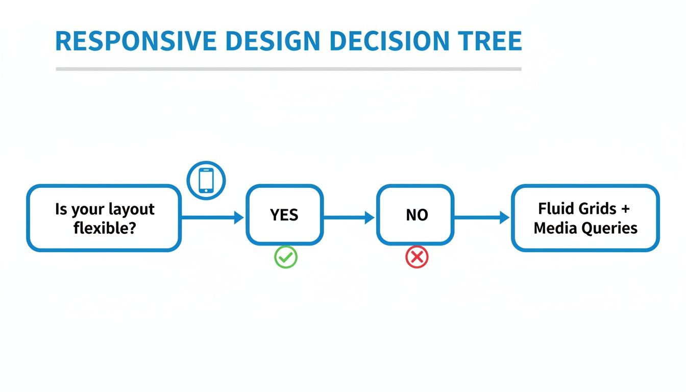
Think of responsive design like pouring water into a glass. The water is a single, fluid thing that perfectly fills whatever shape it's poured into. A responsive layout works the same way. It’s one flexible grid that dynamically stretches or shrinks to fit the screen, whether it’s a tiny phone or a massive tablet. Elements just reflow and resize themselves in real-time.
Adaptive design, on the other hand, is more like having a set of pre-sized LEGO bricks. Instead of one fluid layout, you create several distinct, fixed layouts, each one custom-built for a specific screen size (we call these "breakpoints"). When someone opens your app, the system checks their screen size and serves up the perfect pre-built layout.
This decision is not just a technical footnote; it's a strategic fork in the road.
Flexibility vs. Optimization: The Big Trade-Off
So, which one is better? It depends on what you're trying to achieve.
A responsive approach is often simpler to get up and running. You build one layout, and its fluid nature ensures your app will look good on pretty much any device, even ones that have not been invented yet. That's a huge win for future-proofing your work.
But adaptive requires more heavy lifting upfront. Your team has to design, build, and maintain multiple distinct versions of the UI. The payoff? You can deliver a more optimized, pixel-perfect experience for each specific device you target. It can also lead to faster load times, since the app only loads the assets needed for that one layout.
The core trade-off is between the future-proof flexibility of responsive design and the tailored optimization of adaptive design. Your app's goals, target audience, and resources will point you in the right direction.
To make the choice clearer, let’s break it down side-by-side.
Responsive vs. Adaptive Design: A Quick Comparison
This table breaks down the key differences between responsive and adaptive design approaches to help you decide which is better for your mobile app.
| Attribute | Responsive Design (Fluid) | Adaptive Design (Fixed Layouts) |
|---|---|---|
| Flexibility | Highly flexible. A single layout adapts to all screen sizes, including future devices. | Less flexible. Relies on predefined breakpoints for specific screen sizes. |
| Development Effort | Generally less complex upfront. One codebase manages all layout adjustments. | More complex. Requires creating and maintaining multiple fixed layouts. |
| User Experience | Provides a consistent, seamless experience across all devices. | Can offer a highly optimized, pixel-perfect experience for targeted devices. |
| Performance | May load all assets regardless of screen size, potentially slowing down smaller devices. | Can be faster as it only loads the assets required for the specific detected screen size. |
| Best For | Apps targeting a wide and unpredictable range of devices with limited resources. | Apps needing precise layout control and performance optimization for popular devices. |
In the end, there's no single "best" answer. A startup launching a new social media app will probably lean responsive for its incredible reach and scalability. But a premium e-commerce app that wants to deliver a flawless experience on the latest flagship phones might go adaptive to nail that visual perfection.
Your team has to weigh these factors to build the right foundation for your app's journey.
Getting Your Hands Dirty with Core Layout Systems
Alright, now that we’ve sorted out the responsive vs. adaptive debate, it’s time to get practical. Building an app that feels right on every screen means you have to master the tech that makes your UI bend and stretch. These core layout systems are the real engines behind responsive design, dictating how every button, image, and text block positions and resizes itself.
Think of these systems as rulebooks for relationships between your UI components. Instead of telling a button to be exactly 50 pixels from the left edge, you define its relationship to its neighbors, like "stay centered in your container" or "always hang out 10 pixels below the title." This relational thinking is what lets your UI adapt gracefully to whatever screen it finds itself on.
Each platform has its own favorite system, but they all operate on this same fundamental idea.
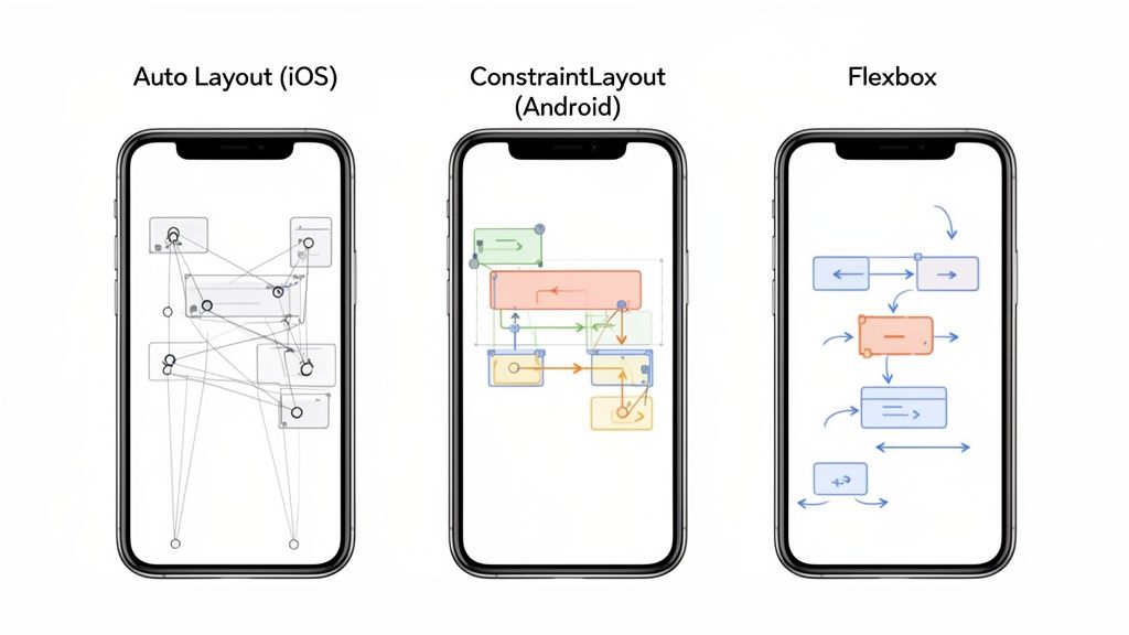
Auto Layout: The iOS Standard
For anyone building on iOS, Apple’s Auto Layout is your bread and butter. It’s a constraint-based system where you set up rules that describe how you want your layout to behave. These rules, or constraints, manage the size and position of UI elements in relation to each other or the screen itself.
Working in Xcode's Interface Builder, for example, you can set these up visually without touching a line of code. You might tell a "Sign Up" button to always stay horizontally centered and keep a fixed distance from the logo above it. When the screen rotates or the app runs on a massive iPad, Auto Layout automatically does the math and shifts the button to honor those rules.
The real magic of Auto Layout is its descriptive nature. You aren’t telling elements where to go; you’re explaining how they should relate to their surroundings. This makes your layouts both powerful and surprisingly easy to reason about.
This system is perfect for creating designs that just work across the entire Apple ecosystem, from the smallest iPhone SE to the largest iPad Pro. It handles tricky things like screen notches, safe areas, and dynamic font sizes with total precision.
ConstraintLayout: Android's Answer
Over in the Android world, Google’s ConstraintLayout offers a very similar and equally powerful philosophy. It lets you build large, complex layouts with a flat view hierarchy, which is a big win for performance. Just like Auto Layout, it’s all about defining relationships.
Picture a user profile screen. With ConstraintLayout, you can anchor an avatar image to the top and left edges. Simple enough. Then, you can constrain the username to the right of the avatar and align their vertical centers. This setup guarantees that no matter how wide the screen gets, that username will always sit perfectly beside the image.
Here are a few common constraints you'll use in an editor like Android Studio:
- Relative Positioning: Pinning one element's side to another's (e.g.,
layout_constraintStart_toEndOf="@+id/avatar"). - Centering: Nailing an element to the horizontal or vertical center of its parent.
- Bias: Nudging an element along an axis, almost like a slider (e.g., a 70% horizontal bias pushes it toward the right side of its available space).
This system gives you incredible control, making it the go-to choice for building modern, responsive UIs on Android.
Flexbox: The Cross-Platform Champion
When you step outside native development and into frameworks like React Native or Flutter, Flexbox is the star of the show. It started as a CSS layout model for the web, but its principles were so effective that they’ve been widely adopted for building responsive app interfaces.
Flexbox is fantastic because it excels at distributing space among items in a container, even when their sizes are totally unknown or dynamic. Think of it like arranging books on a shelf. You can tell them to bunch up, spread out evenly, or wrap to the next line if they start running out of room.
You’re mainly dealing with two concepts:
- Flex Container: The parent element where you define the main rules, like the layout direction (
flex-direction: 'row') or how items are aligned (justify-content: 'space-between'). - Flex Items: The children inside the container that can be told how to behave, whether they should grow to fill space (
flex-grow) or shrink to make room (flex-shrink).
With just a few lines of code, you can build a dynamic list that perfectly fills the screen or a navigation bar where the buttons space themselves out automatically. Its simple, one-dimensional approach makes Flexbox a remarkably efficient and intuitive tool for responsive design across any platform.
Designing Responsive UI Patterns and Content Breakpoints
Great responsive design is about more than just a flexible grid. It’s about using proven UI patterns that make your app feel intuitive on any device, big or small. Think of these patterns as a shared language between your app and the user. They help people navigate and interact without a second thought.
You wouldn’t use a hammer to turn a screw, right? The same logic applies here. A simple settings page and a complex data dashboard demand completely different layouts. Choosing the right pattern is the key to creating a clean, functional experience that just works.
Common Responsive Patterns For Mobile Apps
Let's break down a few of the most reliable patterns that designers and developers lean on every single day.
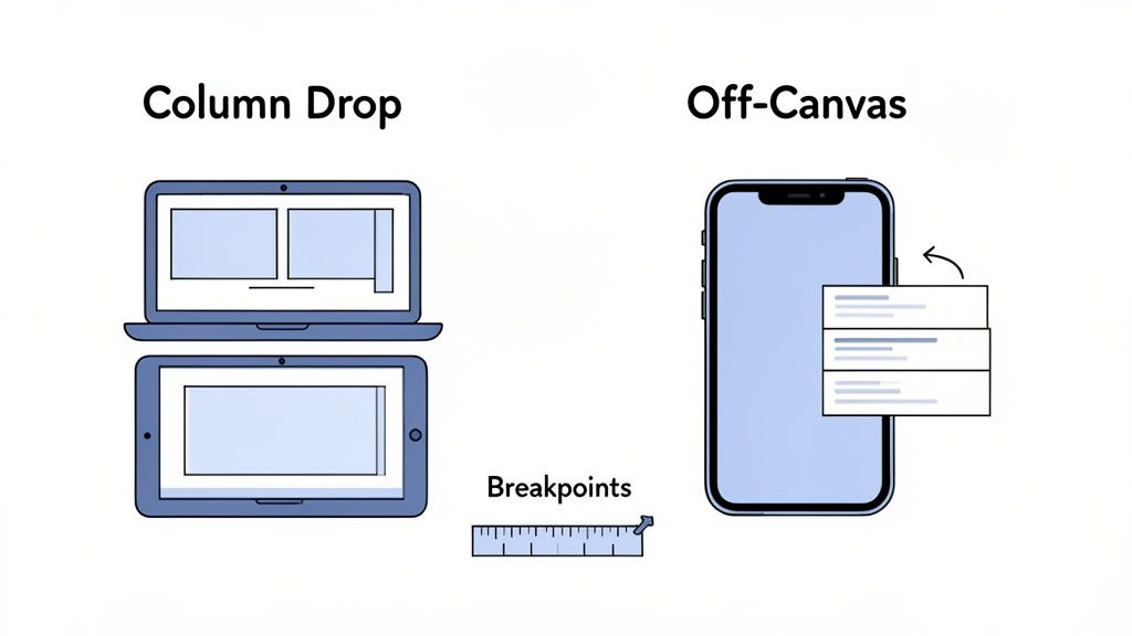
Column Drop: This is one of the simplest and most common approaches you'll see. On a wide tablet screen, content might be laid out in several columns. As the screen shrinks, those columns gracefully "drop" below one another, stacking into a single, easy-to-scroll vertical list. It’s perfect for content-heavy pages like blogs or news feeds.
Off-Canvas Navigation: Screen real estate is gold on a smartphone. The off-canvas pattern cleverly tucks the main navigation menu out of sight, just off the edge of the screen. A quick tap on a hamburger icon slides it into view. This keeps the primary content area clean and focused while giving users full access to navigation whenever they need it.
Tiny Tweaks: Sometimes, you do not need a complete overhaul. The tiny tweaks pattern is all about making small, subtle adjustments. Think slightly resizing fonts, padding, or button sizes. This is a great fit for simple interfaces that already look pretty good on small screens but just need a little polish to feel right at home on larger ones.
When you're dealing with these kinds of nuanced design decisions, hiring top-tier UI/UX designers who can masterfully implement these concepts is absolutely critical.
The Art Of Setting Content-First Breakpoints
One of the biggest mistakes teams make is tying their breakpoints to specific devices, creating an "iPhone breakpoint" or an "iPad breakpoint." This is a recipe for a brittle design that breaks the moment a new device comes out. A much more durable approach is to let your content dictate where the layout needs to change.
A breakpoint should only be added when the content starts to look bad. Your design should be fluid between those points, not just jump between a few fixed states. This content-first approach ensures your app looks great on every device, today and in the future.
What this looks like in practice is starting with your narrowest screen design and slowly widening the viewport. The second a line of text gets uncomfortably long, an image looks awkward, or elements start crashing into each other, you've found your next breakpoint. This simple shift in thinking keeps the user experience locked in, no matter the screen. For a closer look at building these interfaces, check out our guide to https://screenshotwhale.com/blog/mobile-app-ui-design.
Boost App Store Growth with High-Converting Responsive Screenshots
Your app's responsive design should not just be a behind-the-scenes technical win. It needs to be front and center on your app store page, where you have seconds to make a great first impression. Your screenshots are the most powerful visual tool you have to convert casual browsers into downloads, directly impacting your app store growth.
When someone lands on your page, they imagine using your app on their phone. If your screenshots look blurry, stretched, or poorly formatted for their device, you have created doubt. This is where you can turn your responsive design into a powerful conversion driver by creating efficient and high-converting app store screenshots for both Android and iOS stores.
Create a High-Converting First Impression
A responsive mindset for your screenshots proves your app looks fantastic on a wide range of devices, from the latest iPhone Pro Max to a popular Samsung Galaxy model. You visually promise a polished, seamless experience before they even tap "Get," building trust and signaling quality.
Think of your screenshots as a visual handshake. A crisp, device-specific screenshot is firm and confident. A generic, poorly fitted image is a weak handshake that hurts your brand. This visual storytelling is critical for boosting conversions and achieving app store growth.
Actionable Insights for Screenshots that Convert
Crafting screenshots that grab attention is an art. You have to tell a compelling story in just a few swipes. Here are some actionable tips:
- Use Neat, Appealing Imagery with Vibrant Colors: Your screenshots should pop. Use your brand's color palette, but make it vibrant and eye-catching to stand out from competitors.
- Showcase Key Features with Clear Captions: Do not make users guess. Use short, punchy headlines above each screenshot to highlight a key benefit. Each image should communicate a clear value proposition.
- Ensure Text is Readable: Captions must be large and clear enough to be easily read on a small phone screen. A great message is useless if it is unreadable.
This example from a site editor shows how to bring these elements together into a cohesive, high-converting design.
As you can see, a professional template provides the foundation. A site editor lets you focus on customizing captions and visuals to tell your app's unique story and drive conversions.
Streamline Screenshot Production for Every Device
Manually creating screenshots for every device size required by the iOS and Android stores is a time-consuming nightmare. Each app store has its own set of rules and dimensions that change frequently. For a deep dive, check our complete guide to app store screenshot dimensions.
This is why specialized tools are a must for maintaining a professional, responsive look on both app stores.
Using a dedicated screenshot editor is not just a time-saver; it's a strategy to ensure consistency, compliance, and quality. It lets you generate a full set of localized, responsive, and guideline-perfect screenshots in minutes, not days, which is a massive boost for app store growth.
Platforms like ScreenshotWhale make this process nearly effortless. You can choose from professional templates, drag and drop your UI captures into various device mockups, and even translate captions into over 100 languages. This allows you to generate a full suite of responsive screenshots perfectly tailored for both the Apple App Store and Google Play, ensuring your app looks its best everywhere and maximizes conversions.
Testing and Performance: The Keys to a Flawless UX
A beautiful responsive design is all for nothing if it's slow, buggy, or just plain broken on certain devices. This is where the real work begins. Rigorous testing and performance tuning are what separate a good design from a great, reliable user experience. Skipping this step is just asking for a flood of one-star reviews.
The idea is to make sure your app is not just a pretty face. It needs to be technically sound. That means going deeper than a quick check on your own phone. You need a solid game plan that covers a whole spectrum of devices and network conditions, so you can squash bugs before your users ever see them.
Your Testing Toolkit: A Mix of Methods is a Must
Relying on a single testing method is like trying to build a house with only a hammer. It's just not going to work. For the best coverage, you need a smart combination of simulators and real, physical devices.
- Simulators and Emulators: Think of tools like Xcode for iOS and Android Studio as your first line of defense. They let you quickly cycle through dozens of virtual screen sizes, orientations, and OS versions. It's the fastest way to spot obvious layout blunders without needing a drawer full of phones.
- Real-Device Cloud Testing: Simulators are fantastic, but they can't mimic real-world performance hiccups or weird hardware quirks. This is where cloud testing platforms come in. They give you remote access to a massive library of physical iPhones, iPads, and Android devices, showing you exactly how your app behaves in a genuine user environment.
- Performance Profiling: It's time to look under the hood. Built-in tools like Xcode's Instruments or Android Studio's Profiler are your best friends here. You can monitor CPU usage, memory consumption, and network activity to pinpoint and fix performance bottlenecks that make your app feel sluggish.
The Hit List: What to Hunt for During Testing
When you're putting your responsive UI through its paces, you need a sharp eye for the common gremlins that can absolutely tank the user experience. You should be obsessively checking for:
- Overlapping UI elements where text slams into buttons or images.
- Unclickable buttons or touch targets that are frustratingly small.
- Text that gets cut off or shrinks into an unreadable mess on small screens.
- Painfully slow load times for images and other heavy assets.
Your app has to feel fast and fluid on every device, not just the latest flagship model. Performance is a feature, and it’s one of the most important parts of a great user experience, especially for people on slower networks or older phones.
Failing to deliver a smooth experience has real, measurable consequences. In the app world, a staggering 73% of users will ditch an app because of poor visuals or broken navigation. This number alone proves how tightly UI responsiveness is linked to user retention. If you want to dive deeper into how UI and performance directly impact user behavior, check out these web design statistics. The data makes it crystal clear: a technically solid and reliable app is non-negotiable for growing your user base in a cutthroat market.
Responsive Design FAQs
Jumping from the theory of responsive design to the nitty-gritty of building an app always brings up a few tricky questions. Let's tackle some of the most common ones that pop up for designers and developers in the trenches.
How Should I Handle Responsive Typography?
This is a big one. A headline that looks perfect on a tablet can feel like it's screaming at you on a phone. The secret is not picking a dozen different font sizes, but using relative units that scale gracefully with the screen and, just as importantly, with the user's own preferences.
For iOS, your best friend here is Dynamic Type. It's built right into the system and lets your fonts automatically adjust based on the accessibility settings a user has chosen. On Android, the gold standard is using Scale-Independent Pixels (SP) for your font sizes. This clever unit considers both the screen's pixel density and the user's font size settings, which is a huge win for readability and accessibility.
What Are the Biggest Mistakes to Avoid?
The most common trap I see is designing for devices, not for content. People get fixated on creating an "iPhone layout" and an "iPad layout," but that's a brittle approach that will break as soon as a new screen size comes out.
A much better way is to let your content tell you when the design needs to change. When does a line of text get uncomfortably long? When do two buttons start to feel cramped? Those are your natural breakpoints, and they're far more resilient than tying your design to a specific product.
Another killer is forgetting about performance. It’s so easy to grab a beautiful, high-resolution image and drop it into a mobile layout, but that can absolutely crush your app's load time. Always, always compress your images and use modern, efficient formats. A snappy, fluid experience is non-negotiable, especially when someone's on a spotty network.
How Does Responsiveness Impact App Accessibility?
They're two sides of the same coin, really. A fluid layout that reflows content is exactly what a screen reader needs to parse information in a logical, predictable order. And when your typography respects the user's font size settings, you’re making your app usable for people with visual impairments.
Good responsive design inherently improves accessibility. It forces you to build a flexible, well-structured interface that works for everyone, regardless of their device or abilities. It's not just about making things look good; it's about creating an inclusive experience.
By making sure your touch targets are big enough on every screen and that the reading order makes sense no matter the layout, you’re not just ticking an accessibility box. You’re opening your app up to a much wider audience.
Ready to transform your app store presence with stunning, responsive visuals? With ScreenshotWhale, you can generate high-converting, localized screenshots for every device in minutes. Try our drag-and-drop editor today and see how easy it is to boost your downloads. Visit us at screenshotwhale.com.