Mastering User Interface Design Fundamentals for App Store Growth
Discover user interface design fundamentals to boost usability and engagement with practical tips for building intuitive apps.
When someone is scrolling through the App Store or Google Play, your app has just a few seconds to make a case for itself. Before they read a single word of your description, before they even glance at the reviews, they are looking at your screenshots.
This is your first impression. And it is where solid user interface design fundamentals stop being a nice to have and become your most powerful sales tool for driving conversions.
Your First Impression on the App Store
Think of your app store page as a storefront. Your icon is the sign above the door, but your screenshots are the window display showing people what is inside. If that display is cluttered, confusing, or just plain ugly, they will walk right on by.
Good UI design turns that window display into a compelling story that pulls people in. It builds instant trust, showing them your app is not just functional, but thoughtful and easy to use. Just like you would pour effort into designing a great app icon, your screenshots deserve that same level of care.
This guide will break down the foundational principles like layout, color, and typography into a practical framework. The goal is to help you transform your screenshots from simple screen grabs into high converting app store screenshots for the Android and iOS stores.
Why Good UI in Screenshots Matters
That split second decision a user makes is everything. Screenshots that look slapped together signal a low quality app, and potential users will scroll right past without a second thought.
On the flip side, efficient and high converting screenshots that nail the UI fundamentals accomplish a few critical things:
- They Communicate Value Instantly: Great UI clearly shows off what your app does best, without needing a wall of text to explain it.
- They Build User Trust: A polished, professional look immediately suggests your app is well built, reliable, and worth their time.
- They Boost Conversion Rates: A compelling visual narrative gives people the confidence they need to hit that "Download" button.
Do not underestimate the power of good design here. Studies have shown that a well designed user experience can lift conversion rates by as much as 400%. That is the kind of impact that separates a hobby project from a successful business and boosts app store growth.
Your app store screenshots are your first and often only chance to make a case for your app. Applying user interface design fundamentals ensures you are making the strongest case possible.

To put it all into perspective, let's break down how these core design concepts directly translate into better performing app store screenshots.
Core UI Principles and Their Impact on App Screenshots
| UI Principle | Primary Goal | Impact on App Store Conversions |
|---|---|---|
| Layout & Composition | Create visual balance and guide the user's eye. | Makes features easy to understand at a glance, reducing cognitive load and friction. |
| Hierarchy | Emphasize the most important elements first. | Draws attention to key value propositions and call to actions, increasing clarity. |
| Typography | Ensure text is readable, legible, and visually appealing. | Builds trust through professionalism and makes marketing copy more persuasive. |
| Color Theory | Evoke emotion and create a cohesive brand identity. | Reinforces your brand and makes screenshots visually memorable and attractive. |
| Affordance & Signifiers | Make interactive elements obvious and intuitive. | Shows users that the app is easy to navigate before they even download it. |
| Accessibility | Design for everyone, including users with disabilities. | Broadens your potential user base and signals an inclusive, user centric product. |
As we dive into each of these principles, you will see how they are not just abstract theories but practical tools for convincing users your app is worth the install.
Guiding the Eye with Layout and Hierarchy
When a user lands on your app store page, a great screenshot instantly tells them where to look. This is not magic; it is the result of a solid layout and a clear visual hierarchy. These are two of the most fundamental principles in UI design, and they are what separate a confusing mess from a compelling story.
Think of your layout as the architectural blueprint for your screenshot. It is how you use spacing, grids, and alignment to create a sense of order. A calm, organized space is easy for the brain to process.
A cluttered screenshot is an absolute conversion killer. It screams "this app is complicated" before the user has even touched it. The best weapon against this kind of chaos is whitespace, the empty area around and between your text and images. Giving your content room to breathe makes everything more readable and pulls the user's focus exactly where you want it.
Establishing a Strong Visual Hierarchy
Once your layout feels clean and uncluttered, the next step is to build a clear visual hierarchy. This is really just the art of making your most important message shout the loudest. By playing with size, color, and placement, you can create a visual path that guides the user’s eye from one key point to the next.
For example, your main value proposition should probably be the biggest and boldest text on the screen. A standout feature or a critical call to action can be highlighted with a pop of vibrant, contrasting color to grab immediate attention. This is how you turn a jumble of information into a simple, powerful story that leads straight to that 'download' button.
Hierarchy is not about making everything big and bold. It is about making the right things stand out to tell a clear story in three seconds or less.
As you design your screenshots, stop and ask yourself: what is the single most important thing I want someone to take away from this image? Make that element the hero of the shot. Everything else is just there to play a supporting role, creating a balanced and intuitive design. If you are looking for a shortcut, exploring different mobile app design templates can give you a great head start with these principles already baked in.
Practical Tips for Better Layout and Hierarchy
You do not need to be a design guru to apply these ideas. With a tool like the ScreenshotWhale editor, you can make these adjustments easily and see the impact right away. Here are a few actionable insights you can apply now:
- Embrace the Grid: Use the alignment tools. Seriously. Making sure your text and images line up cleanly gives your design a professional, intentional feel that builds trust. In an editor, this is as simple as selecting multiple text boxes and clicking the "Align Left" button.
- Vary Your Font Sizes: Create a clear difference between your main headline, any subheadings, and smaller descriptive text. A good rule of thumb is to make your headline at least twice the size of your body text.
- Use Color for Emphasis: Do not just rely on size to do the heavy lifting. A splash of a bright, on brand color can make a specific benefit or feature absolutely impossible to ignore.
- Prioritize with Placement: We naturally see things at the top or center of an image as more important. Put your most compelling message right where users are going to see it first.
2. Communicating Your Brand with Color and Typography
Color and typography are not just decorative fluff; they are the very soul of your app. Get them right, and you forge an instant emotional bond that builds your brand and gets people to tap "install." These two elements work in tandem, setting the entire mood before a user even reads a single word of your headline.
Think of color as your app's emotional language. Are you fun, energetic, and exciting? Vibrant, saturated colors scream that from the rooftops, perfect for a game or a fitness app. Or are you more about sophistication and calm? A muted, monochromatic palette communicates that instantly, making it a natural fit for a meditation or finance app. Choosing the right colors is not just an artistic choice; it is a core part of designing an interface that connects.
Choosing Your Core Color Palette
A simple three color framework is a fantastic starting point for any app screenshot. This little trick keeps your designs looking cohesive and professional without ever feeling visually cluttered.
- Primary Color: This is your hero, your main brand color. It should show up the most, creating a consistent vibe across all your screenshots.
- Secondary Color: Think of this as the supporting actor. It should complement your primary color and is great for subheadings, secondary buttons, or highlighting less critical info.
- Accent Color: This is your secret weapon. Use this high contrast color sparingly to make the most important stuff like a killer benefit or a call to action absolutely jump off the screen.
With an editor like ScreenshotWhale, you can lock in these brand colors once and apply them everywhere. It’s a huge time saver and makes sure every single visual you create is perfectly on brand.
Your color palette is a strategic tool. Use it to guide the user's eye, create emotional appeal, and make your app’s most important features impossible to miss.
Selecting Legible and On-Brand Typography
If color sets the mood, typography gives your app its voice. For app store screenshots, your two biggest priorities are legibility and brand alignment. The fonts you pick have to be dead simple to read on a small phone screen. No exceptions.
This obsession with clarity is not new; it has deep roots. The whole reason we have graphical user interfaces (GUIs) today is thanks to pioneers at Xerox PARC back in the 1970s. They ditched complex command lines for visual metaphors like windows and icons, proving that intuitive, visually accessible design was the future. That same principle still guides how we choose readable fonts. You can explore the full history of UI to see just how far these ideas have come.
When you are picking fonts, keep it simple. Try pairing a bold, impactful font for your headlines to grab attention with a clean, simple sans serif for body text to keep things readable. Steer clear of overly decorative or whisper thin fonts that make people squint. Your typography should always support your message, never get in its way.
Building User Confidence with Clear Visual Cues
https://www.youtube.com/embed/cQq70Ts0Ajs
How do you convince someone your app is a breeze to use before they have even downloaded it? You do it with your app store screenshots. This is where clear visual cues like affordance and feedback do all the heavy lifting for you, building instant confidence in your app's usability.
Affordance is a fancy word for a simple idea: making things look like what they do. A physical button sticks out, so you know to push it. A doorknob is shaped to be turned. In the digital world, this means making your buttons look tappable and your sliders look draggable. This became absolutely critical when touchscreens took over and our physical buttons vanished.
The jump to direct manipulation with our fingers was a game changer. Today, a whopping 82% of users actually prefer apps with gesture based controls. It just feels natural.
Making Interactivity Obvious
Your app store screenshots are the perfect place to signal this intuitive design. Using the ScreenshotWhale editor, you can add simple visual tricks that subconsciously tell users, "Hey, this app is easy."
- Use Subtle Shadows: A slight drop shadow under a button makes it feel raised, almost like it is begging to be tapped. In an editor, you can often add this with a single click in the element style settings.
- Leverage Familiar Icons: Everyone knows what a play button or a trash can icon means. These universal symbols need zero explanation.
- Maintain Visual Consistency: Keep your interactive elements looking similar. Maybe they all share the same color or shape. This trains the user to spot them instantly.
To keep everything consistent and effective, it helps to lean on a good user interface design framework as a guide for your team.
Showing the App Responds
The other side of this coin is feedback. Feedback is the app's way of saying, "Got it!" after a user takes action. Even though your screenshots are static, you can still hint at how responsive and satisfying your app feels to use.
Good feedback tells the user, "I heard you, and I'm doing what you asked." This silent communication is key to making an app feel reliable and well built.
For example, show a screenshot where a little checkmark appears next to the "Add to Cart" button after it has been tapped. Or maybe you can display a subtle loading animation or a "Success!" message. These small details pack a big punch. They scream that your app "just works," helping drive more downloads and fuel your app store growth.
Your Secret Weapon for Growth? Accessible Design.
Let's be honest, "designing for accessibility" can sound like a technical chore, another box to check before you ship. But it is actually one of the most powerful growth strategies you can have. An accessible app is simply an app that more people can use. That means a bigger market, better reviews, and ultimately, more downloads and app store growth.
When you apply these core UI principles to your screenshots, you are sending a powerful signal to everyone who lands on your app page: this is a high quality, user focused product.
It all starts with something surprisingly simple: color contrast. We have all squinted at text that practically melts into its background. It is a frustrating experience that makes people bounce. Inside the ScreenshotWhale editor, you can pick your background and text colors and instantly check if they pass the bar.
A good rule of thumb? Aim for a contrast ratio of at least 4.5:1 for your main text. This is not just about following rules; it is about making sure your message is crystal clear on any device, in any lighting, which is key to creating high converting app store screenshots.
Actionable Tips for More Accessible Screenshots
Beyond just color, a few other design choices can make a huge difference in how clear and effective your screenshots are. The best part is that accessible design is just good design. These tips will make your screenshots more effective for everyone.
- Pick Readable Fonts: Stick to clean, simple sans serif fonts. Ditch the overly decorative or whisper thin styles that become illegible at small sizes. Make sure your font size is large enough to be read comfortably on a phone screen.
- Lean on Universal Icons: A house icon for "home"? A magnifying glass for "search"? These symbols do not need a translator. Using them reduces the mental effort for users and makes your features instantly understandable, no matter their language or culture.
- Write Clear Captions: Never assume the image tells the full story on its own. Use short, snappy headlines to spell out the key benefit the user is seeing in each screenshot.
Accessibility is not just about being inclusive; it is about building trust. When users see you have thought about their needs, they are far more likely to believe your app will deliver a great experience.
Making these small tweaks in your design process can have an outsized impact on your app's reach and success. It shows you care about your users, a message that cuts through the noise in a crowded app store. For a deeper dive into inclusive design, check out this practical guide on how to make a website accessible.
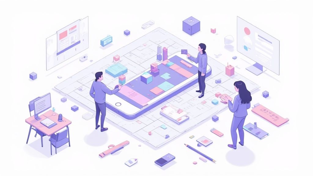
Putting It All Into Practice: Crafting Your Screenshot
Alright, theory is great, but now it is time to get our hands dirty. Let's walk through how to take these UI design principles and actually apply them to create efficient and high converting app store screenshots for both the Android and iOS stores.
We are going to take a plain screen capture and, step by step, build it into a real marketing asset. The goal is not just to make something pretty; it is to make smart, intentional choices that show off your app's value and build a user's confidence from the moment they see it.
Applying Core UI Principles in the Editor
First things first, let's nail the layout. When you open your editor, give your app screen some breathing room. Adding generous padding around it is the quickest way to kill the clutter and pull the user's eye right where you want it.
Next up is hierarchy. Your headline needs to be the loudest thing on the screen. Make it significantly larger than your descriptive text and use a bold, clear font. This is your one shot chance to grab their attention with your app's main benefit.
Now for color. Stick to a simple, strategic palette. Using your primary brand color for the background creates a clean, professional look. Then, pick a single high contrast accent color for a specific feature callout or button. This simple trick guides the user’s eye exactly where you want it to go.
Here is a look at these principles in action within the ScreenshotWhale editor. Notice how clean and organized it feels.
This blend of a spacious layout, strong typography, and intentional color makes the app’s value instantly understandable. If you want more ideas on how to frame your visuals, we have got a complete guide to creating a professional iPhone app mockup that is worth a read.
Don't Forget a Final Accessibility Check
Before you hit export, there is one last crucial step: a quick accessibility check. This is not just a box to tick; it is about making sure your screenshot is clear and readable for everyone, which is the cornerstone of great UI design.
Think of it as a final quality control check.
- Is my text high contrast? Can someone with low vision easily read the captions against the background?
- Is my font legible? Avoid overly decorative fonts that are hard to decipher, especially at smaller sizes.
- Are my icons universally understood? If you use symbols, make sure they are clear and do not require a manual to understand.
Focusing on these simple things makes your design more inclusive and, ultimately, more effective.
Good design is accessible design. High contrast and clear fonts are not just compliance tasks; they are fundamental to creating a screenshot that actually converts for all users.
By following this process, you can confidently take these user interface design fundamentals and turn them into a repeatable blueprint for creating screenshots that perform well on both the App Store and Google Play.
Got questions about using design fundamentals for your app store assets? Let’s tackle some of the most common ones that come up.
What’s the Single Most Important UI Principle to Start With?
If you are pressed for time and can only focus on one thing, make it visual hierarchy. Hands down.
A strong hierarchy grabs a potential user's attention and immediately tells them what your app is all about. Use the ScreenshotWhale editor to make your main headline significantly bigger and bolder than everything else. This simple tweak forces the eye to the most important message first, and it can completely change how clear and effective your screenshots are.
How Can I Actually Tell if My New Screenshot Designs Are Working?
The only way to know for sure is to test them in the real world with A/B testing, right inside the app stores.
Launch your new set of screenshots, the ones you have carefully crafted with solid UI principles, and run them against your old ones. Keep a close eye on your conversion rates, specifically metrics like page views to installs. If that number starts climbing, you have clear proof that your improved designs are doing their job.
What's the Best Tool for Making Screenshots That Actually Convert?
For anyone serious about app marketing, a specialized tool will always beat a generic design program. You will save hours and get a much better result.
A platform like ScreenshotWhale is built for this exact purpose. It is not a blank canvas; it is a system designed with user interface design fundamentals baked right in. You get access to device mockups, layouts that already follow proper hierarchy, and simple color palette tools. It is everything you need to create professional, high converting visuals for both the App Store and Google Play in just a few minutes.
Ready to see what a difference great design makes? Start creating stunning, high converting screenshots with ScreenshotWhale and watch your app’s growth take off. Start designing for free today!