Optimal Icon Sizes for App Store and Google Play
Discover essential tips for app store icon sizes and improve your app's visibility.
Key Tips for Optimal App Store Icon Sizes
The icon of your app is crucial; it's what users notice first. It acts as the entry point to your app, making accuracy and adherence to guidelines essential. Each app store has unique requirements, and failing to meet them can lead to rejections. This is a headache you will want to avoid.
For submissions to the Apple App Store, your main icon must be 1024x1024 pixels. Meanwhile, the Google Play Store necessitates a 512x512 pixel icon. Perfecting these crucial files is a pivotal step in accelerating app growth and increasing conversions.
Quick Guide to App Store Icon Dimensions
Consider the master icon as the definitive reference. Both Apple and Google utilize this high-resolution image to automatically create the smaller icons required for their platforms. This includes icons for the home screen, notifications, settings, and search results. Perfecting the master file guarantees your app maintains a professional look across different platforms.
Master Icon Specifications
The essential distinction between stores lies in size: Apple demands a larger file to meet the high-res Retina display standards, while Google's specification is slightly smaller but equally precise. It's imperative to adhere to each store's size specifications.

Both platforms require a square PNG format, but their rules on transparency differ. Ensure you keep them distinct.
Here's a handy comparison table outlining the vital specs needed before finalizing your assets.
Primary Icon Specifications for App Stores
This table outlines the core upload specifications for Apple and Google stores. Keep it accessible to avoid common submission mistakes.
| Specification | Apple App Store (iOS) | Google Play Store (Android) |
|---|---|---|
| Dimensions | 1024 x 1024 pixels | 512 x 512 pixels |
| Format | PNG | 32-bit PNG |
| Transparency | Not approved (must be opaque) | Approved (for adaptive icons) |
| File Size Limit | No strict limit | Below 1024 KB |
| Color Space | sRGB or P3 | sRGB |
Correct setup is essential for a smooth approval. This minor detail is a foundation for app growth and conversions.
Navigate Apple App Store Icon Requirements
If your focus is the Apple ecosystem, start with a vital asset: the 1024x1024 pixel app icon. This high-resolution file acts as a universal key. Upload to App Store Connect, and Apple's system resizes it for all purposes across iOS, iPadOS, watchOS, and macOS.
This streamlined method is a relief compared to previous requirements. Since the debut of Retina displays in 2010, developers have adjusted to one 1024x1024 pixel icon, a remarkable 400% pixel increase. This transition allowed for seamless submission following iOS 7. For an in-depth look, check out the history of iOS app icon dimensions.
Critical Technical Guidelines
To avoid rejection, your master icon must meet a few crucial technical criteria. These are automatically evaluated during app review, so it's essential to get them right from the start for a smooth submission.
Here's a quick checklist for your 1024x1024 pixel icon:
- Format: Use PNG exclusively. JPEGs or GIFs are not permitted.
- Color Space: Stick with sRGB or P3 color spaces to maintain color accuracy on Apple devices.
- Transparency: Ensure your icon is completely opaque. No alpha channels or transparent pixels allowed.
- Shape: Your design must be a perfect square. Avoid rounding corners; Apple applies its "squircle" mask automatically.
The "no transparency" rule is a frequent pitfall, easily delaying launches if missed.
The Lifecycle of Your iOS Icon
Upon uploading the master 1024x1024 pixel file, Apple generates various icons from it, each optimized for specific contexts and devices. This ensures a consistent, high-quality appearance for your app across various platforms.
The image below from Apple's Human Interface Guidelines demonstrates this process.

A single standout design scales beautifully, preserving recognizable identity across all devices.
Key Icon Dimensions Post-Resize
Despite uploading one file, knowing the reduced sizes it will covert can differentiate between a simple and exceptional icon. A design suited for 1024x1024 pixels may lose clarity at smaller sizes.
Pro Tip: Always preview your design at the smallest required sizes, such as 40x40 or 58x58 pixels. This ensures your icon’s central elements remain discernible, essential for notifications and settings.
Some key size reductions Apple creates from your master file include:
| Platform / Context | Icon Size (in pixels) |
|---|---|
| iPhone Home Screen | 180x180 |
| iPhone Spotlight Search | 120x120 |
| iPad Pro Home Screen | 167x167 |
| Notifications (iPhone/iPad) | 40x40 or 60x60 |
| Settings (iPhone/iPad) | 58x58 or 87x87 |
By accounting for these sizes from the beginning, you establish your app’s visual success wherever it appears.
A Deep Dive into Google Play Store Icon Guidelines
The Google Play Store emphasizes adaptability, differing from the Apple Store's "one file" method. Your focus here is creating an icon that shines across a multitude of Android devices. Begin with the main icon for your store listing.
For your Google Play Console submission, a 512x512 pixel, 32-bit PNG is required. Google limits the file under 1024 KB to ensure swift loading on different devices. This icon creates the initial impression, making it critical to perfect.

Understanding Android's Adaptive Icons
Beyond the store listing, Android adaptive icons are vital. Introduced in Android 8.0 (Oreo), they offer visual coherence across different Android launchers from brands like Samsung, Google, and OnePlus.
Here’s their mechanics. Your icon is formed in two distinct layers:
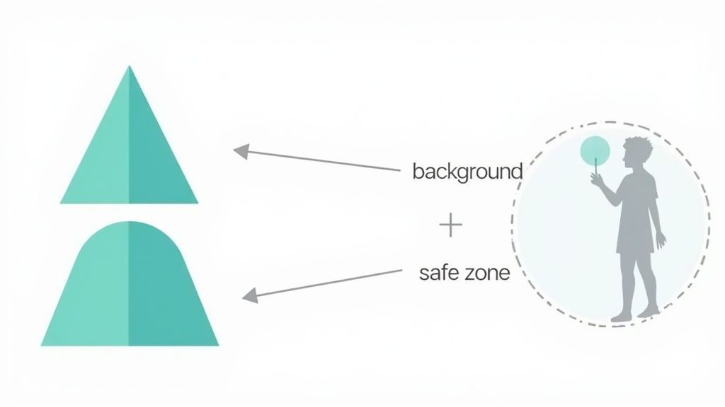
- Foreground Layer: Houses the actual logo or brand symbol needing transparency.
- Background Layer: Solid and opaque, it complements the logo.
This two-layer system allows phone launchers to apply masks like circles, squircles, or teardrops. It also provides dynamic effects, such as a parallax shift when swiping through screens.
The Critical Safe Zone
Respecting the safe zone is crucial to prevent logo cropping. It's a central invisible circle, with a diameter covering 66% of the icon's full size.
For a 108x108 dp icon, the safe zone equates to a 72 dp circle. Logo elements extending outside this boundary risk being cut off. Keep significant visual parts within.
Your foreground layer, which holds the logo, should stay within this inner circle. The background layer should cover the full canvas, preventing bizarre empty perimeter areas once masked. Mastering this ensures effective Google Play graphics and store efficiency.
Designing Cohesive Layers
An effective adaptive icon combines compliant design with two harmonized layers. The foreground is bold and clear, while the background provides a supportive, clean base for the logo.
A common example is a messaging app using a chat bubble logo at the forefront with a brand color background. This simple, clear approach underscores the brand identity.
Designing Icons to Enhance Downloads
Your app icon transcends store requirements—it's key marketing material. As a user’s initial touchpoint, it must captivate and prompt interaction. A well-designed icon enhances visibility and attracts downloads.
An effective design emphasizes simplicity, recognizability, and scalability. Simplicity allows swift comprehension, recognizability ensures memorability among other apps, and scalability maintains its crisp appearance across different sizes, from large 1024x1024 pixel store displays to compact 40x40 pixel notifications.

Creating a Distinctive Visual Profile
A well-chosen color scheme is crucial for making your icon stand out. Bright, vivid colors can capture user interest amidst competition. Colors also communicate emotion: calming blues suit meditation apps, while energetic reds and oranges align with fitness apps.
Distinction is vital in the saturated app market. The Apple App Store alone welcomes about 57,089 new apps monthly, a figure always increasing. Your icon must be distinctive yet adhere to technical guidelines, like maintaining a 1024x1024 pixel PNG format. Visit 42matters.com for more competitor insights.
Successful icons often consist of a straightforward symbol representing the app’s function. For example, a music note for streaming apps or a camera lens for photo editing apps delivers immediate, clear communication. Discover more on designing high-converting app icons.
Boosting Conversions via A/B Testing
Don’t assume your initial icon is ideal. A/B testing is how you truly determine what drives downloads. This involves displaying different icon versions to distinct user groups to identify which performs better.
A/B testing your app icon is highly effective. Small design updates can massively improve conversion rates—up to 20-30%—without altering app code.
Here’s a simple method for successful A/B testing:
- Create Variations: Develop 2-3 distinct icon ideas. Consider significant changes in color, imagery, or style.
- Utilize Testing Tools: Both Apple App Store (Product Page Optimization) and Google Play Store offer built-in testing utilities.
- Examine Results: Run tests until you gain statistically significant results. Deploy the best-performing version to all users.
Iterating based on actual data allows for informed decisions contributing to your app’s growth.
Avoiding Common Technical Errors
Submitting an app icon might seem simple, but certain technical missteps can quickly lead to rejection. Paying attention to these details is crucial for a successful submission. Incorrect export settings could delay your launch.
iOS: The Impact of Transparency and Rounded Corners
One frequent error in iOS submissions is including transparency. Apple's rules are explicit: the 1024x1024 pixel PNG must be fully opaque. Any transparent pixel triggers immediate rejection by the system.
A similar mistake is pre-shaping iOS icon corners. Submit a perfect square strictly; rounding corners automatically can lead to double-rounded edges, causing an unprofessional appearance.
Android: Overlooking the Safe Zone
For Android's adaptive icons, ignoring the safe zone is a common pitfall. Key parts of your logo must reside within this center area to prevent cropping by various manufacturer masks.
Placing crucial logo elements near the edges guarantees some will be trimmed off on certain devices.
Design Errors That Don't Scale
Beyond platform rules, certain design risks don’t translate well in practice. Complex icons thrive at 1024x1024 pixels but become indistinct smudges at smaller dimensions. Preview your design at minimum sizes to ensure recognition.
Avoid these rookie mistakes:
- Photos: Avoid photographs; they rarely scale well and appear blurred.
- Text: Unless text is integral, skip it; it becomes unreadable and cluttered at small scales.
- System UI Elements: Avoid iOS or Android UI components in your icon to prevent user confusion.
Remember: App store reviews are frequently automated. Scripts scan for technical errors before human review. Stick to guidelines for smooth submissions.
Consider technical requirements as your closing checklist. By fulfilling every item, you prevent submission setbacks and ensure your beautifully crafted icon reaches the app store without issues.
Enhancing Your App Icon Workflow with Tools and Templates
Designing an eye-catching app icon is only half the task. The main challenge lies in the precise and efficient export of assets. Setting up your workflow with the right tools is crucial for avoiding submission troubles and ensuring your icon appears sharp on every device.
Tools such as Figma, Sketch, and Adobe Photoshop are excellent for the initial design stage. Vector tools like Figma and Sketch are particularly advantageous for scalable assets requiring clarity at different sizes. Photoshop remains popular for intricate raster designs.
Automating Tedious Exports
Manually exporting every icon size for iOS and Android is painstakingly slow and prone to error. This is where specialized tools and plugins assist, automating the generation of a complete set of icons from a single master file.
This automation is not just a time-saver; it minimizes errors and confirms all files comply with app store icon size standards. For instance, a Figma plugin can transform your primary 1024x1024 pixel design into all required sizes, correctly named, and ready for Xcode or Android Studio.
Here is how the "App Icon Generator" plugin in Figma works.
This simple tool enables you to select for both iOS and Android, generating a complete asset package in one click, eliminating tedious manual resizing and exporting.
Essential Templates and Resources
Starting with templates can be a substantial shortcut. A quality template includes main icon sizes and critical safe zone guides for Android’s adaptive icons. This ensures no awkward cropping due to masks. Explore reliable mobile app design templates for a strong start.
Bringing in additional creative resources can make visuals consistent and engaging. Utilizing a color palette generator can help establish a unique color scheme that makes your icon pop.
A consistent workflow is vital. Utilizing templates and automation builds a repeatable process, ensuring every icon fits your brand and meets app store specifications, simplifying future updates and A/B tests.
Frequently Asked Questions About App Icon Dimensions
Navigating app icon requirements can be complex. Here are straightforward answers to common questions from designers and developers.
Can iOS and Android Icons Differ?
Yes, they can vary, and in many cases, they should.
Maintain brand recognition, but acknowledge that iOS and Android have distinct design philosophies. Android’s adaptive icons involve layers and depth, while iOS icons are flat, aligning within Apple's "squircle" mask.
Leading apps adjust icons slightly for each platform, possibly altering background, gradient, or shadow, but maintaining the central symbol. It's a minute detail but enhances user experience by making apps feel more native.
Frequency of App Icon Updates?
No definitive rule exists, but top apps typically refresh icons more than expected—often 3 to 4 times yearly.
Updates aren’t total redesigns but often align with events:
- Seasonal Events: Adding festive elements keeps icons current.
- Major App Updates: New icons underscore new features or UIs.
- A/B Testing: Consistent experimentation can unlock improved store conversions.
Frequent updates keep apps fresh and attention-grabbing.
Consequences of Incorrect Icon Size?
There's no flexibility here. An incorrect icon size results in an immediate rejection by store automated reviews. These aren't suggestions; these are strict rules.
Submitting a 1023x1024 pixel icon to the Apple Store or one with transparency leads to errors like "Invalid App Store Icon" or "Icon must be 1024x1024 pixels." Rectifying and re-uploading delays launches.
A brilliant icon is just the start. Your app's page needs to persuade users to click "Install." With ScreenshotWhale, design eye-catching, branded screenshots for both the App Store and Google Play within minutes. Use proven templates to boost downloads and enhance your listing. Start your design journey free.